A full rebrand for Trident Trackway, covering strategy, identity and website design.
A complete rebrand for the UAE's first materials transformation company — converting recycled waste into ground protection solutions for events and construction.
- Agency
- JansenHarris
- Year
- 2023
- Role
- Brand Designer
- Category
- Brand
Sole designer — collaborated with strategist and client on brand strategy, mentored by Creative Director.
The Challenge
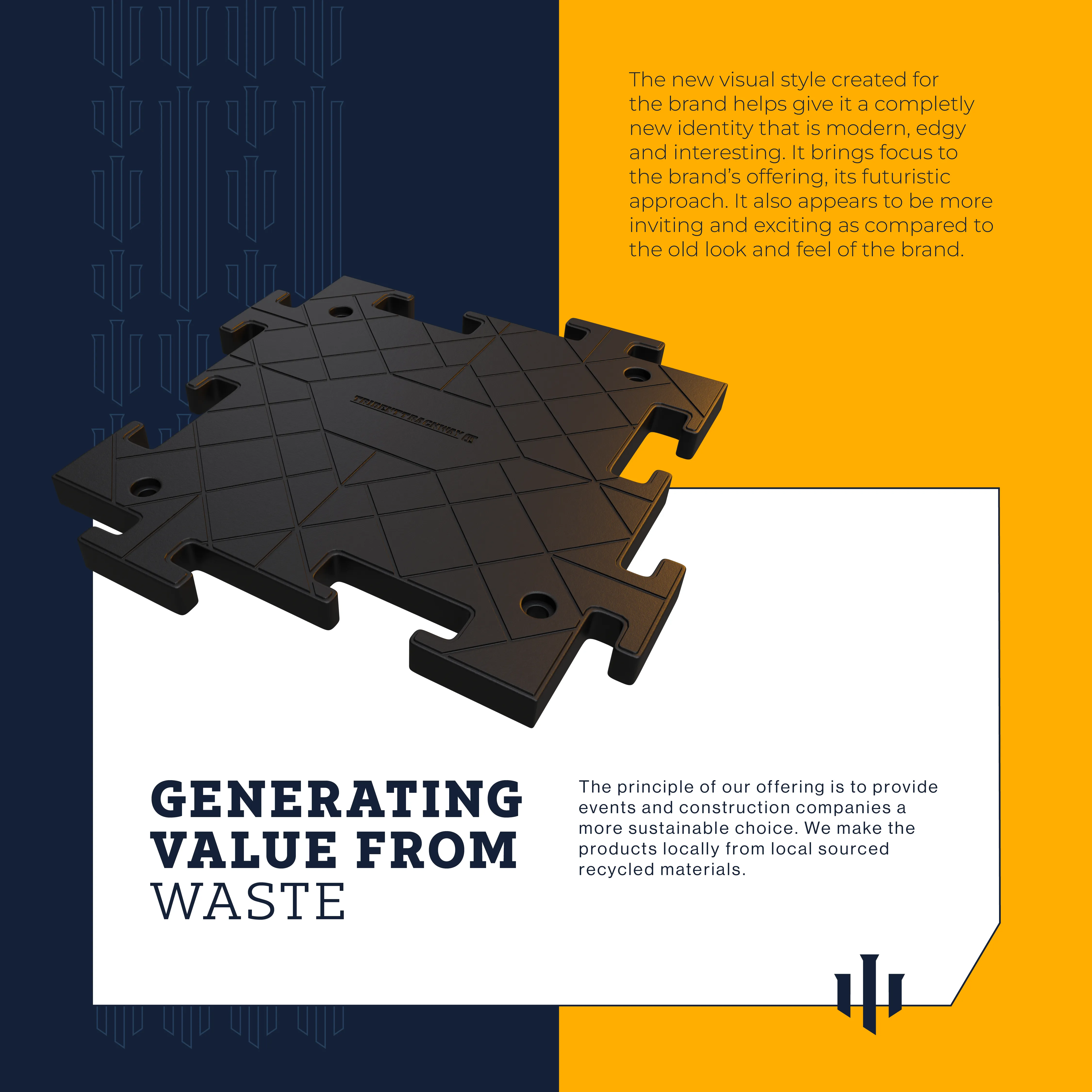
Trident Trackway is the first company of its kind in the UAE — a materials transformation business that converts recycled waste into hard-wearing, long-lasting ground protection tiles for events and construction sites. Despite being genuinely pioneering, their brand told none of that story. The existing identity was outdated, generic, and built for a company a fraction of Trident's size and ambition.
The brief was to rebuild the brand from the ground up — retaining the trident symbol as a nod to the three founding members, but modernising everything else. Strategy, positioning, visual identity, print and digital collateral, and a full website all needed to be developed from scratch.
UAE First
The only company of its kind in the market
Technology + Sustainability
Two differentiators, one clear message
Full rebrand
Strategy, identity and website
The Approach
01 — Research
The project began with a competitor audit across UAE, UK and US markets — including Signature Systems, Sunbelt Rentals, Elite GSS and Southern Trackway. The audit revealed a category where brands were overwhelmingly B2B, jargon-heavy and visually flat. None of them were leading with sustainability, despite it being an increasingly important procurement factor.
Signature Systems
USA
Positioning
Premier composite matting — engineering and safety led. Application-based solutions for multiple industries.
Services
Visual Strength
StrongSustainability
Weak — mentioned, not ledSunbelt Rentals
USA
Positioning
World-class rental experience — scale and customer satisfaction led. 1.5M+ items of equipment.
Services
Visual Strength
StrongSustainability
Absent — not communicatedElite GSS
UK
Positioning
Specialist ground support — innovation and performance led. Construction, civil engineering and events.
Services
Visual Strength
Weak — no distinctive identitySustainability
Absent — not communicatedSouthern Trackway
UK
Positioning
Fast, affordable trackway solutions — price and speed led. Heavy and light use product ranges.
Services
Visual Strength
Weak — basic, no clear systemSustainability
Absent — not communicatedCompetitor audit — four players across UAE, UK and US markets.
02 — Strategy
From the audit, six issues with the existing brand emerged — no USP, flat colour, jargon-heavy tone, poor photography, and no clear message. The key strategic recommendation was to lead with what made the product genuinely different: the technology behind it and the sustainability story it enabled. These two things together were the USP. No competitor was communicating either.
What Wasn't Working
No clear USP
Flat colour palette
Jargon-heavy tone
Poor photography
Hidden sustainability
B2B focused only
Where the Opportunity Was
Powerful photography
Use bold, emotive imagery to build an aspirational following and brand presence
Bold differentiation
Stand out through colour, simplicity of message and confident visual design
One clear USP
A single umbrella message to anchor the entire company ethos and offering
Social media presence
Build visibility and community through a consistent, active social presence
Humanise the brand
Clear, concise messaging that speaks to people — not just procurement teams
Lead with technology
Make the sustainability story and product innovation the hero of all communications
03 — Identity Direction
The existing logo had one thing worth keeping — the trident symbol, representing the three founding members. Rather than starting from scratch, the decision was made, collaboratively with the client, to retain that equity and rebuild everything around it. The old mark was generic and had no personality. The goal was to make the symbol timeless and ownable: something that could carry the brand at any scale without feeling temporary.
04 — Defining the audience
Two distinct audiences shaped the brand strategy — construction companies, who needed speed, reliability and minimal site preparation, and event management companies, who needed flexible, sustainable solutions for temporary surfaces. Both audiences valued credibility and clarity above all else.
Audience 01
Construction Companies
Speed, reliability and minimal site preparation
- Protecting finished surfaces during final construction phases
- Seeking a clear interface with all information in one place
- Seek an orderly , simple interface that is easy to navigate
Audience 02
Event Management Companies
Flexible, sustainable solutions for temporary surfaces
- Protecting expensive surfaces from foot and vehicle traffic
- Needing accessible routes across all terrain types
- Prefer frictionless, instructive brand interactions
Two audiences, one brand — construction companies and event management companies.
05 — The Positioning
Audience
Businesses and event companies looking for sustainable flooring alternatives.
Category
A materials transformation company.
Problem Solved
Converts waste matter into hard-wearing, long-lasting, safe ground protection.
Benefit
An eco-friendly, forward-thinking solution to your ground cover needs.
Brand positioning — audience, category, problem solved and benefit defined.
"Trident Trackway were already doing something remarkable.
The brand just needed to say so."
The audit made the opportunity clear — no competitor had a distinctive identity, and none were communicating what made their product genuinely different. The strategic decision was to lead with the sustainability story and the technology behind it, making that the core of how the brand spoke. But the identity itself was built around something more personal — the trident, representing the three founders, rebuilt to be timeless and ownable at every scale.
The Solution
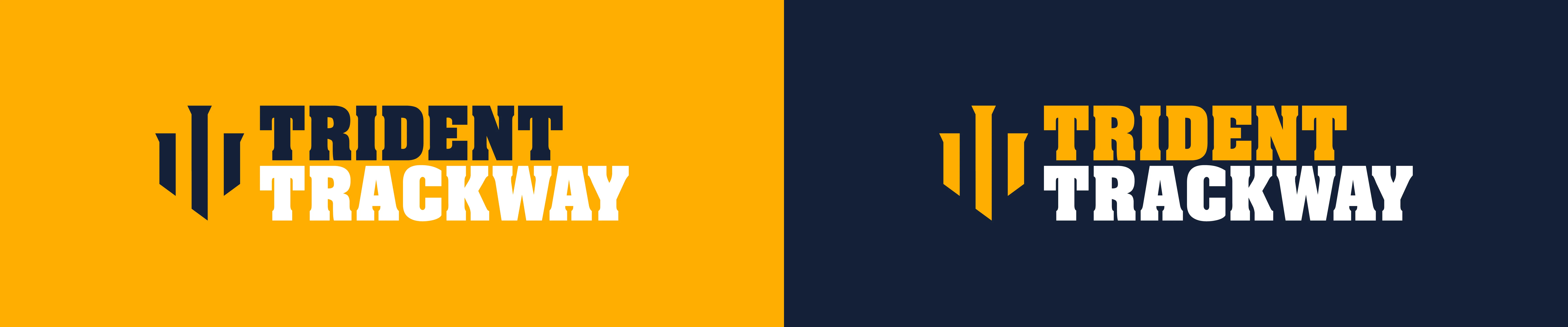
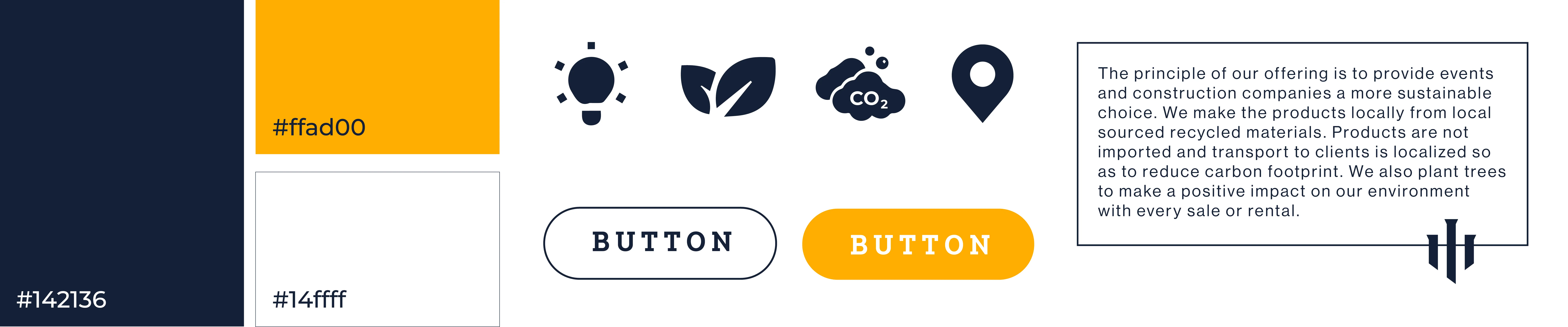
The trident symbol was rebuilt with contemporary proportions — three pillars, abstract and modern, designed to work from business card to billboard. A bold amber and navy palette replaced the flat original colours. The brandmark was set in spaced, heavy type for legibility at all sizes. A trident-derived repeating pattern was developed as a secondary visual language, giving the brand range across digital and physical touchpoints.
The rebrand was rolled out across every touchpoint — from office stationery to full-scale billboards. A website was designed from the ground up, with a full information architecture mapped before a single screen was drawn, ensuring the user journey was as clear as the brand itself.
01
Visual Identity
Full logo suite, colour palette, typography system, icon set and trident pattern visual language.
02
Print & Digital Collateral
Business cards, billboards and brand application across physical and digital touchpoints.
03
Information Architecture
Full site map developed to ensure logical content hierarchy and intuitive user journeys.
04
Website Design
A complete website design — from wireframes through to final UI — built to tell the sustainability story and convert both target audiences.

Brand Identity & Visual System
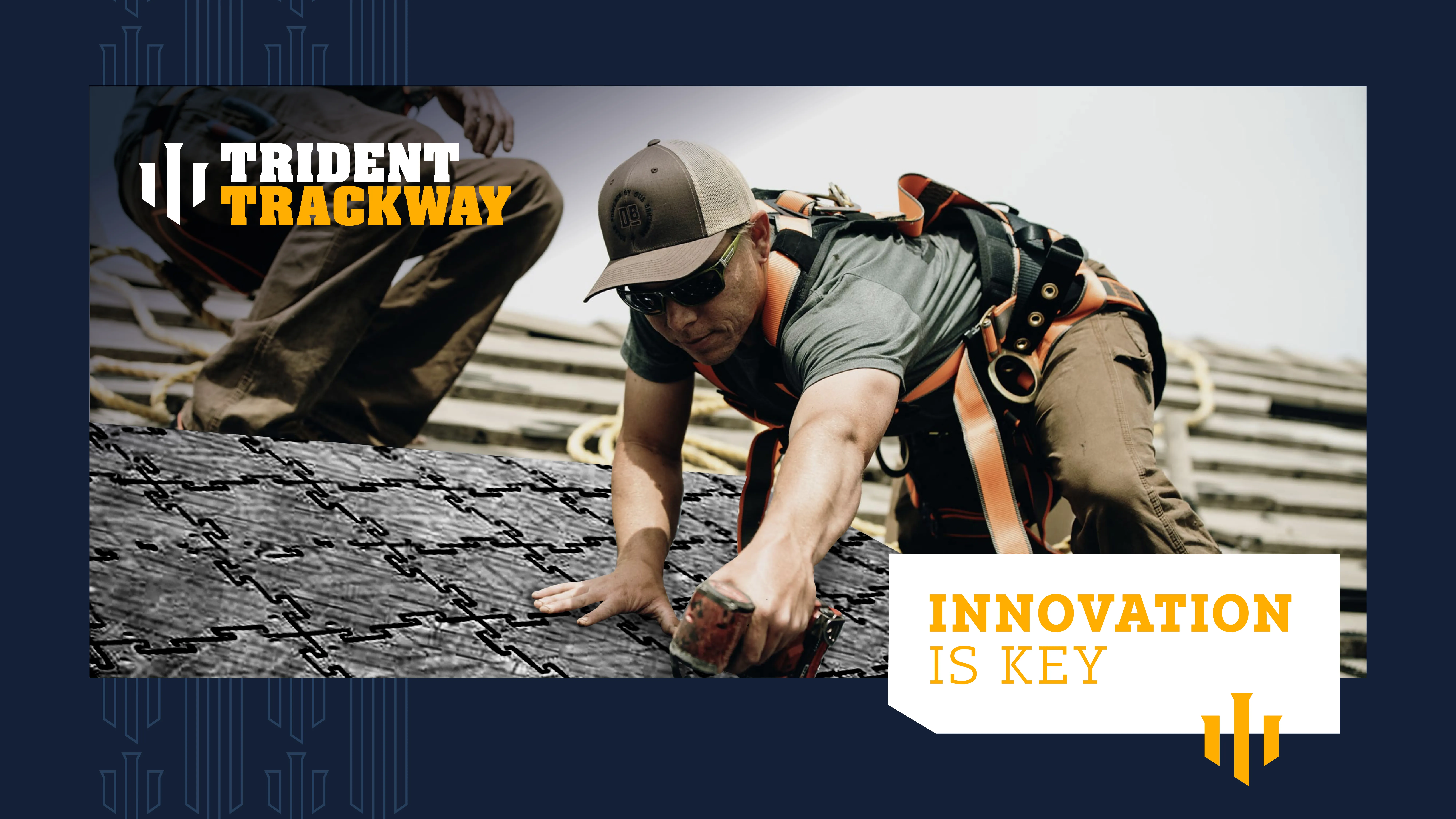
Brand in use — identity applied to product communication
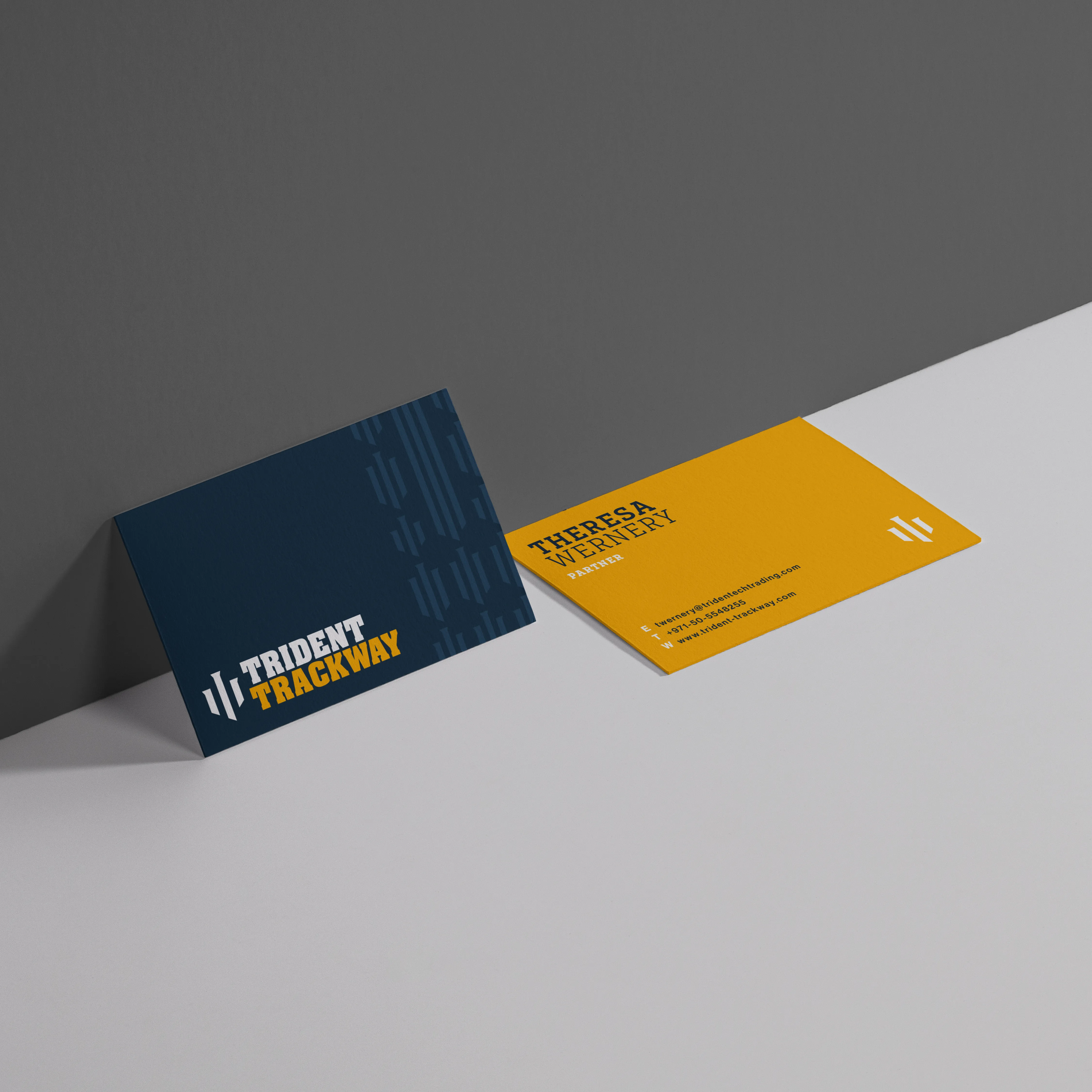
Business cards — navy front with trident pattern, amber back with contact details
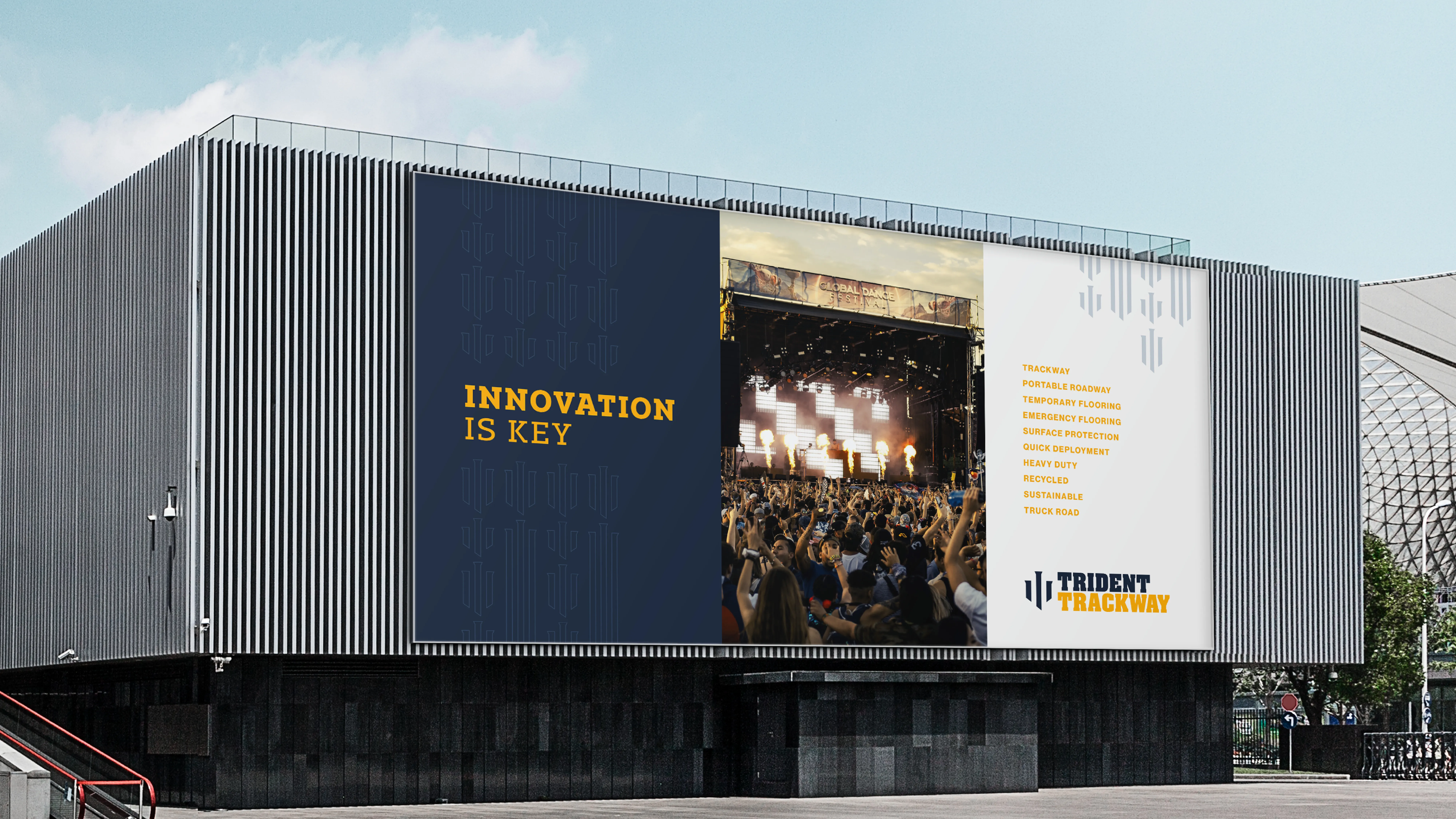
Billboard — the brand at scale
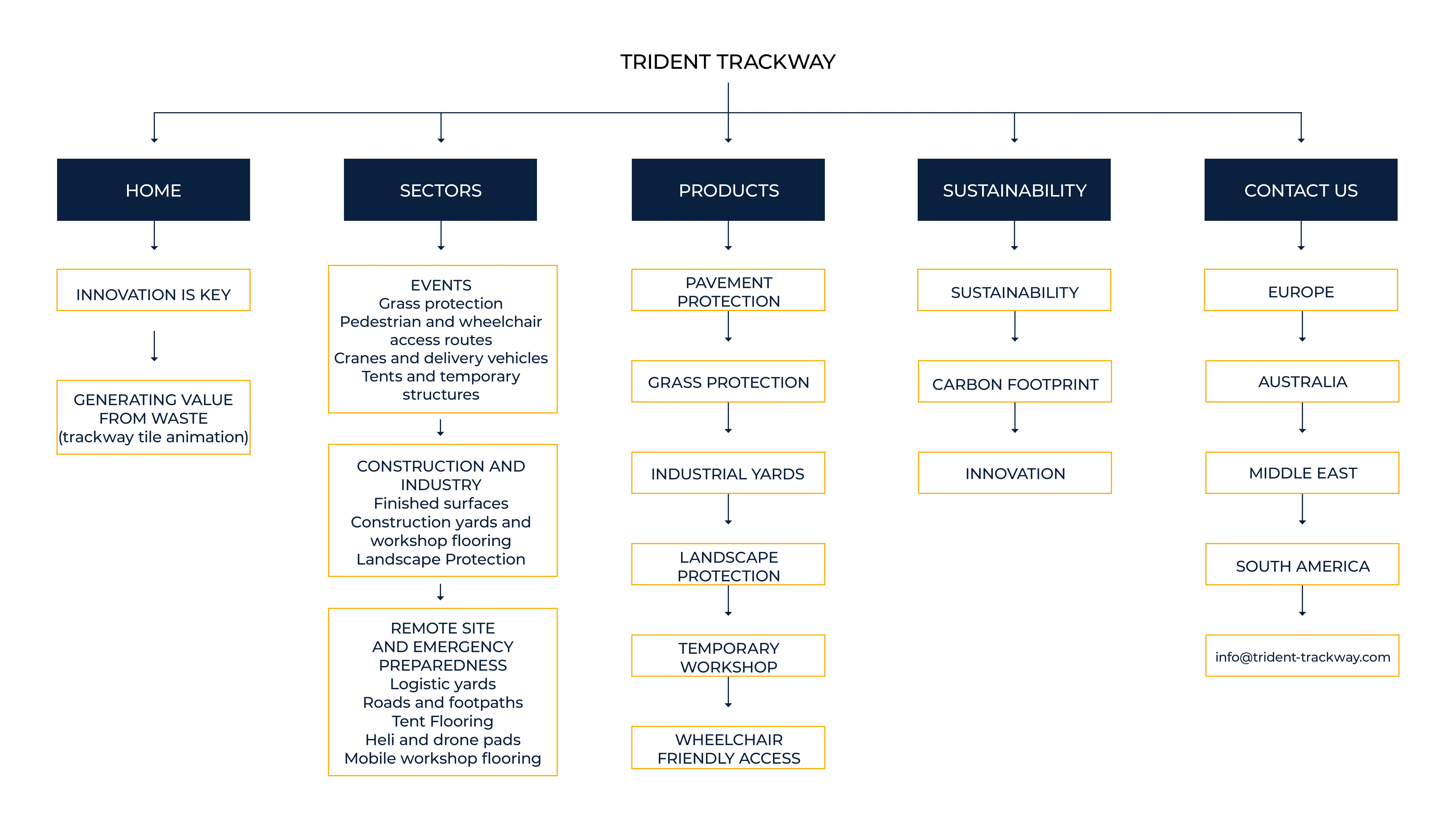
Information architecture — the full site map developed before any screen design began
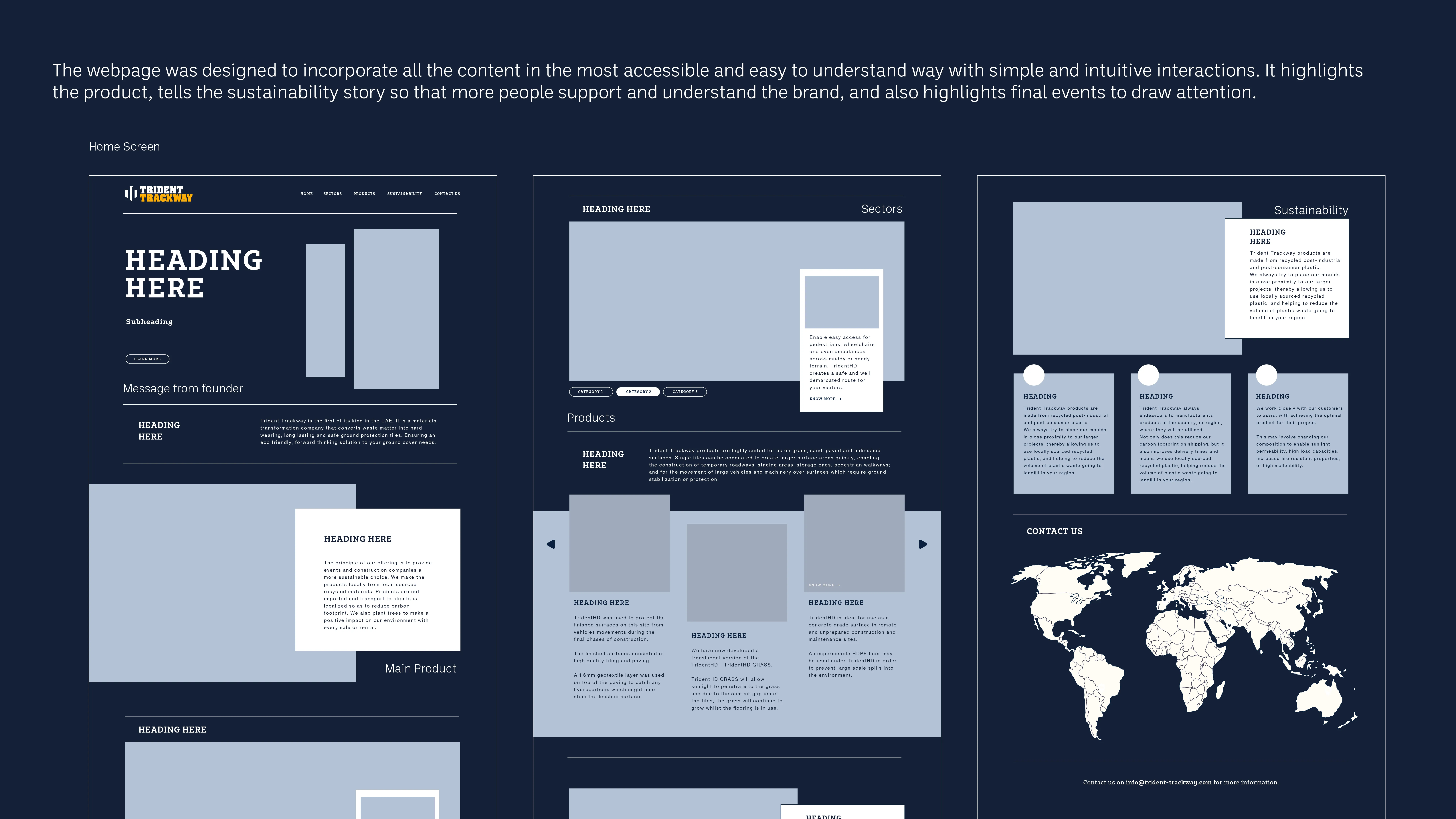
Wireframes — layout and content decisions
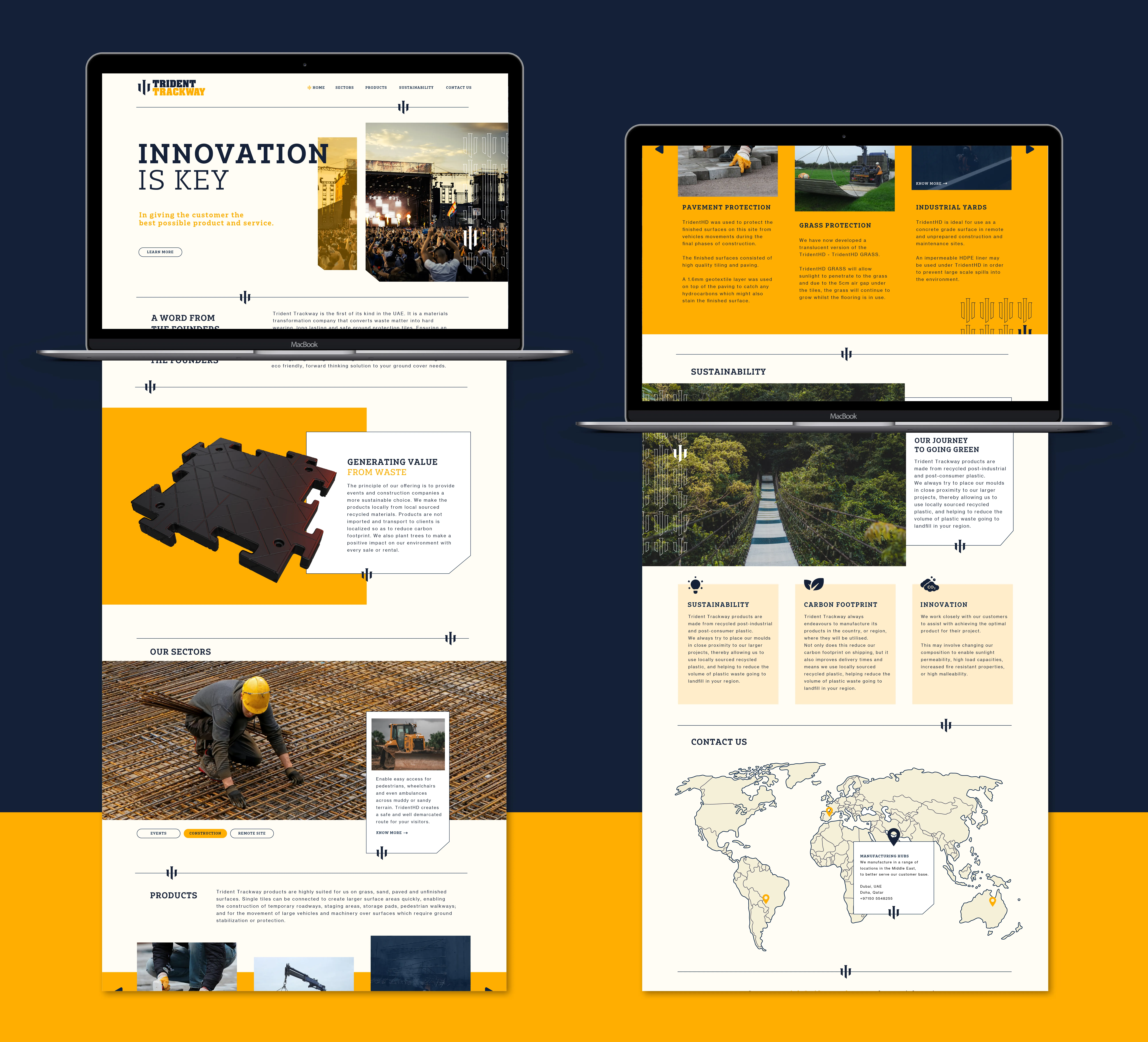
The Trident Trackway website — designed to communicate the product, the technology and the people behind it
The Outcome
The website launched and the brand was adopted across all client collateral. The rebrand gave the business a step-change in how professional it looked in market — the client's response was that it finally reflected the ambition and quality of what they were building. The brand has since evolved, which is the best sign a system is working: it was built to be flexible enough to grow.
A full rebrand — strategy through execution — for a company that was already doing something worth noticing. The work made sure people noticed.