Brand identity for a luxury all-day dining experience — from concept to full rollout.
A complete brand system for The Market, the all-day eatery at Mövenpick Resort, Al Marjan Island, Ras Al Khaimah. Developed from two creative directions through to full execution across signage, menus, uniforms and photography.
- Client
- Mövenpick Resort
- Year
- 2022
- Agency
- JansenHarris
- Role
- Brand Designer
- Category
- Brand
The Challenge
The Market was a new all-day dining restaurant opening inside the Mövenpick Resort on Al Marjan Island, a luxury property in Ras Al Khaimah, UAE. With the resort already established as a luxury destination, the restaurant needed a brand identity that felt worthy of its environment: refined, considered, and distinct enough to hold its own as a destination in its own right. There was no existing brand to build from. Everything needed to be created from scratch: a name treatment, a visual identity, a typographic system, and a rollout across every physical touchpoint a guest would encounter, from the signage at the entrance to the menu in their hands and the uniforms on the staff.
Resort Dining
brand environment
End-to-end
concept to execution
2 directions,
5 touchpoints
creative scope
The Approach
Rather than arriving at a single direction immediately, two distinct creative territories were developed and presented — each with its own rationale, moodboard, brandmark, colour system, typography, signage treatment and uniform concept. This gave the client a genuine choice rooted in creative thinking, not just aesthetic preference.
One brief. Two directions.
Direction 01 — The Farmer's Market
Earthy textures, rustic materials, the visual language of farmer's market signage. Bold stencil typography, a warm rich palette — deep mineral green, spice red, wheat and sunflower — and sketched illustrations as a graphic device. Vintage with a modern touch.
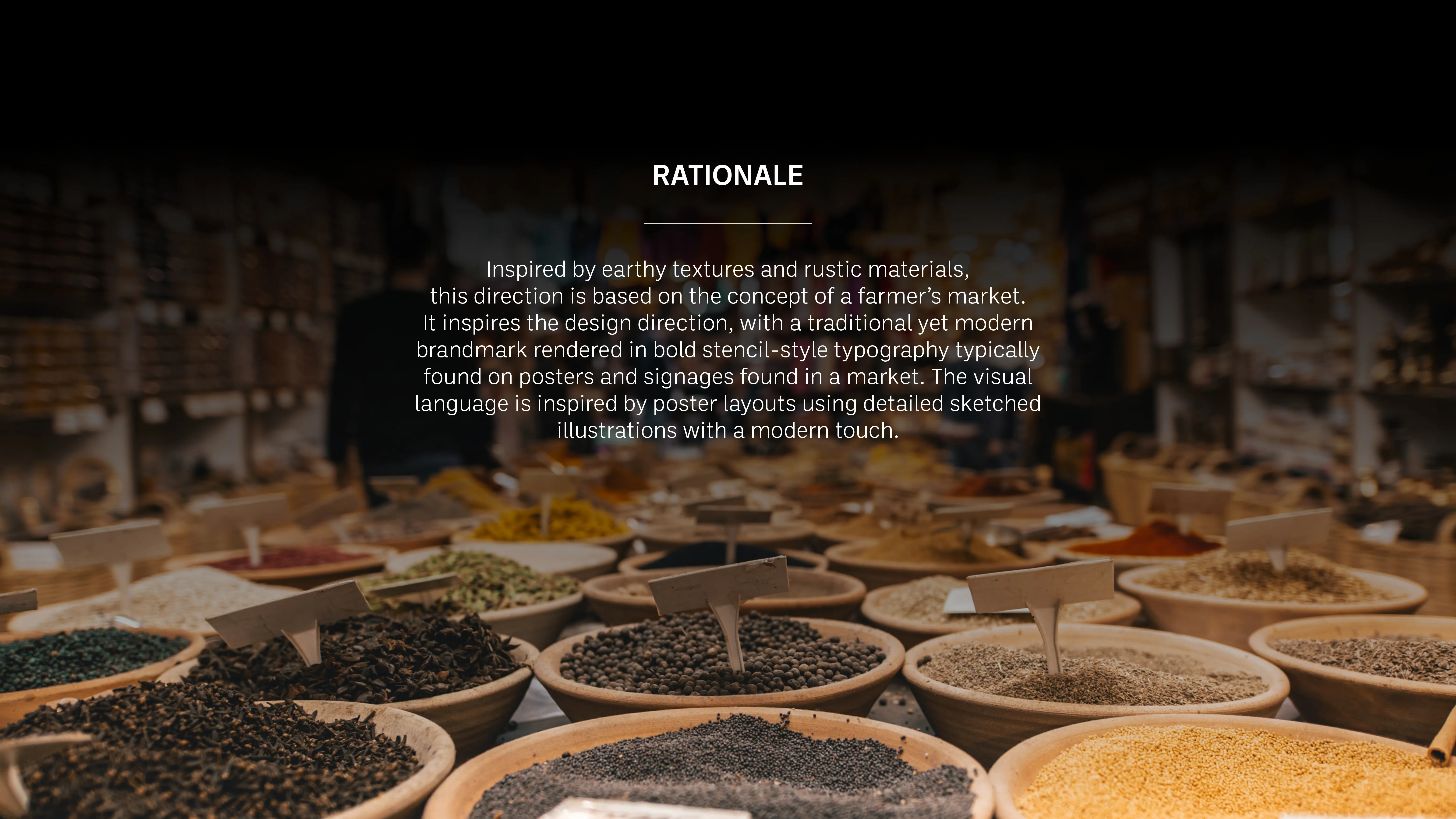
Rationale — earthy textures, rustic materials, farmer's market visual language.
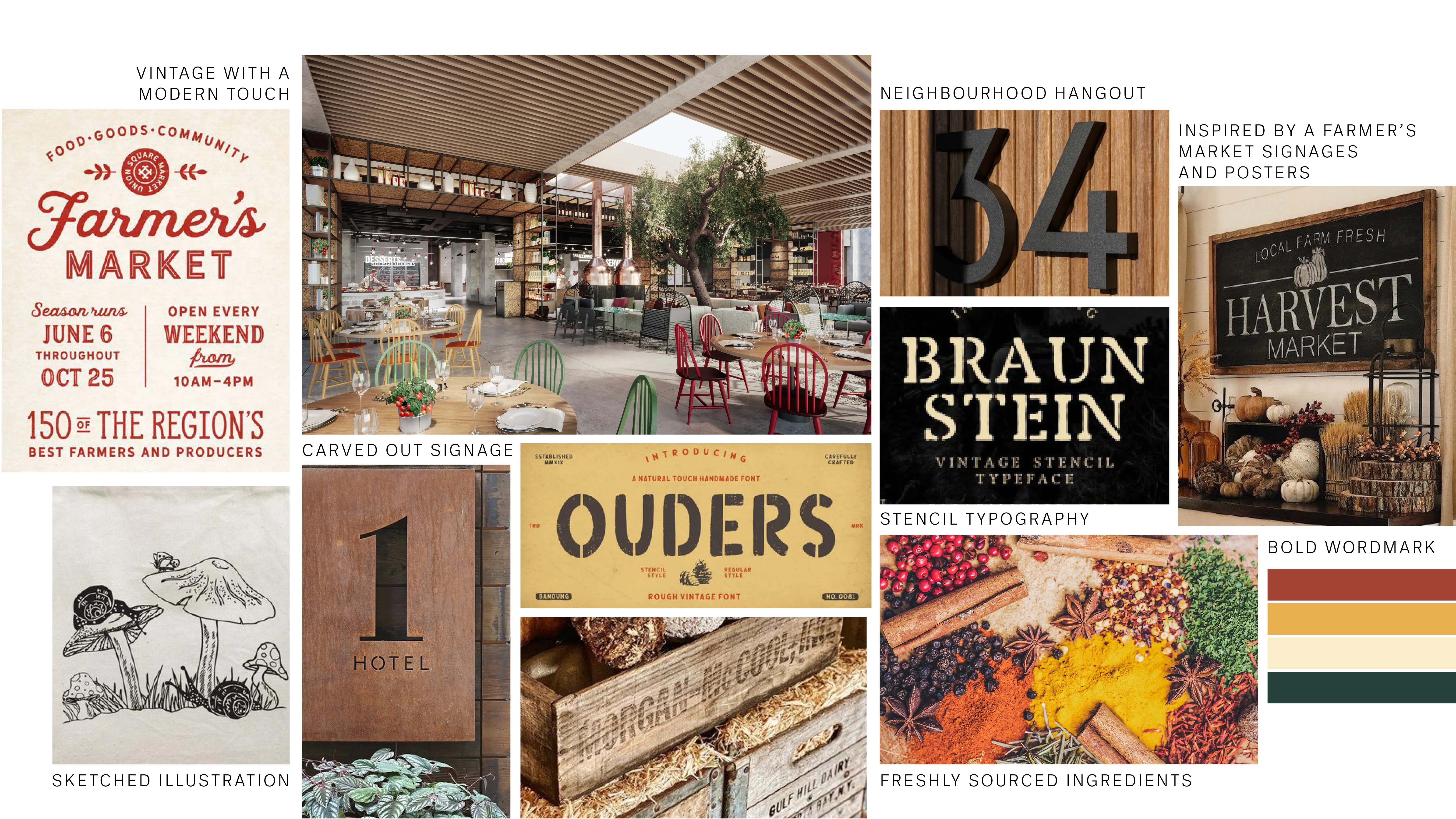
Moodboard — vintage market signage, stencil typography and earthy textures.
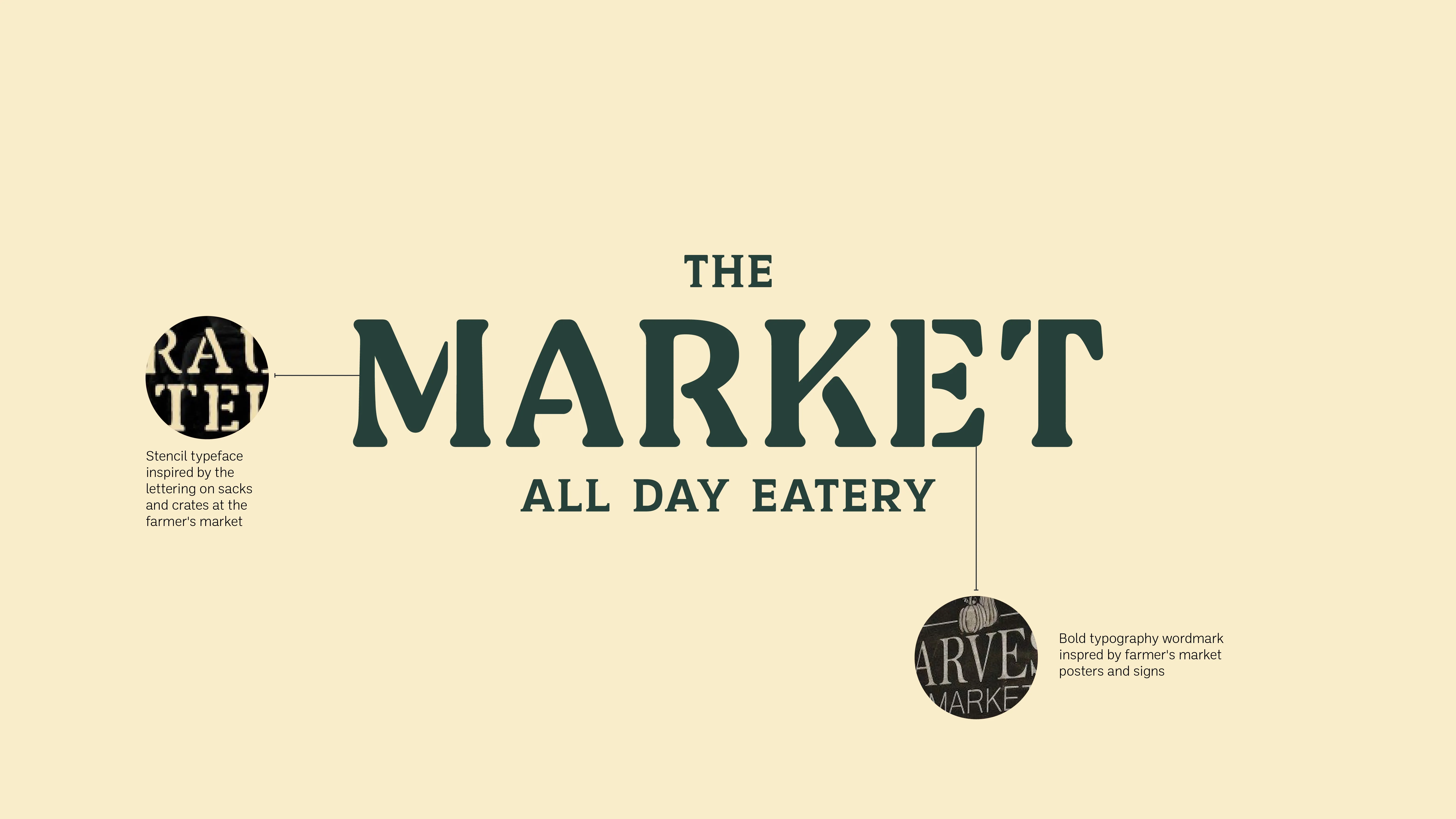
Brandmark — bold stencil typeface inspired by lettering on market sacks and crates.
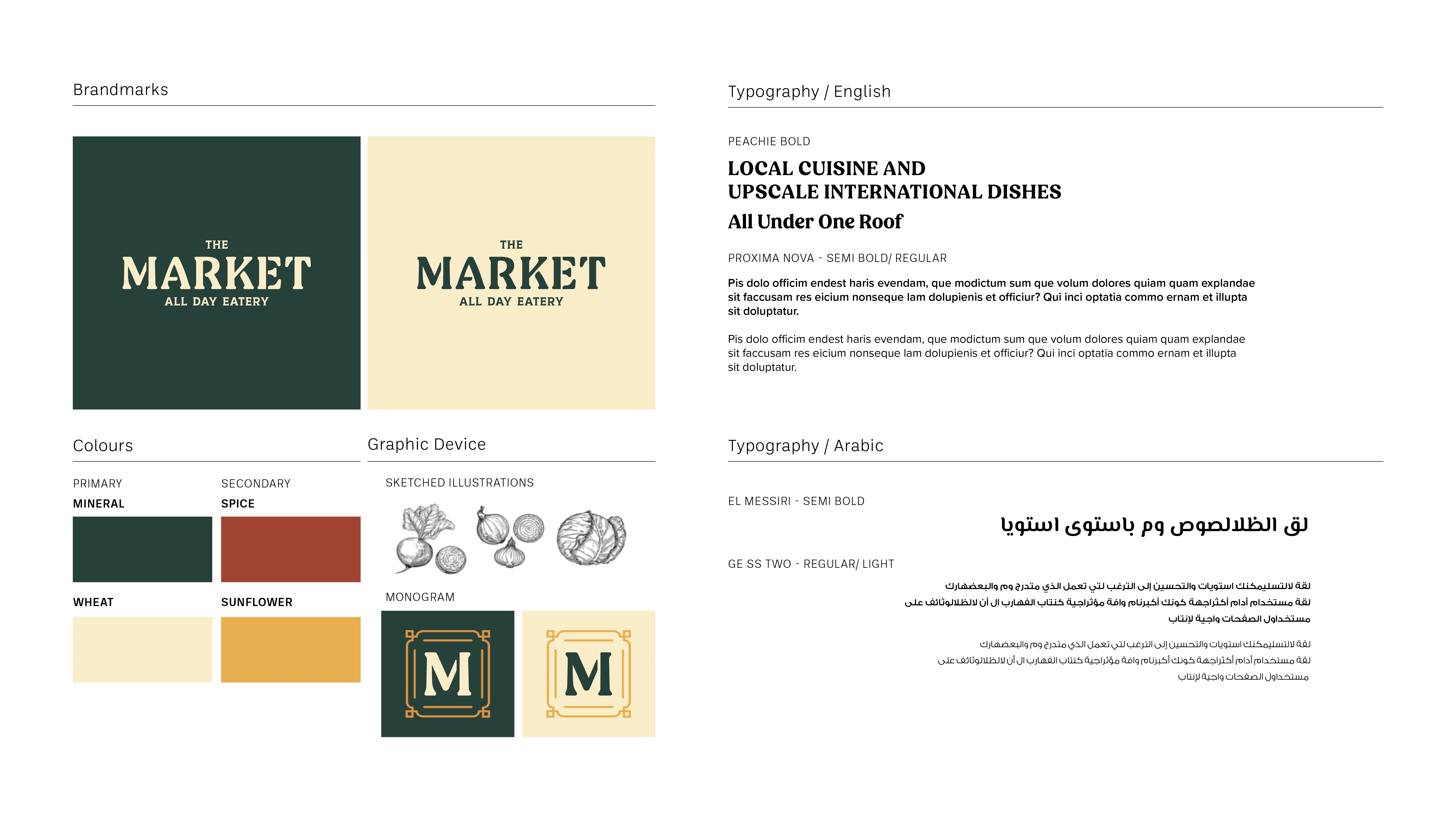
Brand system — mineral green and spice palette with sketched illustrations and the M monogram.
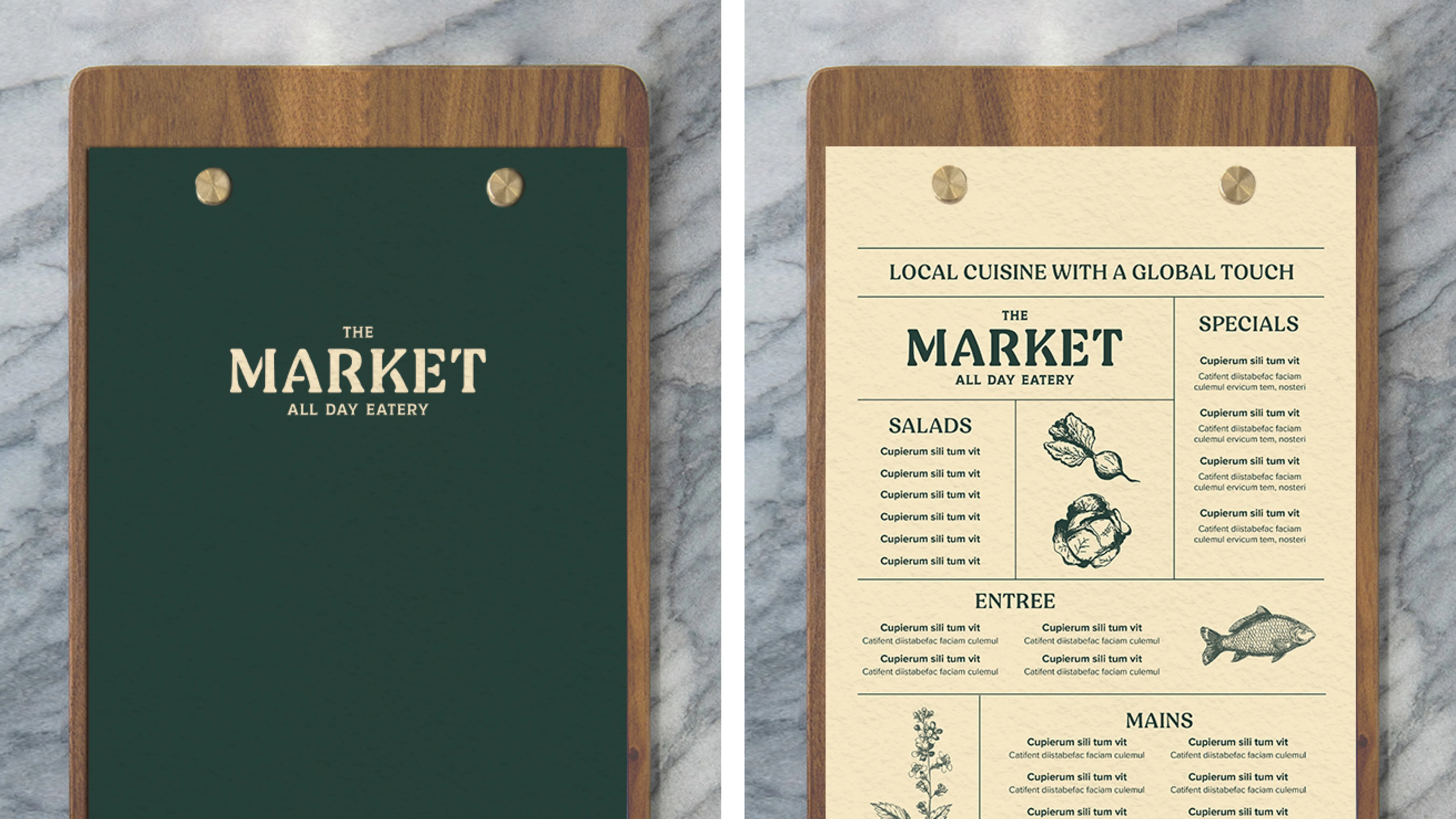
Menu — screw post bound with wooden board, logo debossed on the back, interior with sketched illustrations.
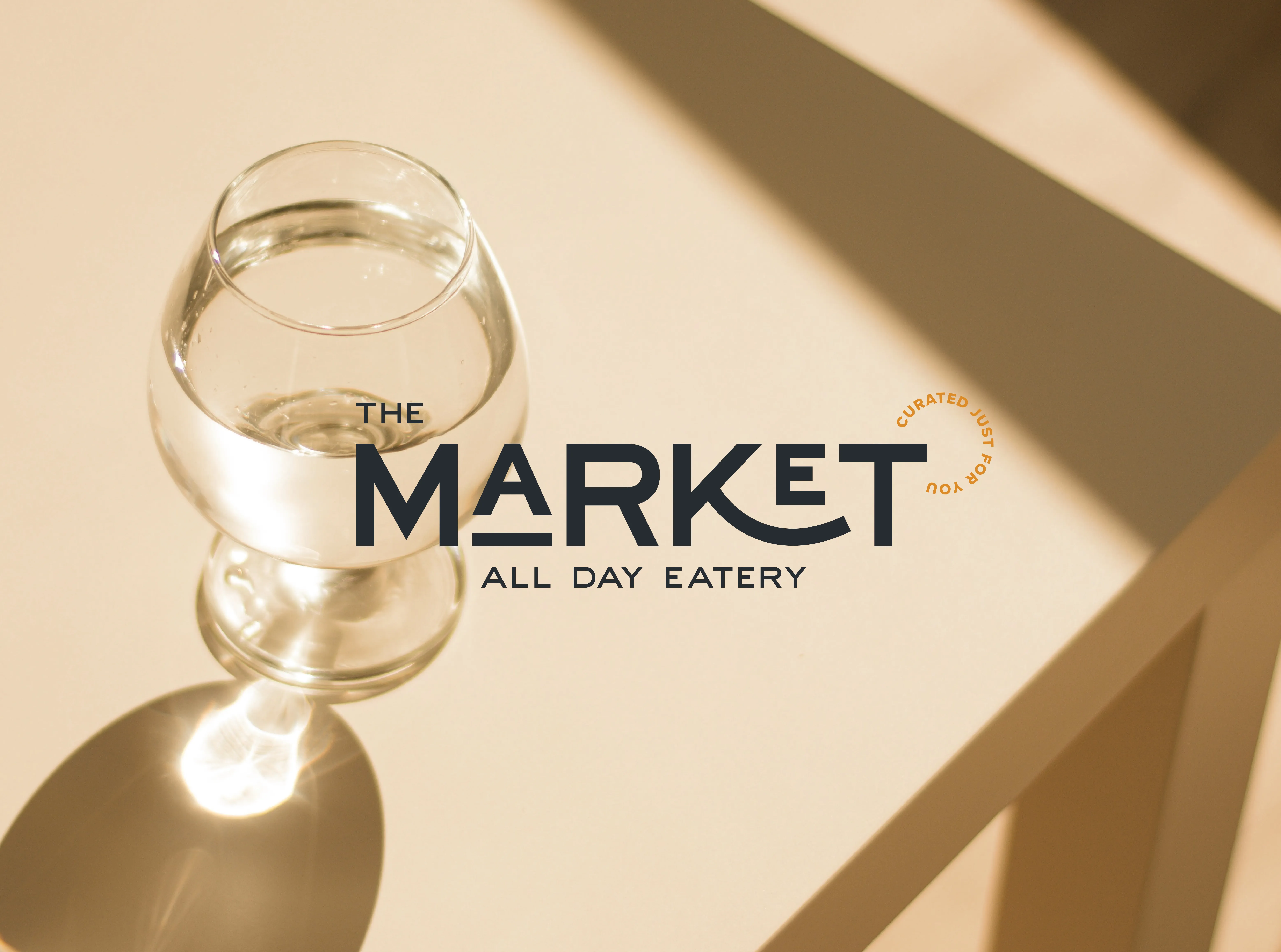
Direction 02 — Modern Minimalism ✦ Chosen
Clean lines, contemporary materiality, quiet luxury. A boundary-less wordmark in stretched typography, a minimal palette of charcoal, cream and caramel, and a typographic seal device to highlight key offerings — personality without compromise.
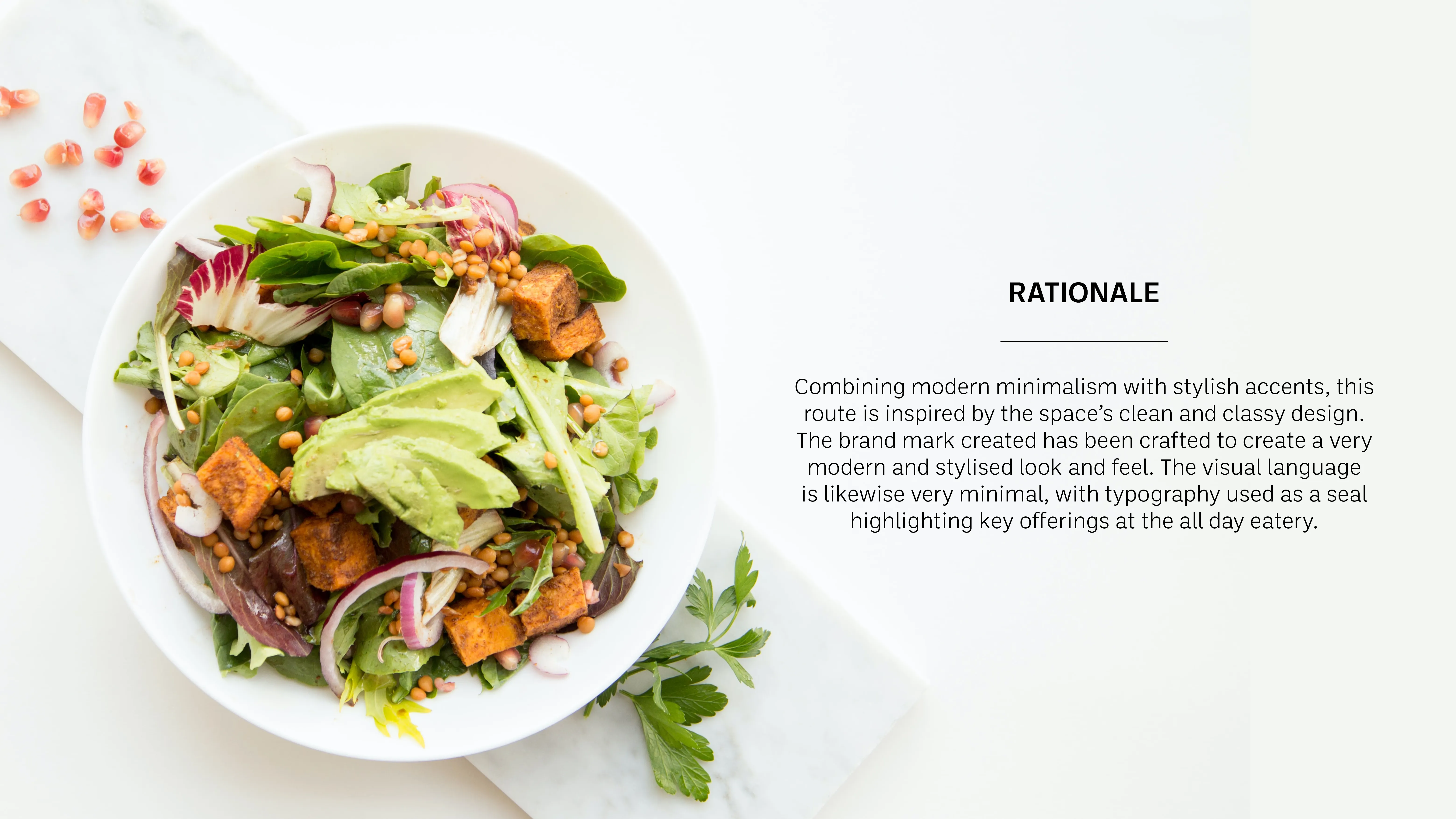
Rationale — contemporary materiality, clean lines and quiet luxury.
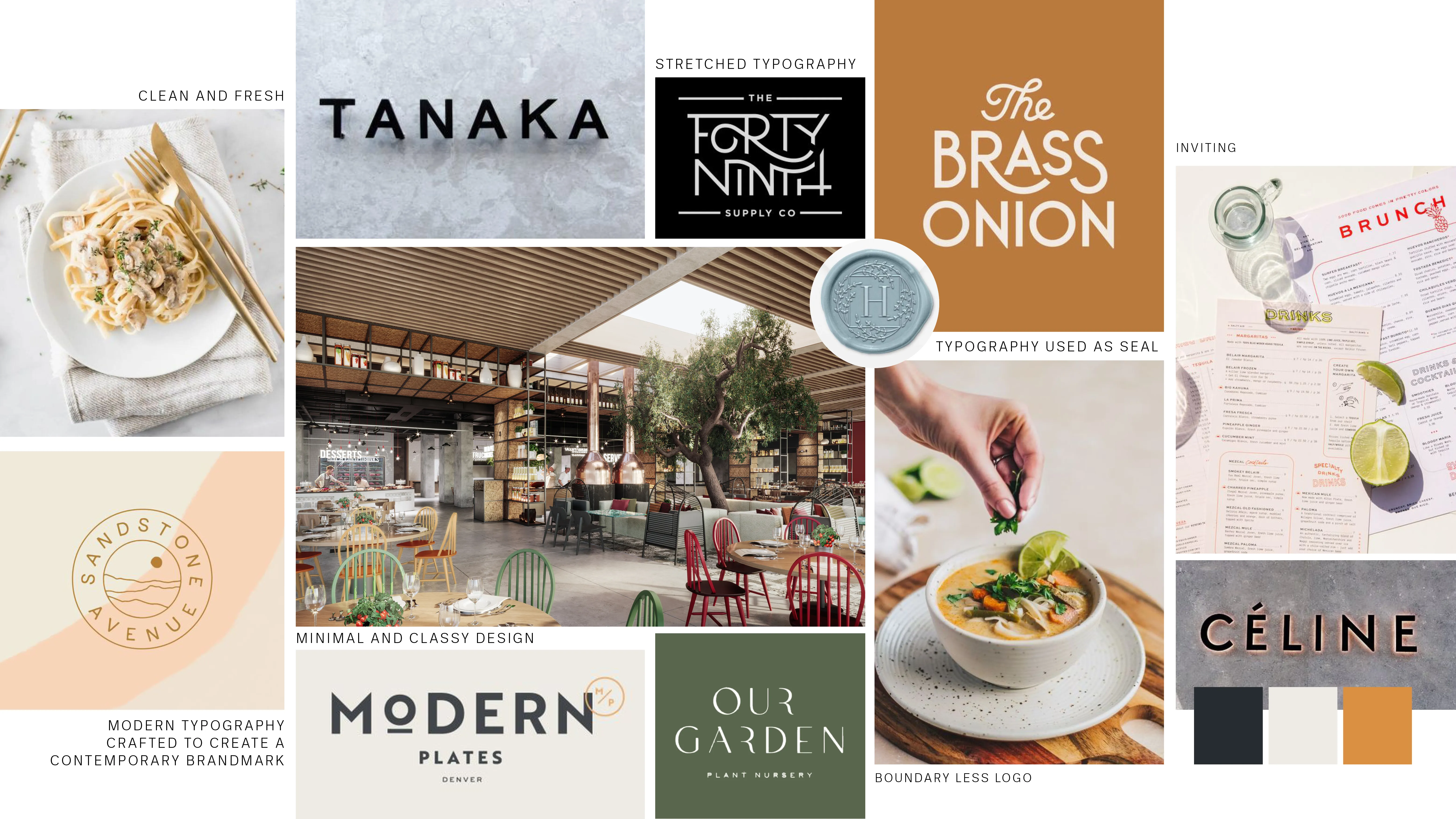
Moodboard — minimal hospitality, refined typography and charcoal tones.
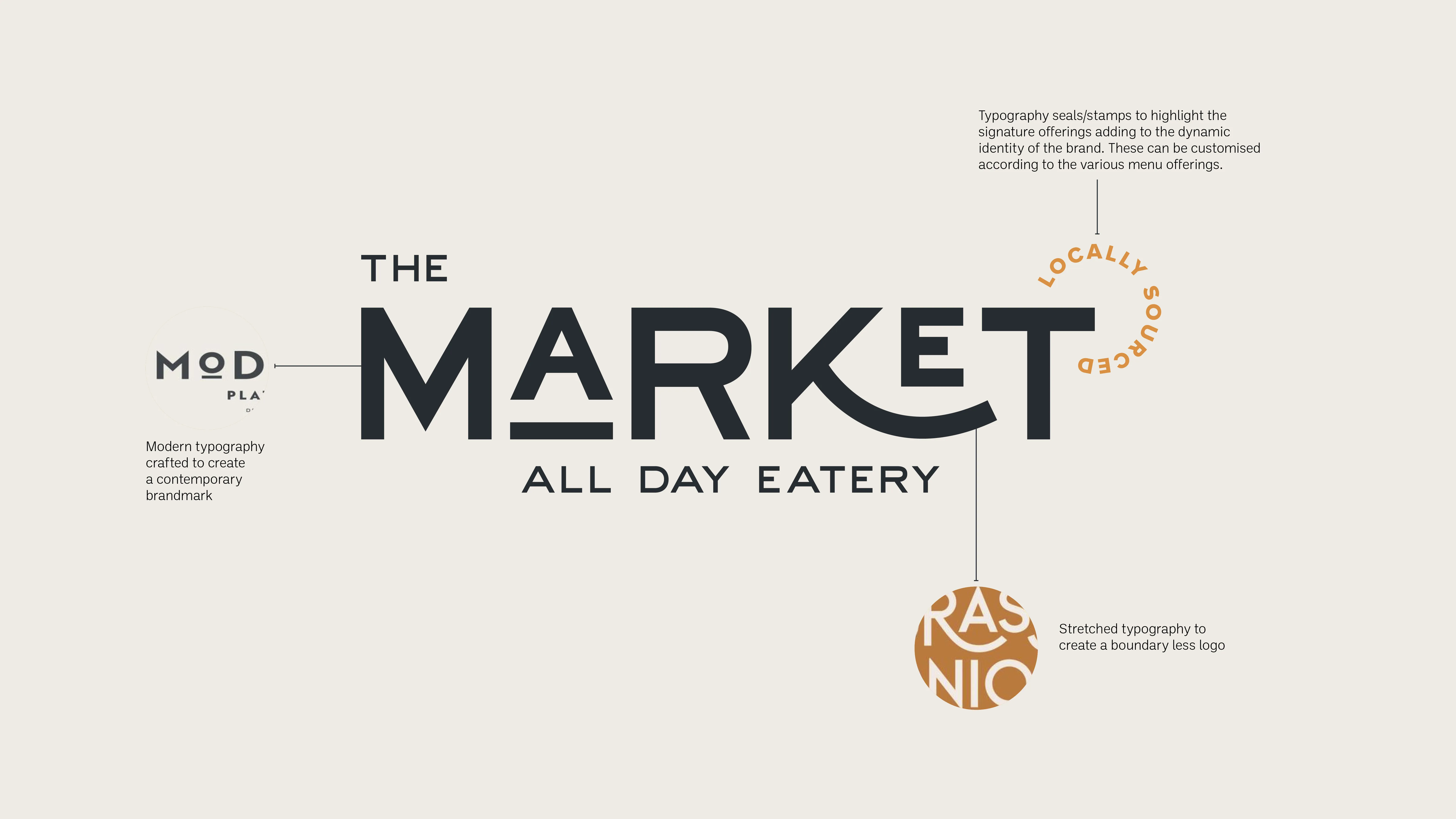
Brandmark — stretched wordmark in modern typography, boundary-less and confident.
Brand system — charcoal, cream and caramel palette with brandmark, typography and typographic seal device.
Menu — linen cloth textured cover with screen-printed logo and specials insert pouch.
Every element of Direction 02 was taken from the restaurant itself — its clean lines, its contemporary materiality, its sense of quiet luxury. The brand didn't need to shout. It needed to belong.
The Solution
The chosen direction was rolled out across every touchpoint a guest would encounter — from the moment they saw the sign on the wall to the menu in their hands and the uniform on the staff who greeted them.
01
Brand Identity System
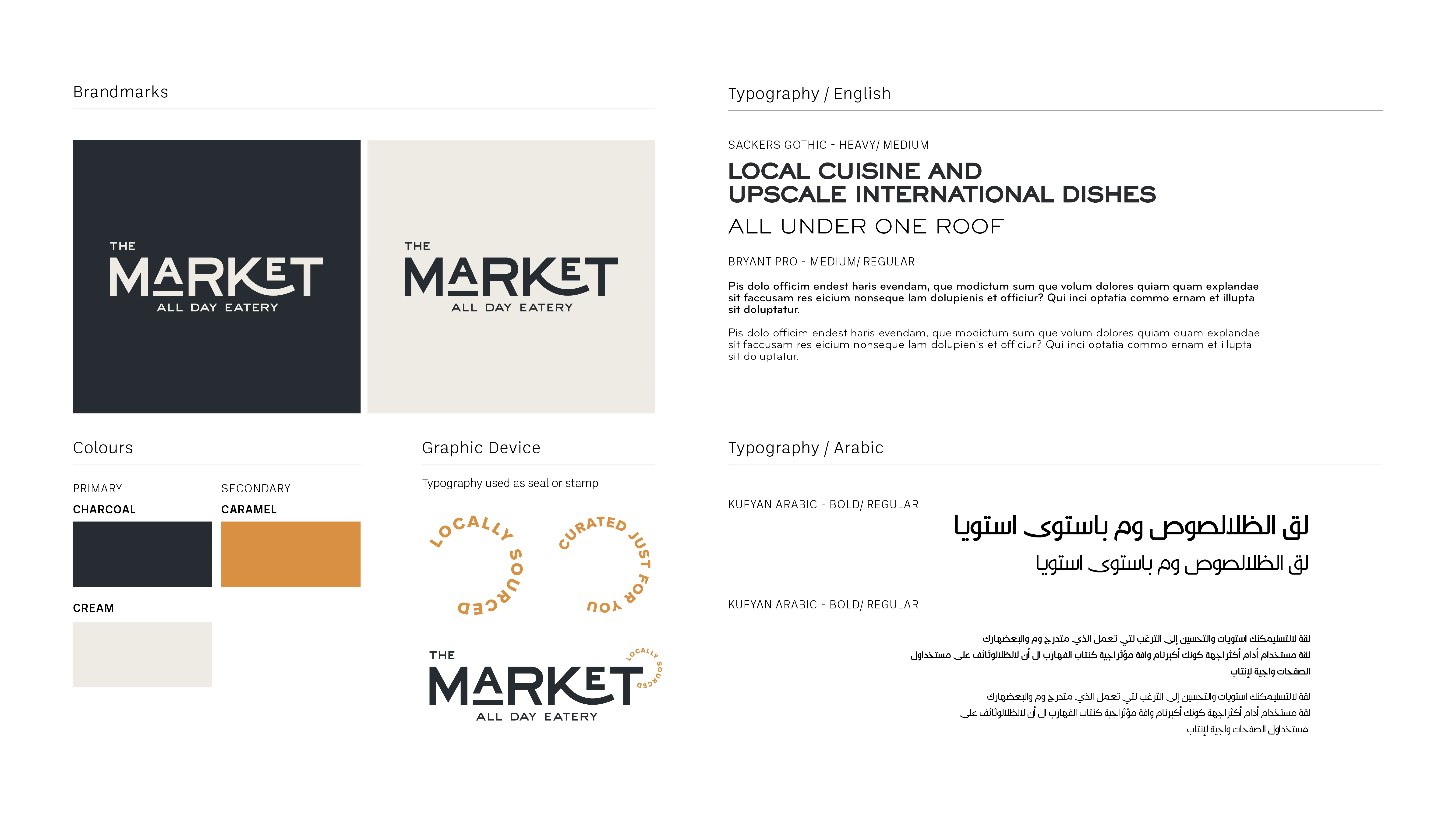
Wordmark, colour palette (Charcoal, Cream, Caramel), typography in English and Arabic, seal device and usage guidelines.
02
Signage
Backlit laser-cut metal lettering mounted on the wall — designed to work in both daylight and at night, when the backlit glow transforms the entrance entirely.
03
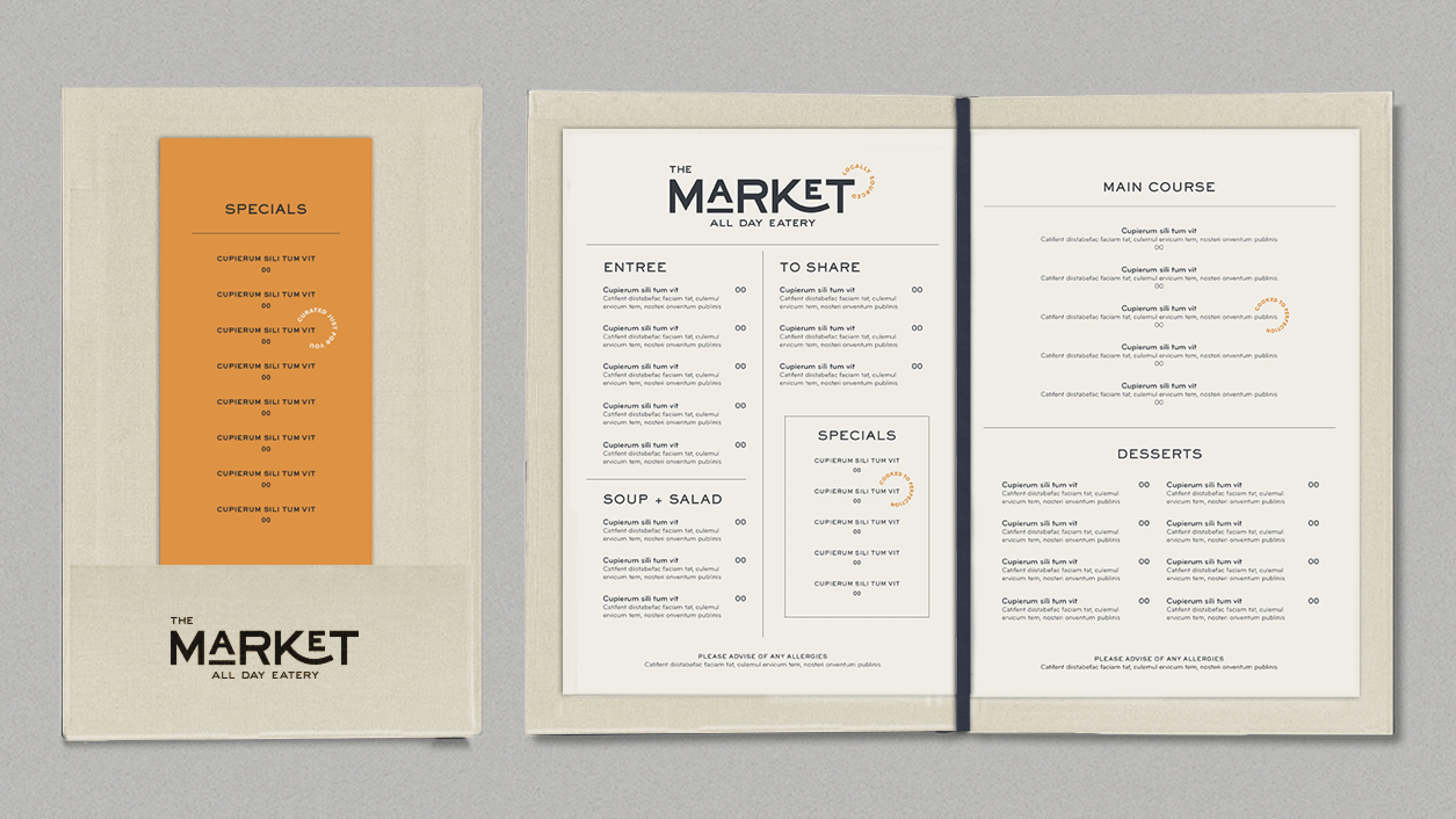
Menu Design
A linen cloth-textured menu with the logo screen-printed on the cover. An elastic binding system allows pages to be swapped as offerings change, with a specials insert slotted into a front pouch.
04
Uniform Design
A full uniform system across three staff tiers — hostess, waiters and waitresses, and managers — each with specific silhouettes, fabrics and brand details including a caramel cloth badge with screen-printed logo.
05
Photography Direction
A defined photography style covering food and beverage, interior shots, human interaction and locally sourced ingredients — specifying lighting, tone, composition and mood to ensure visual consistency across all brand communications.
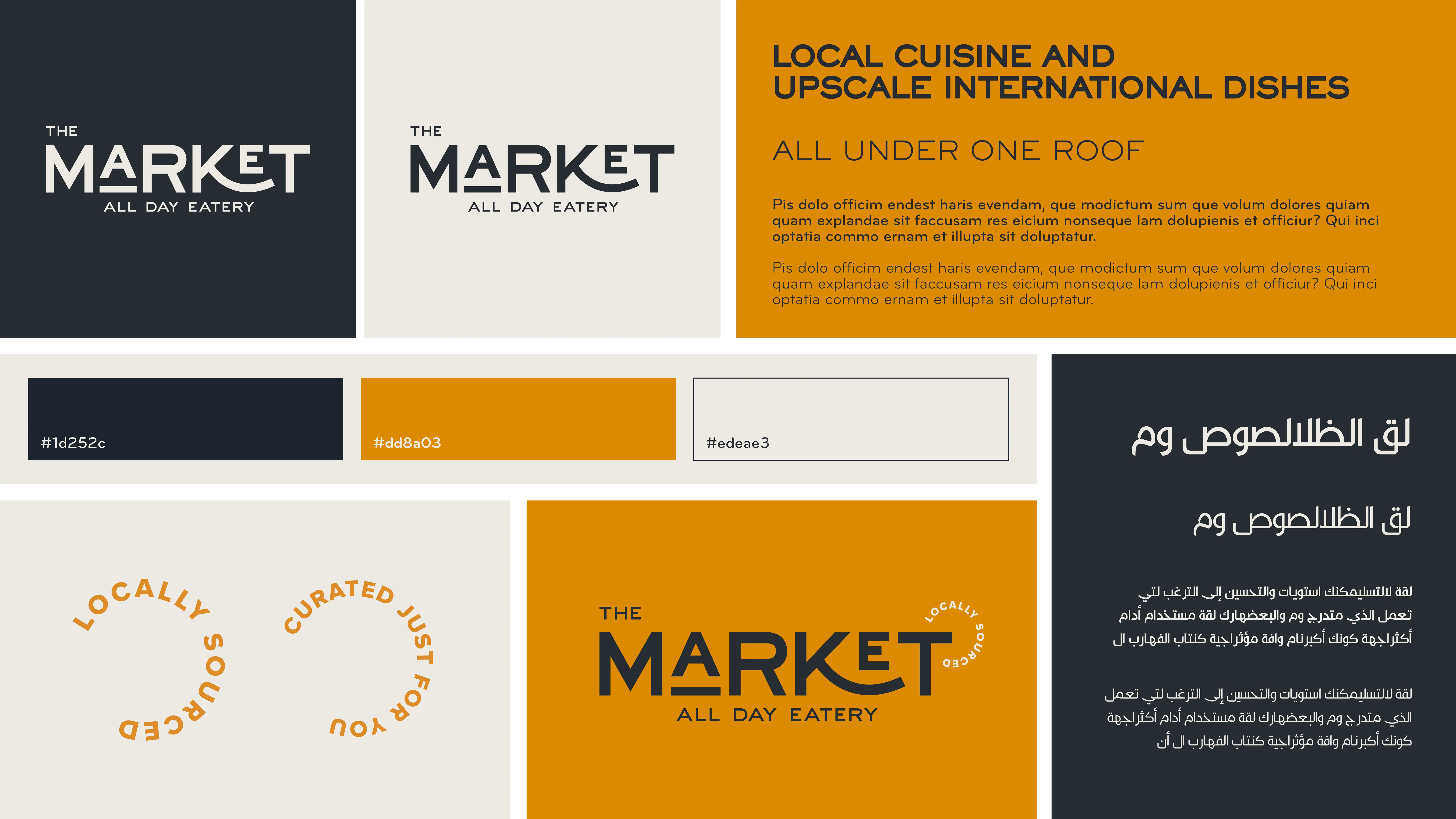
Brand Identity System - Colours, Typography, Graphic Device.
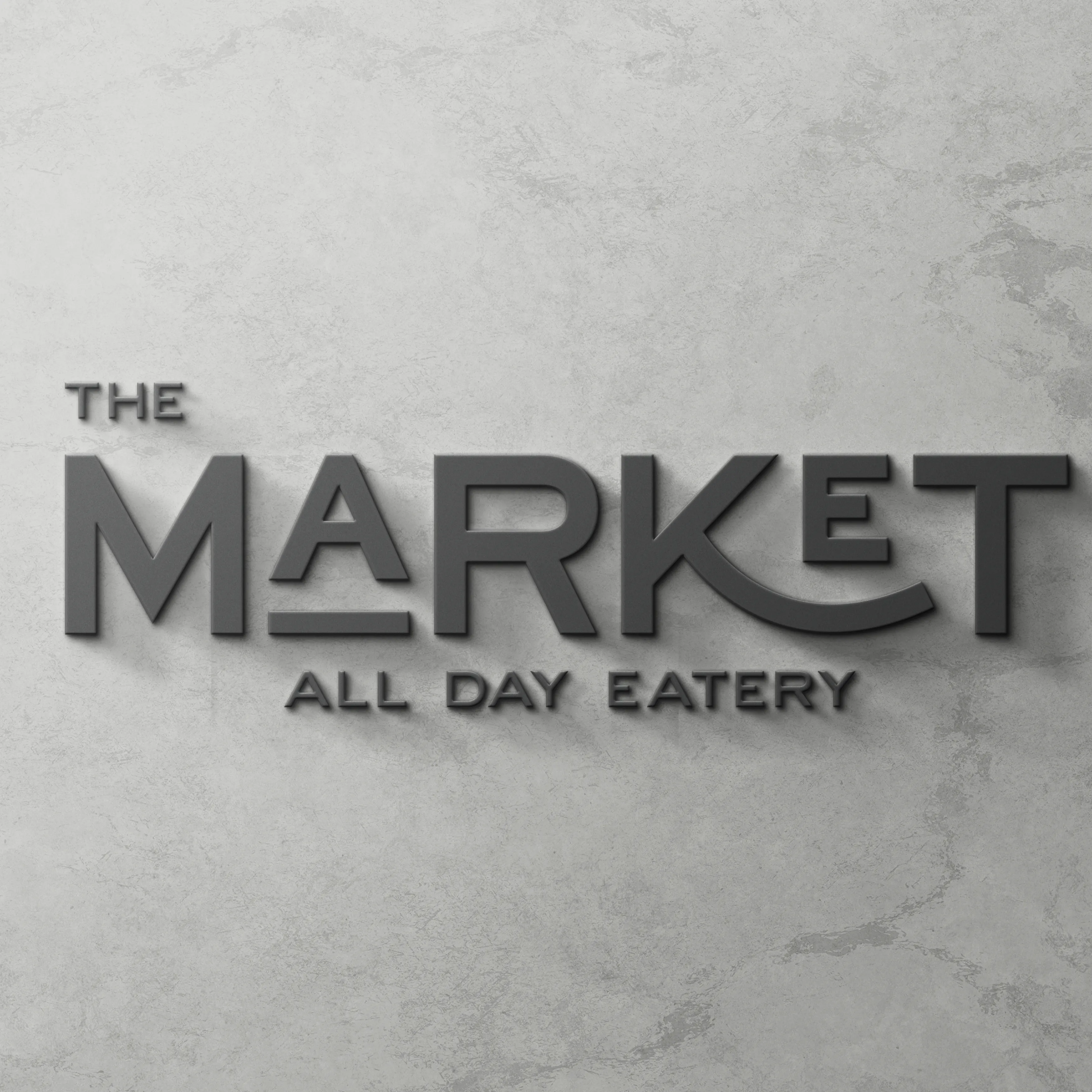
Day View - Laser Cut Metal Signage.
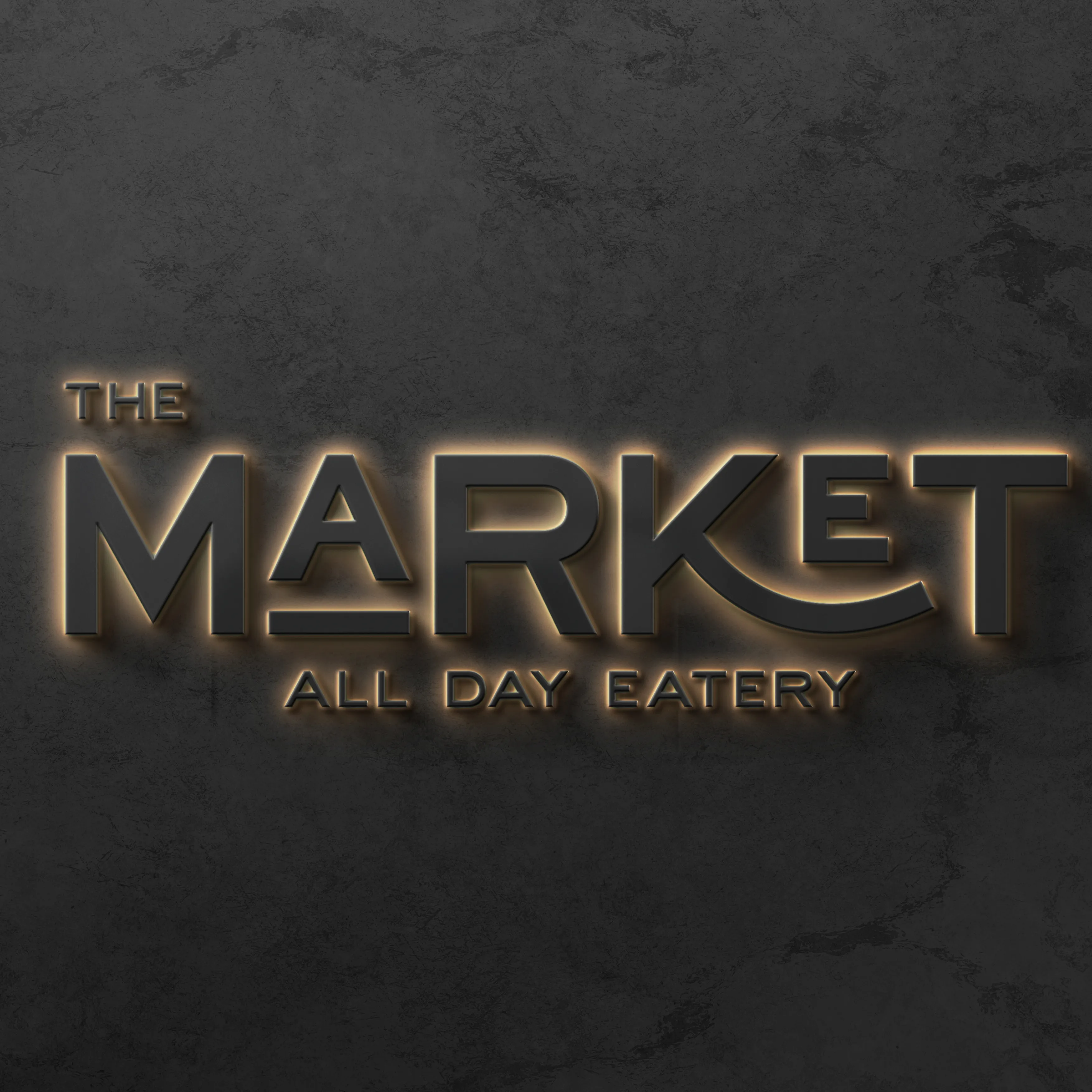
Night View - Backlit Laser Cut Metal Signage.
Menu — linen cloth textured cover with screen-printed logo and specials insert pouch.
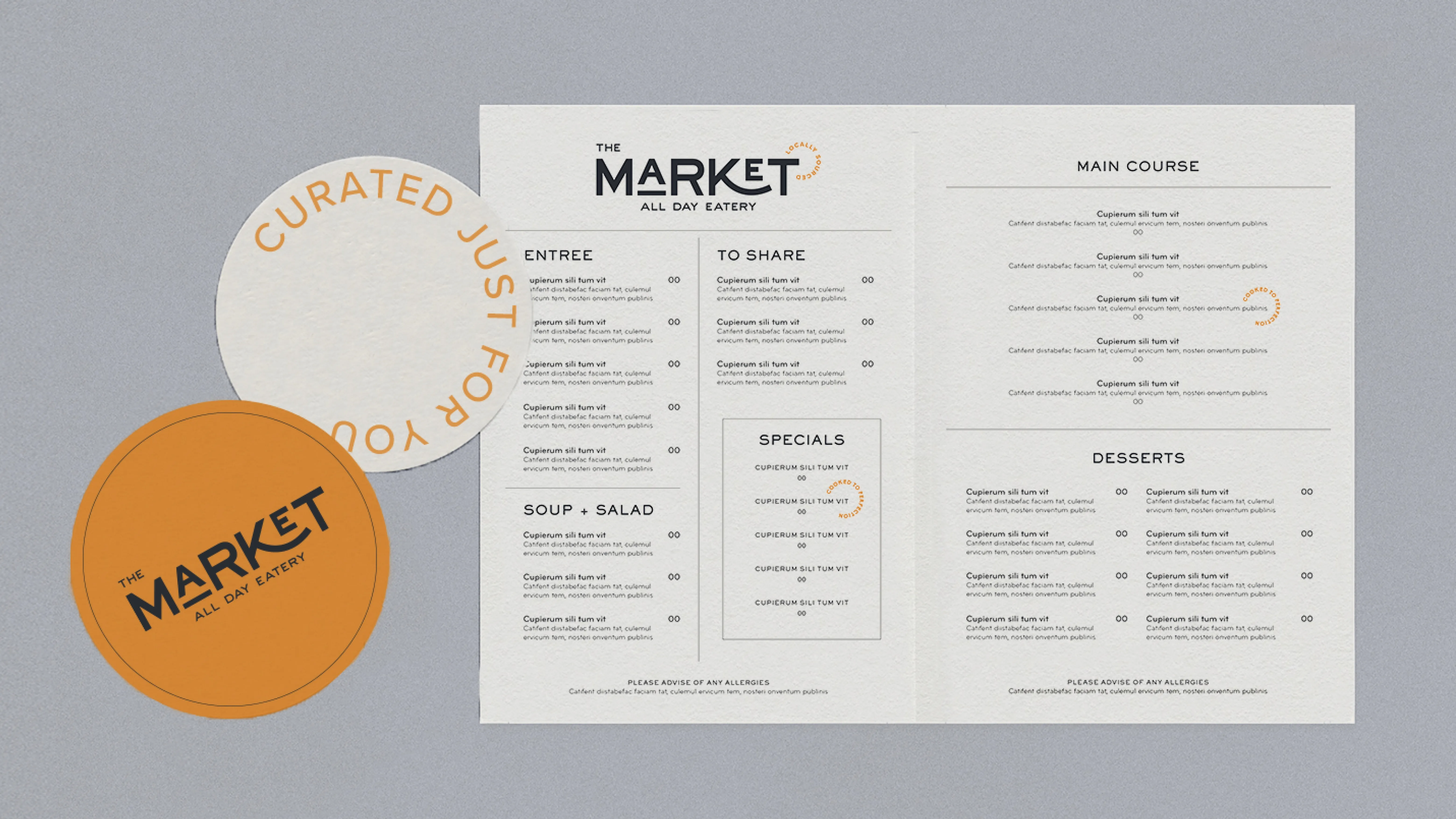
Menu interior — clean typographic layout plus graphic device on coasters.
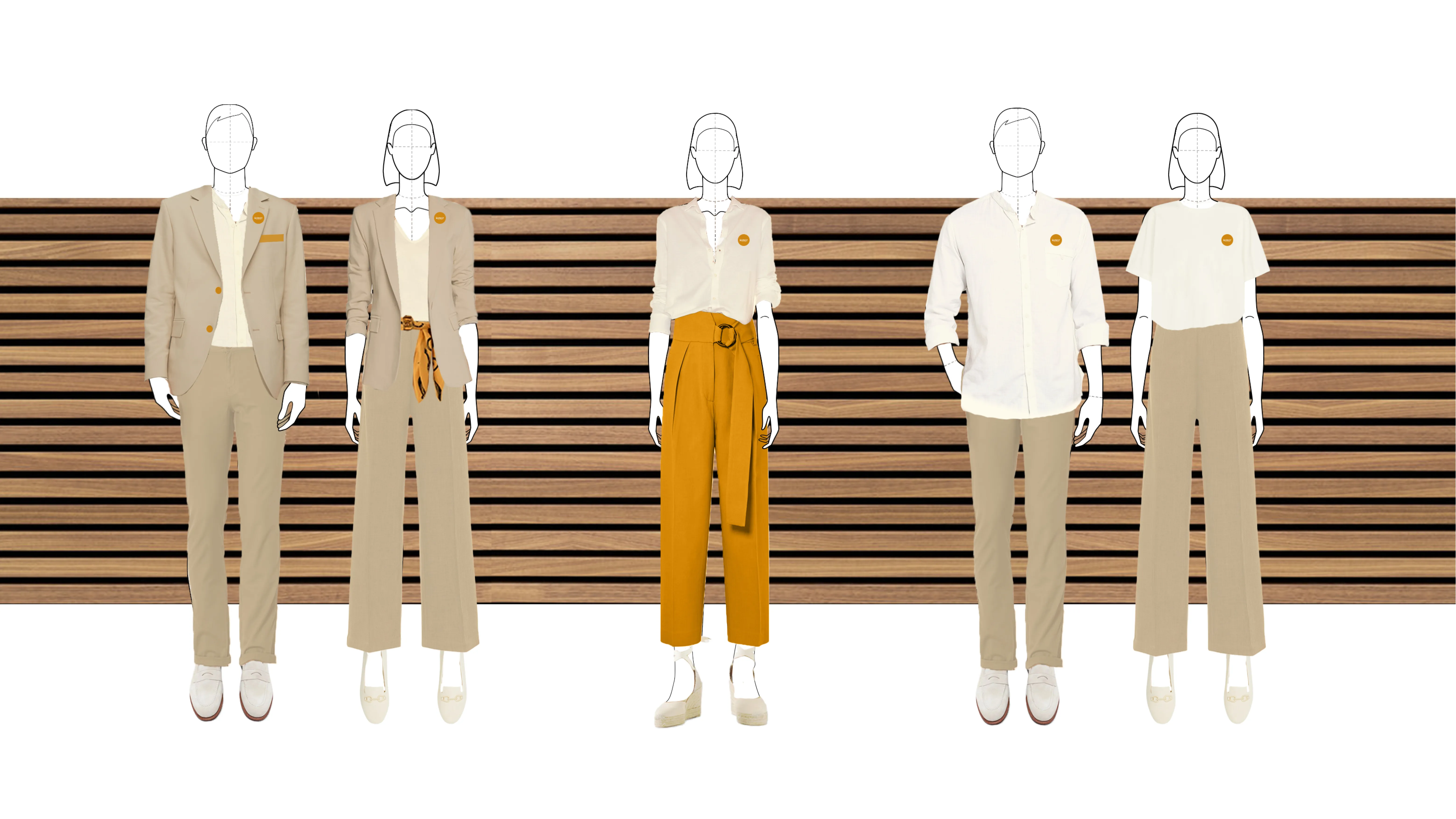
Uniform system — three staff tiers designed to feel casual, smart and consistent with the brand's modern minimalist identity.
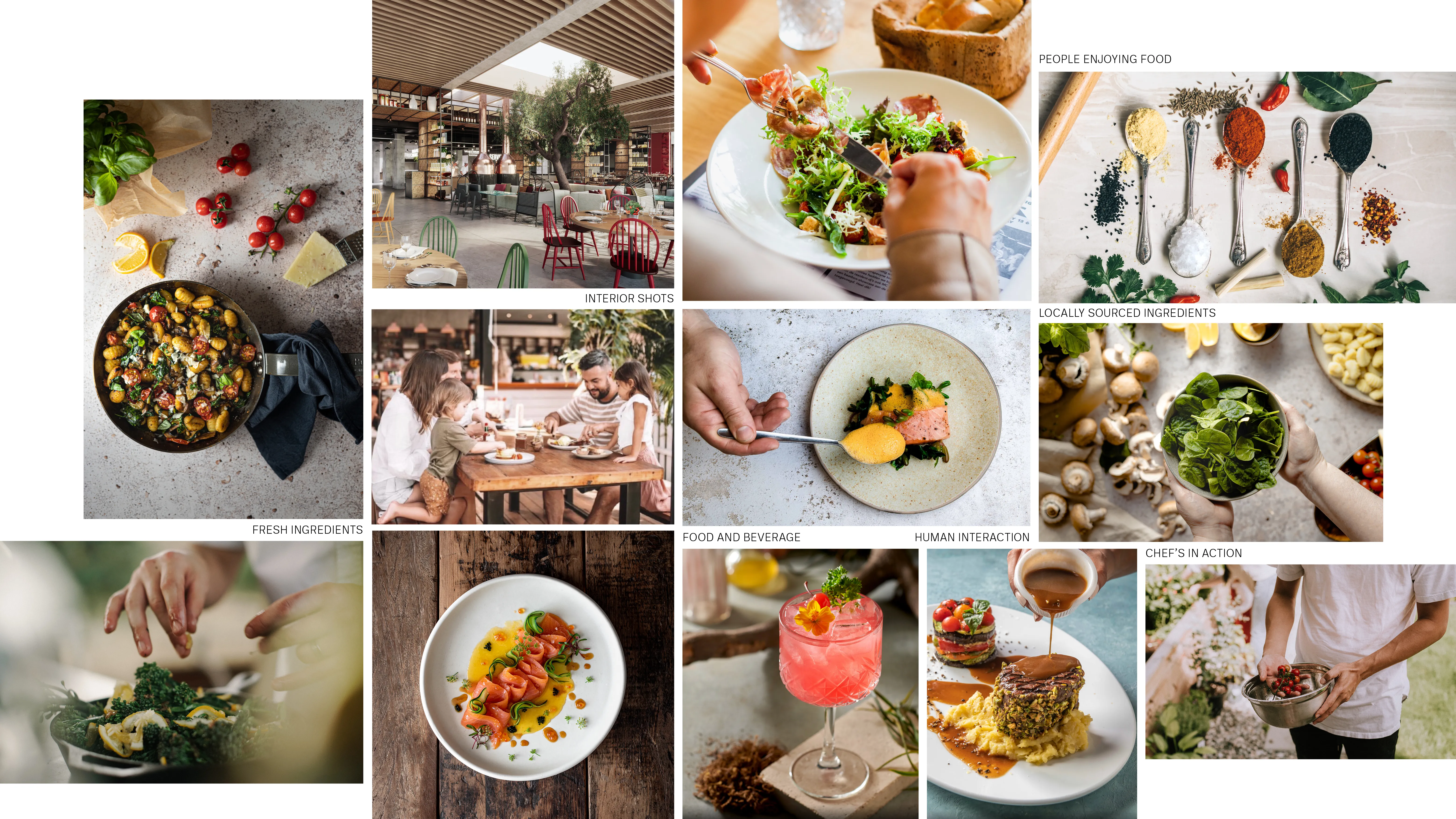
Photography direction — defining the visual language for food, interiors, human interaction and locally sourced ingredients across all brand communications.
A complete, cohesive brand identity for a luxury dining environment,
consistent from the entrance to the table.