Building a brand identity for a revolutionary sustainable technology.
Brand strategy, identity design and launch toolkit for a UAE sustainability startup entering the global stage.
- Client
- Terrax
- Year
- 2022
- Agency
- JansenHarris
- Role
- Brand Designer
- Category
- Brand
Sole designer - brand strategy (in collaboration with strategist & consultant), visual identity, brand guidelines, pitch deck design, business card design, landing page design. Mentored by Creative Director. Timeline: 3 months to trade show launch.
The Challenge
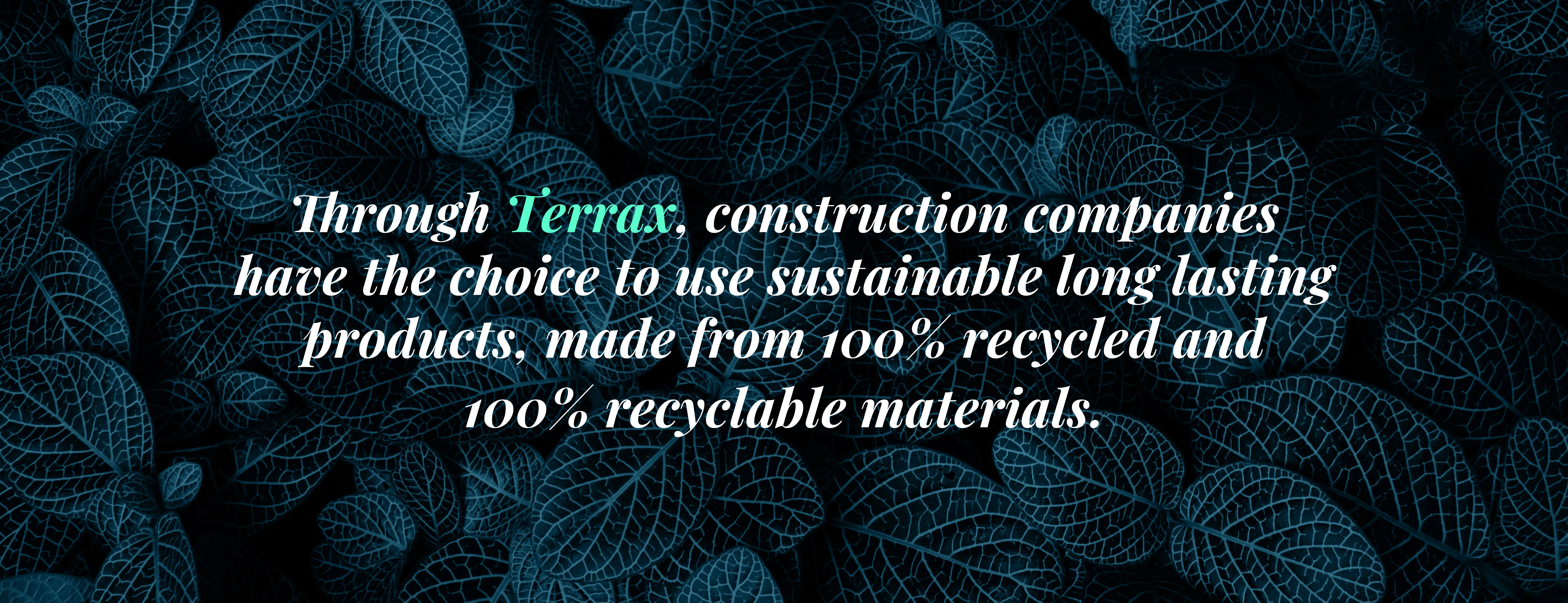
Terrax had spent years developing a patented technology that transforms waste into durable construction materials, becoming only the 4th facility of its kind globally, and the first outside the Americas. The technology was ready. The ambition was clear. But the brand didn't exist yet.
With a trade show deadline fast approaching, Terrax needed to walk into a room full of investors and construction industry leaders and be instantly recognisable, with a name, an identity, and a story that matched the scale of what they'd built.
4th
facility of its kind globally
1st
outside the Americas
24 tons
of mixed waste processed per day
The Approach
Working alongside a brand strategist and consultant, the first step was understanding the landscape Terrax was entering. A competitive analysis across similar sustainability and materials companies revealed a clear pattern, almost every brand in this space defaulted to the same visual language - greens, earth tones, organic shapes. Safe. Expected. Forgettable.
The analysis also surfaced four distinct positioning territories in the market. Terrax's real edge wasn't just that they were sustainable; it was that they had engineered something entirely new. From this, the audience, positioning and brand voice were defined before a single visual was explored.
Who we were designing for
Construction, events, logistics & aviation
Sustainable material solutions for fast-paced operations
Startups
Support bringing sustainable innovation to market
Investors
A credible, future-facing brand worth backing
How Terrax needed to show up
- Category
- Materials transformation company
- Problem solved
- Converting waste into durable construction products
- Positioning
- Innovation and forward momentum
- Brand voice
- Passionate · Engaging · Simplistic · Expert
The Creative Decision
"Every sustainability brand looks green. Terrax isn't just sustainable; they're futuristic. The identity needed to feel like it belonged in the future, not the forest."
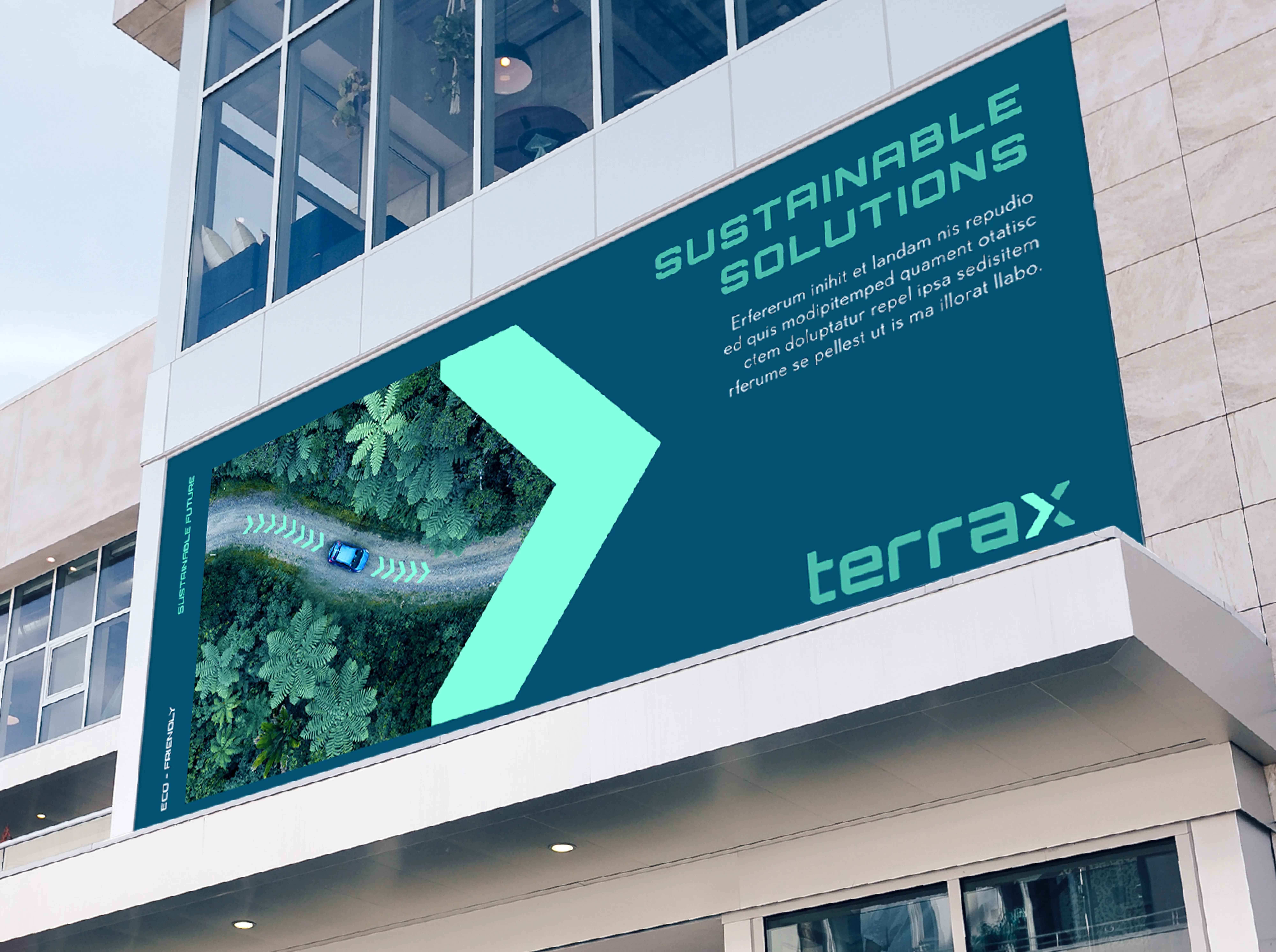
The deliberate choice was made to move away from the conventions of sustainability branding entirely. A deep blue and neon colour palette was chosen to signal technological advancement and forward momentum, positioning Terrax alongside the world's most innovative companies, not just the greenest ones.
The logo incorporated a directional arrow, a simple, purposeful device communicating that Terrax only moves forward. The result was an identity that felt unique in its category, bold enough to stand out at a trade show, and credible enough to sit in front of investors.
The directional arrow in the logo mark communicates forward momentum, a core brand truth built into the identity from the start.
The Solution
The brand launched with a complete toolkit ready for the trade show, everything Terrax needed to show up with confidence and consistency from day one.
01
Brand Identity System
Logo, colour palette, typography, usage guidelines. The full visual language of the brand.
02
Business Cards
The first physical touchpoint for investor and industry networking at the trade show.
03
Pitch Deck
The full Terrax story: who they are, what they've built, why it matters, and where they're going.
04
Landing Page
Digital presence to direct contacts after the show. The brand's first home online.
Brand Logo
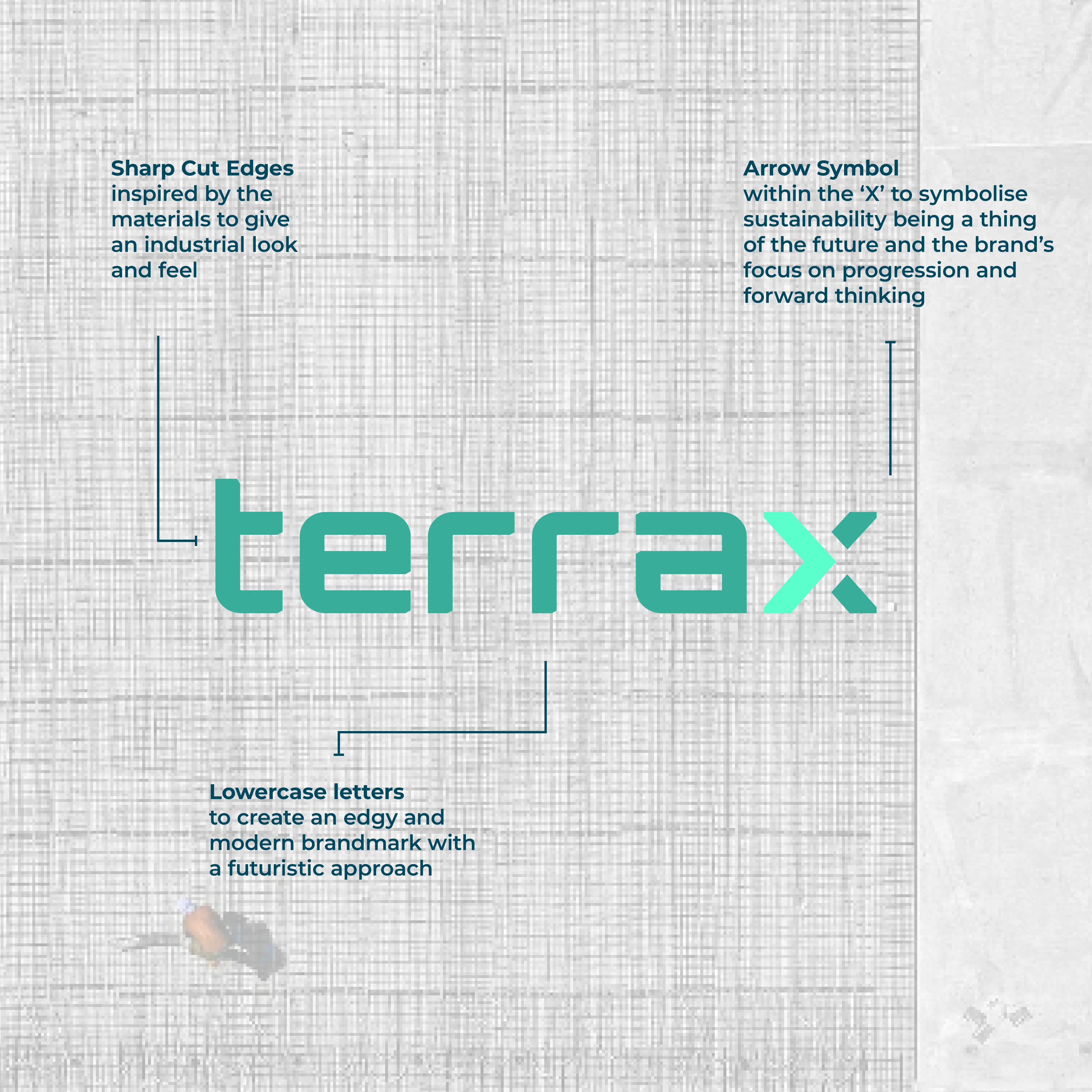
Logo Rationale
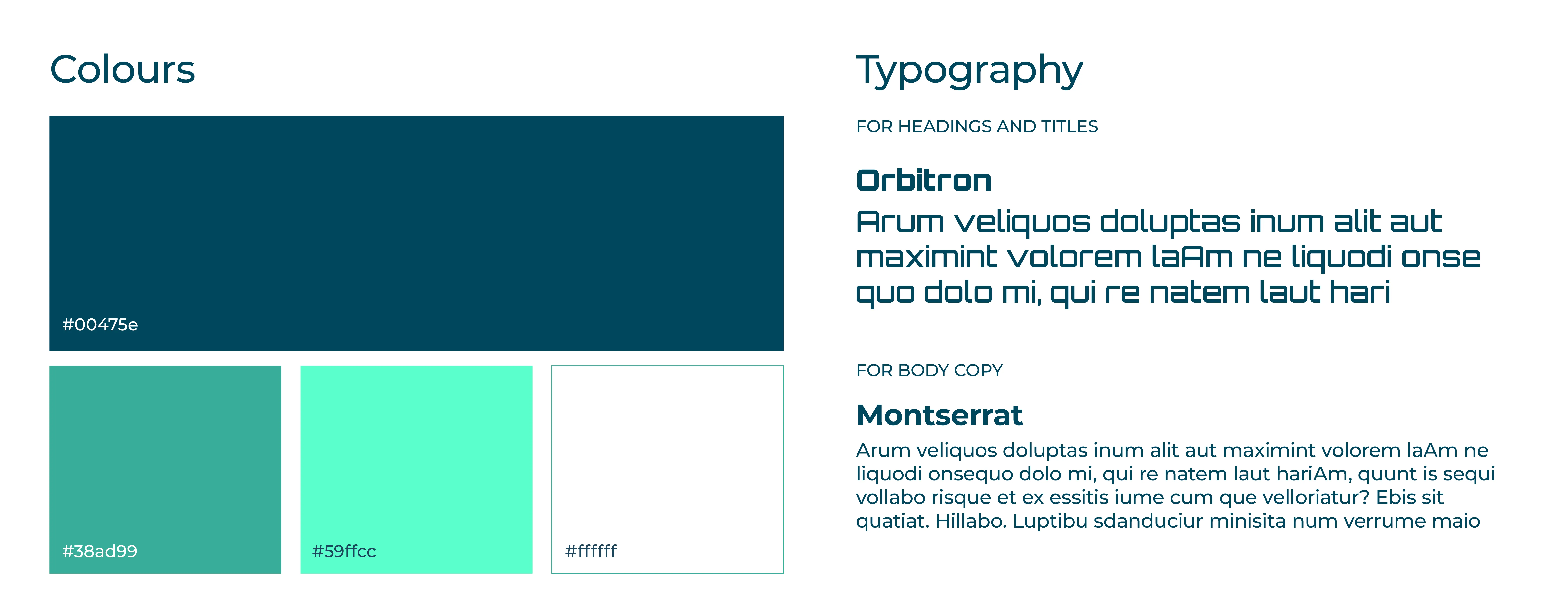
Brand Identity System - Colours and Typography
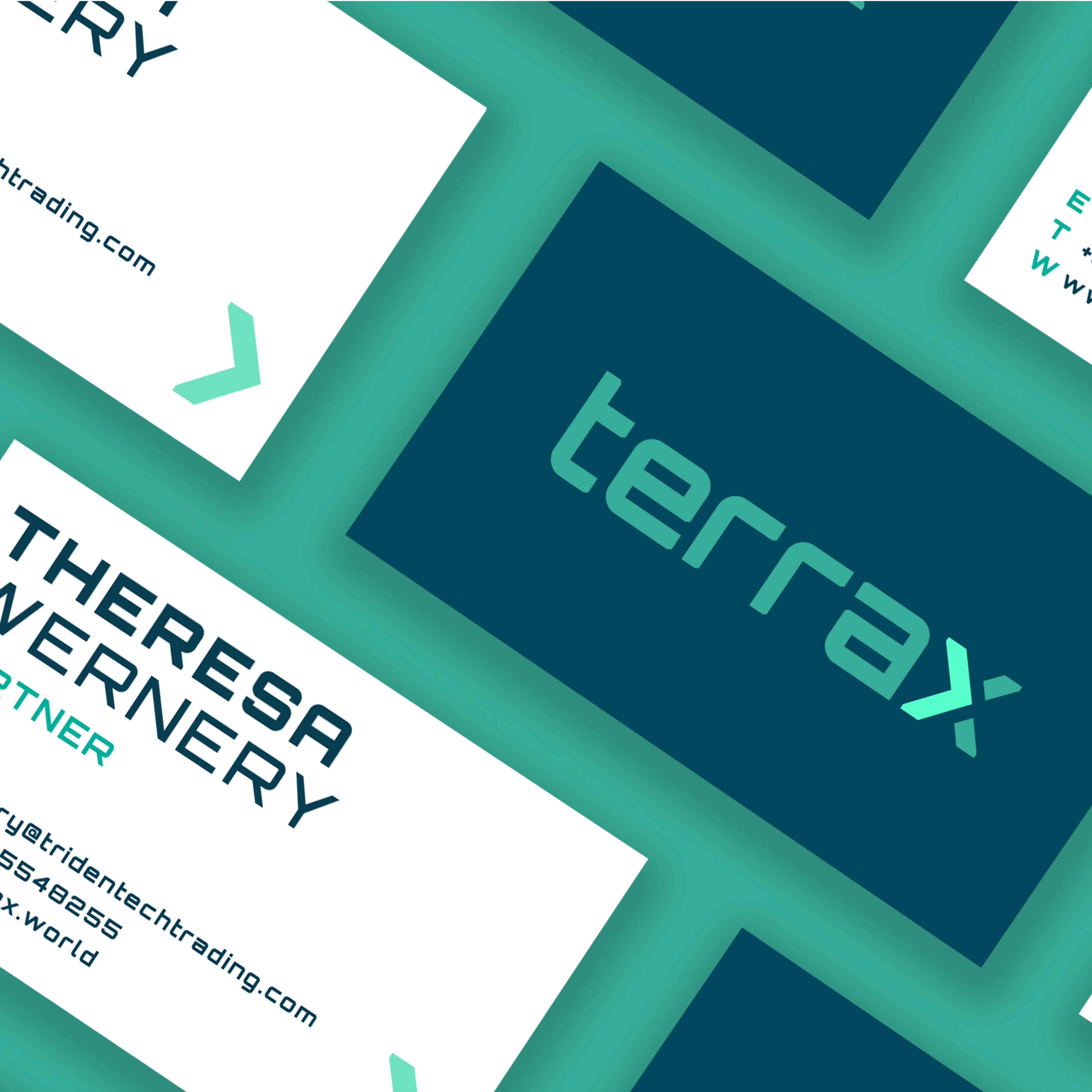
Business cards - the first physical brand touchpoint, designed for investor and industry networking at the trade show
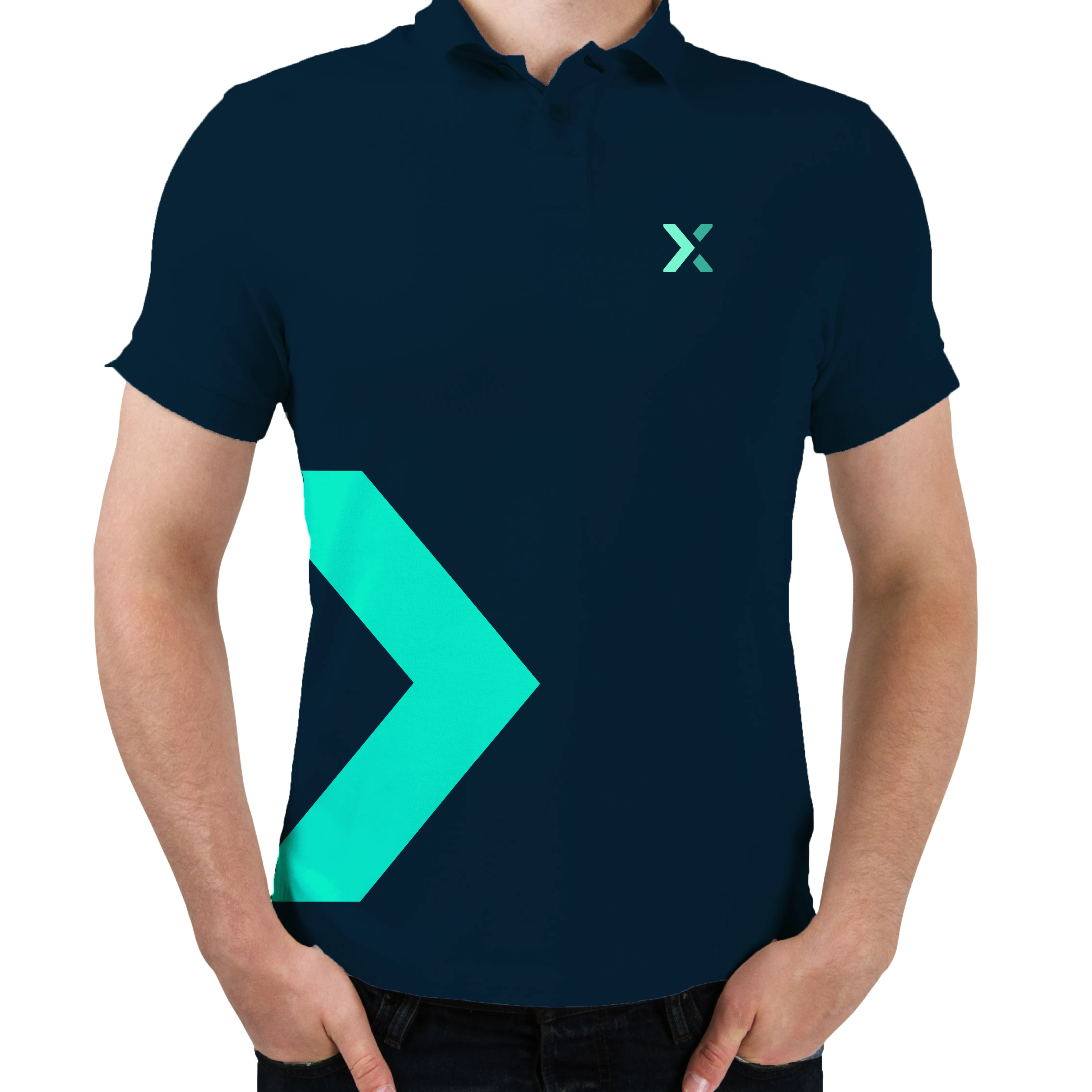
Brand extension - illustrating how the identity system scales to physical touchpoints, demonstrating consistency and flexibility beyond the launch toolkit.
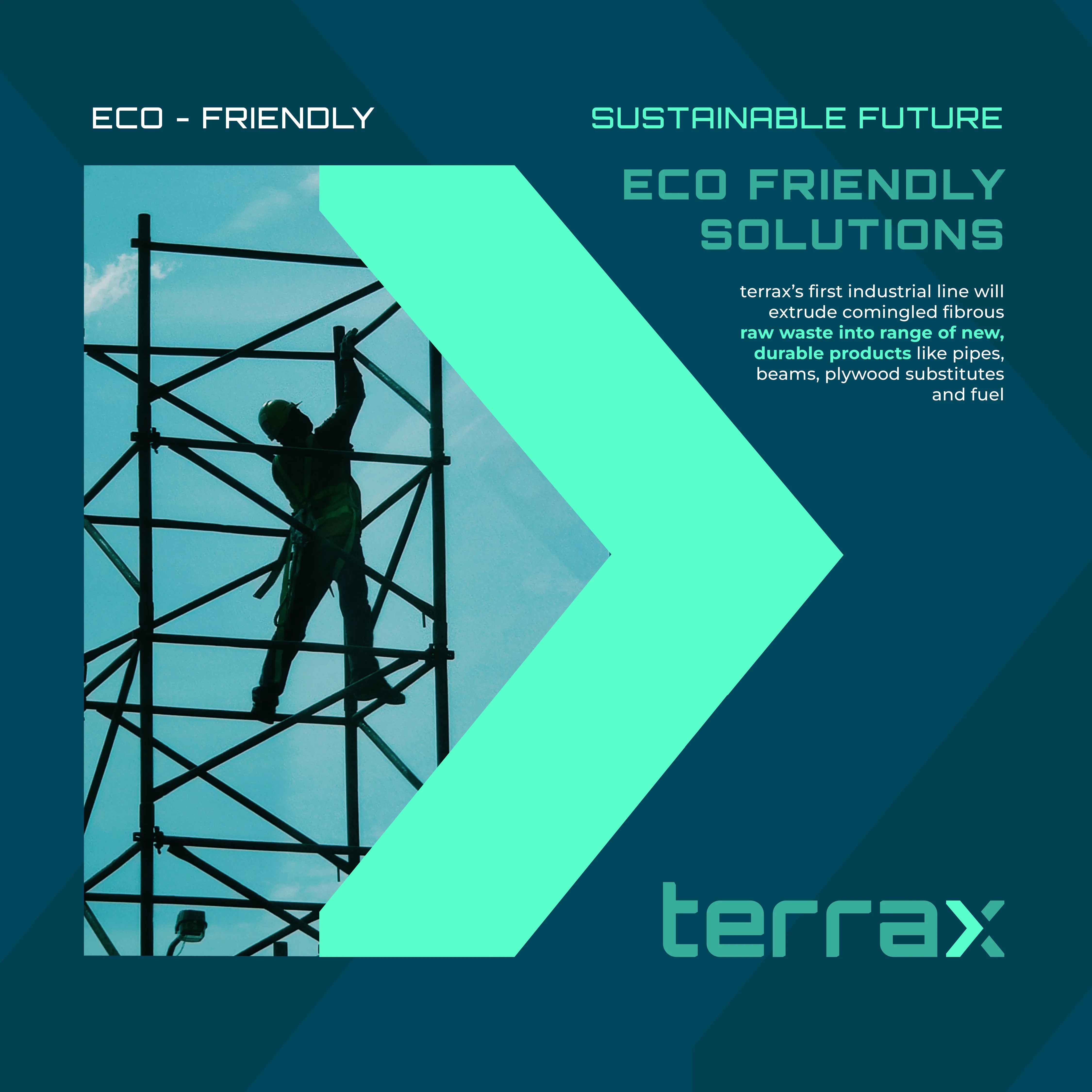
Brand identity applied - the directional arrow motif and blue/neon palette carried consistently across all communications.
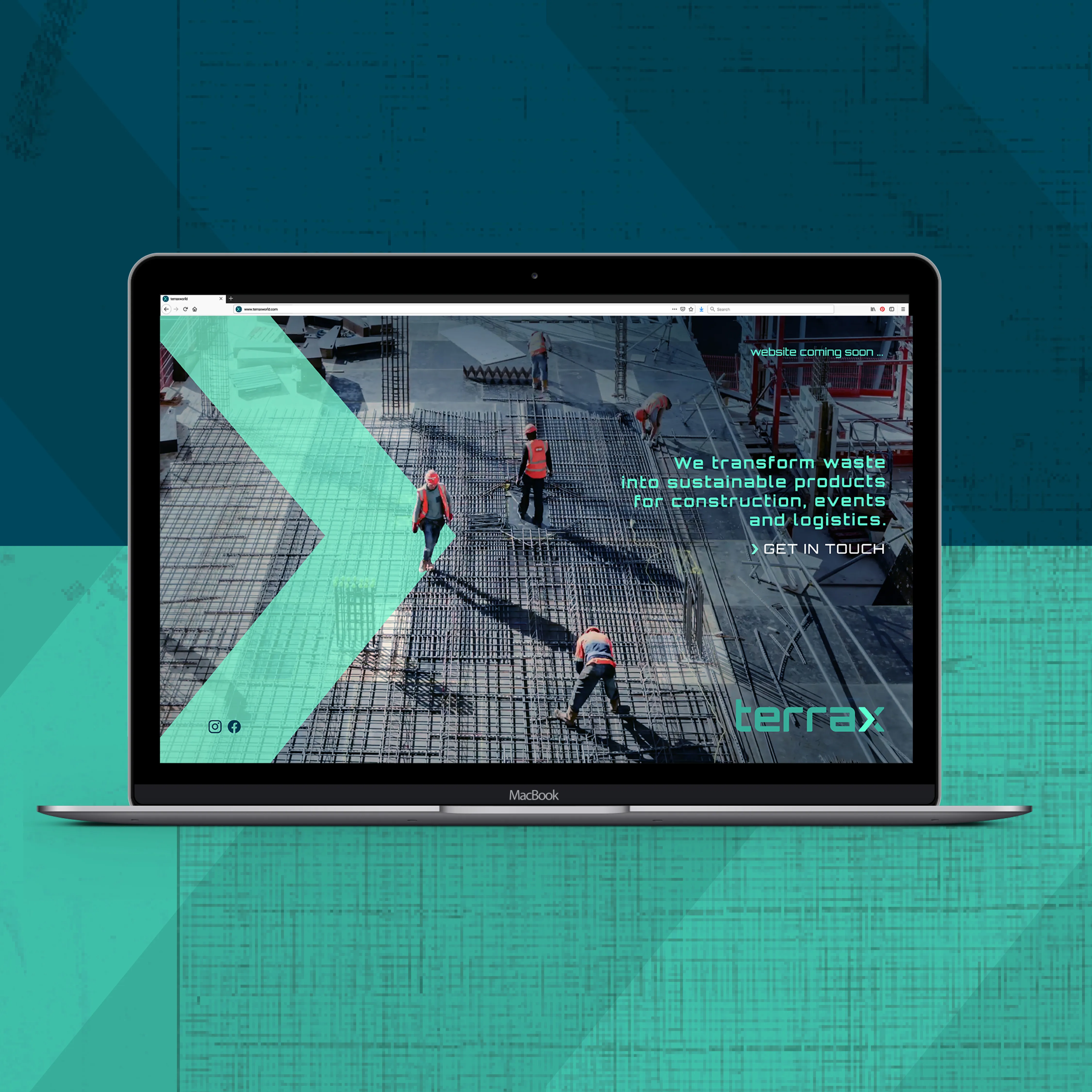
Landing page - Terrax's digital presence, built to direct trade show contacts and introduce the brand online.
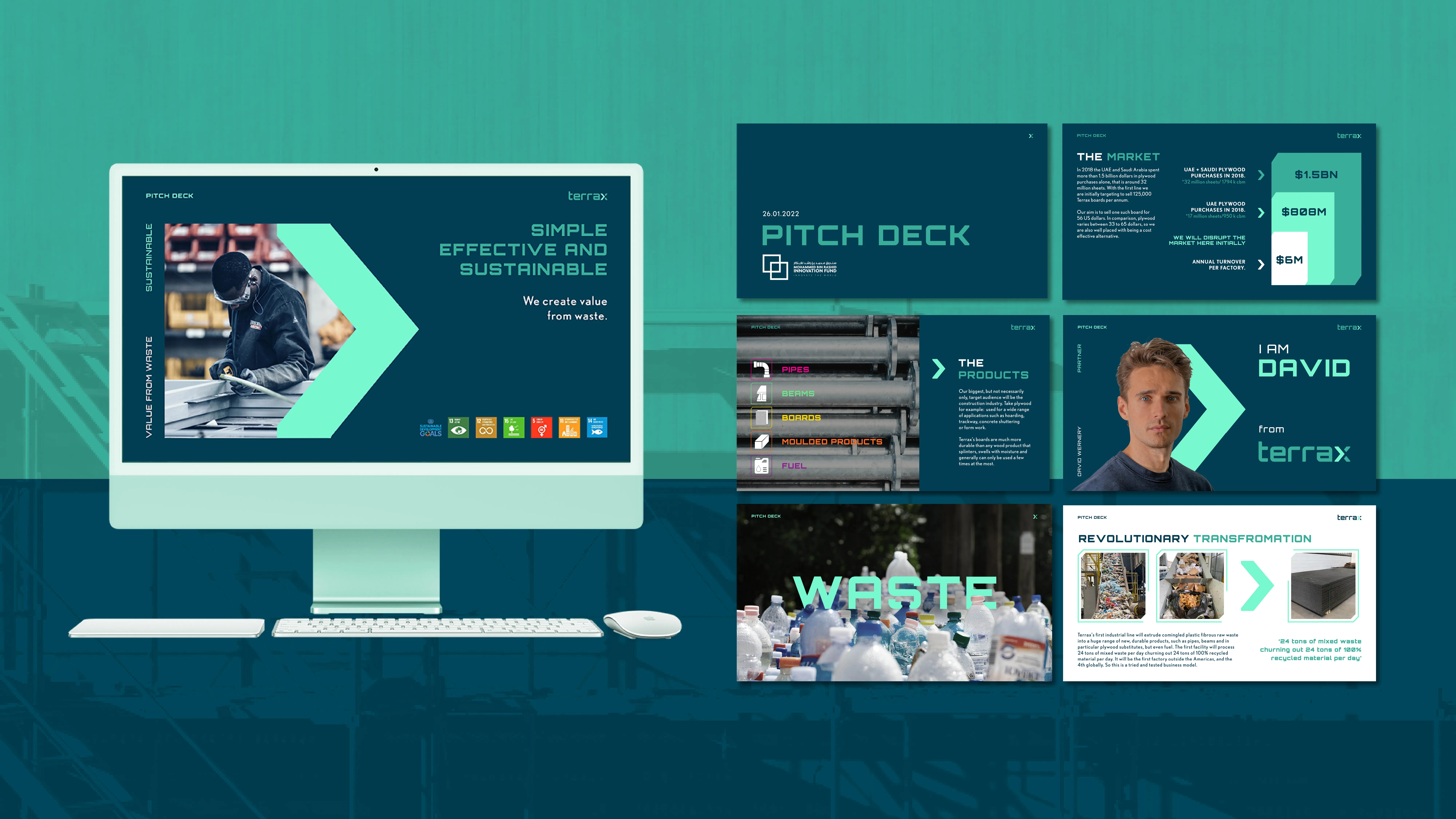
Pitch deck - the full Terrax story across investor-ready slides, covering the product, the market opportunity, and the vision.
A brand built in 90 days that gave a world-first technology the identity it deserved, and the presence to walk into any room with confidence.