Brand Identity for an All-Day Dining Restaurant at the Novotel Kinshasa
Brand identity for Kaukau, developed from the interior architecture outward — covering visual identity, signage and menu design.
- Client
- Novotel Kinshasa
- Year
- 2023
- Agency
- JansenHarris
- Role
- Brand Designer
- Category
- Brand
Sole designer — moodboards, visual identity and menu design. Collaborated with strategist on brand pillars and keywords, 3D designer to bring signage concepts to life, mentored by Creative Director.
The Challenge
Kaukau was a new restaurant opening inside a hotel still under construction in Kinshasa, Congo. No existing brand, no visual reference — only the architectural renders of the space. The brief was to create an identity rooted in the city and the physical space, not a generic hospitality brand with local references applied on top. The starting point was a moodboard.
New venue launch
All-day dining restaurant
Moodboard-first
Identity developed from the space
Rooted in Kinshasa
Designed to belong to this city
The Approach
01 — Starting point
Working with the client, brand pillars and a keyword territory were established. These shaped every creative decision that followed.
Brand Pillars
Values
Time is on your side. Rest, relax, bond.
Vision
Immersive art, smart interactions, happening F&B.
Moments
Creating dreams and memories in a warm environment.
Essence
Inspired, connected, confident, proud.
Keywords
Brand pillars and keywords — the strategic territory before any visual work began.
02 — The space
Before any logo work, the interior renders were studied. The dark green ceiling, cascading foliage, leather seating, mesh trellis — the space already had a character to build from.
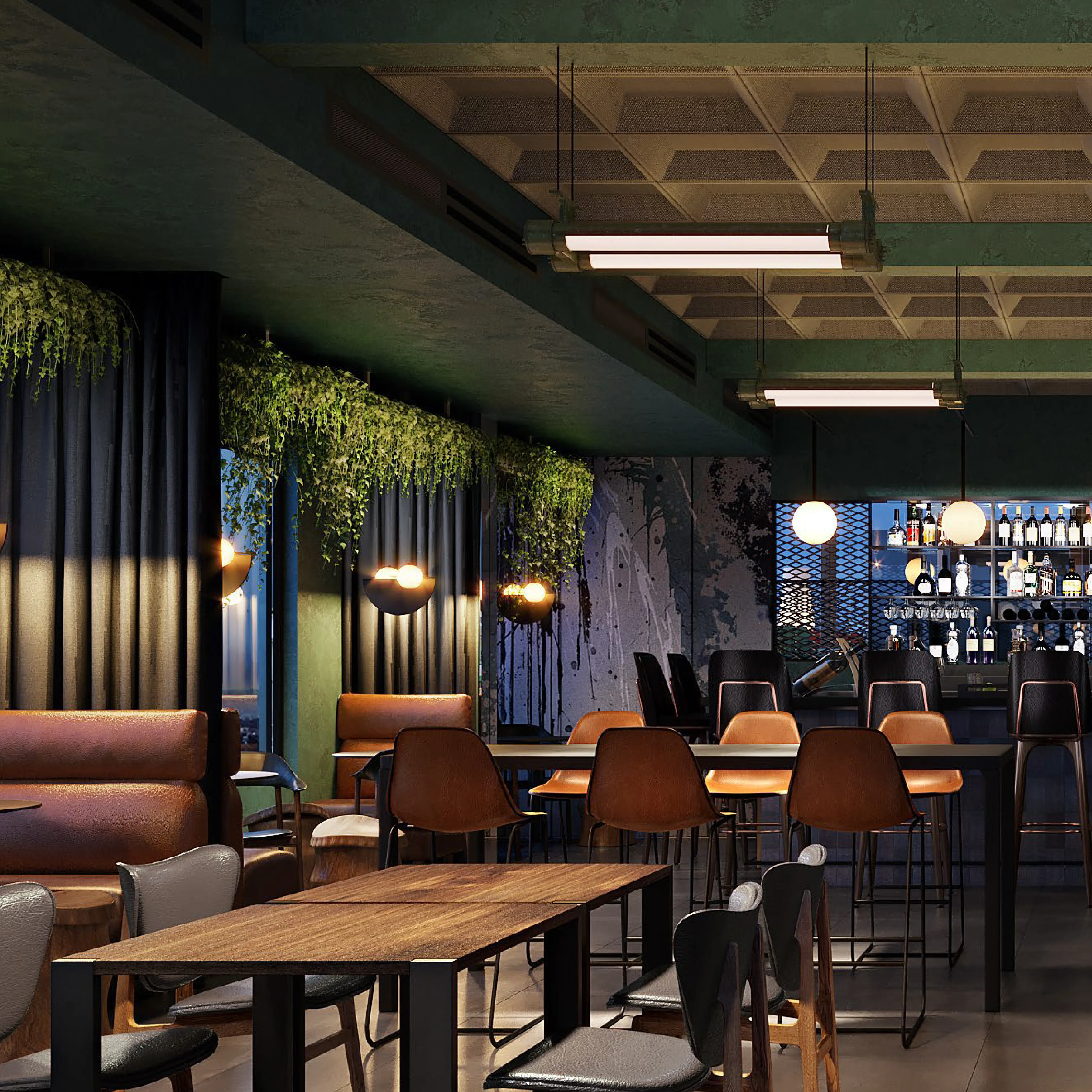
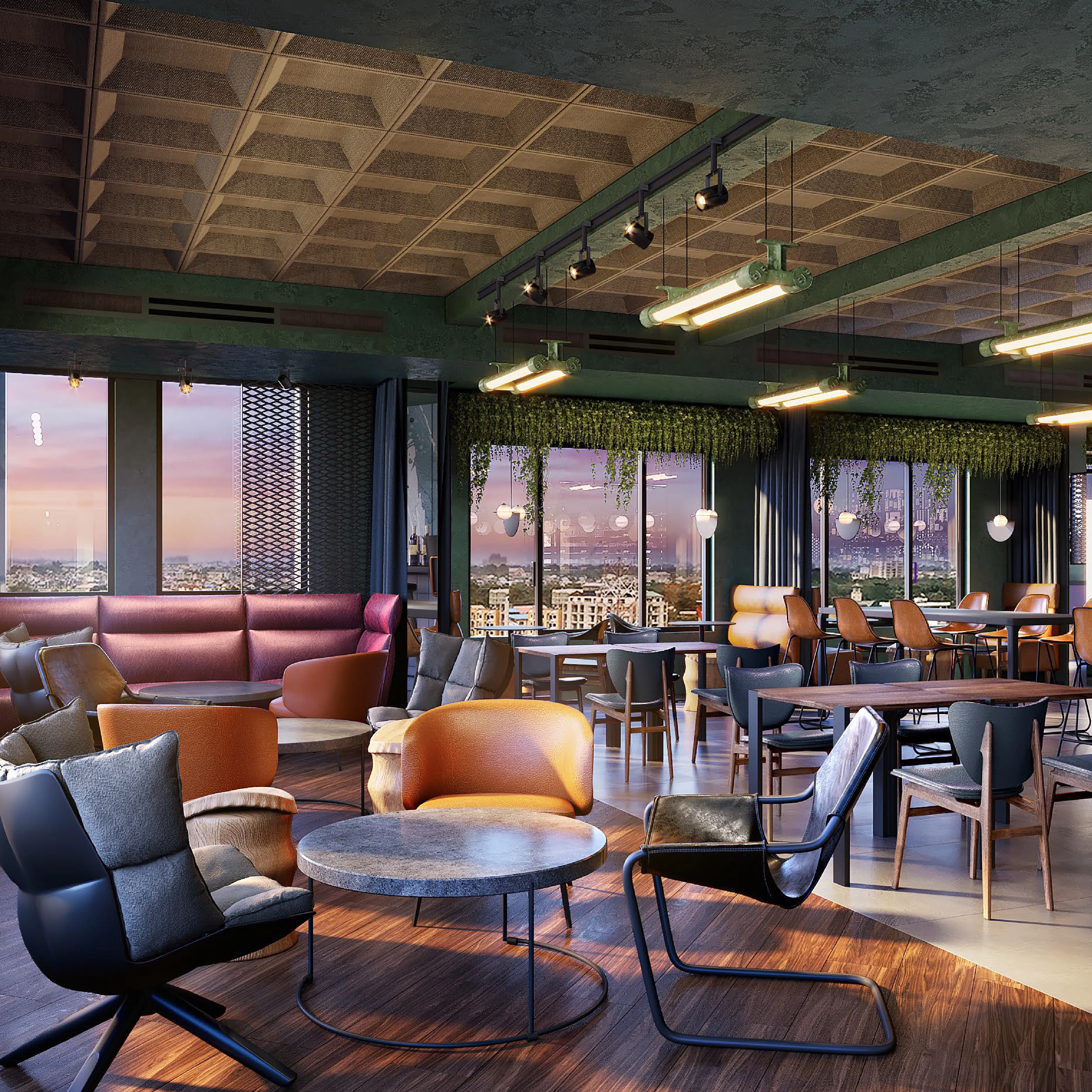
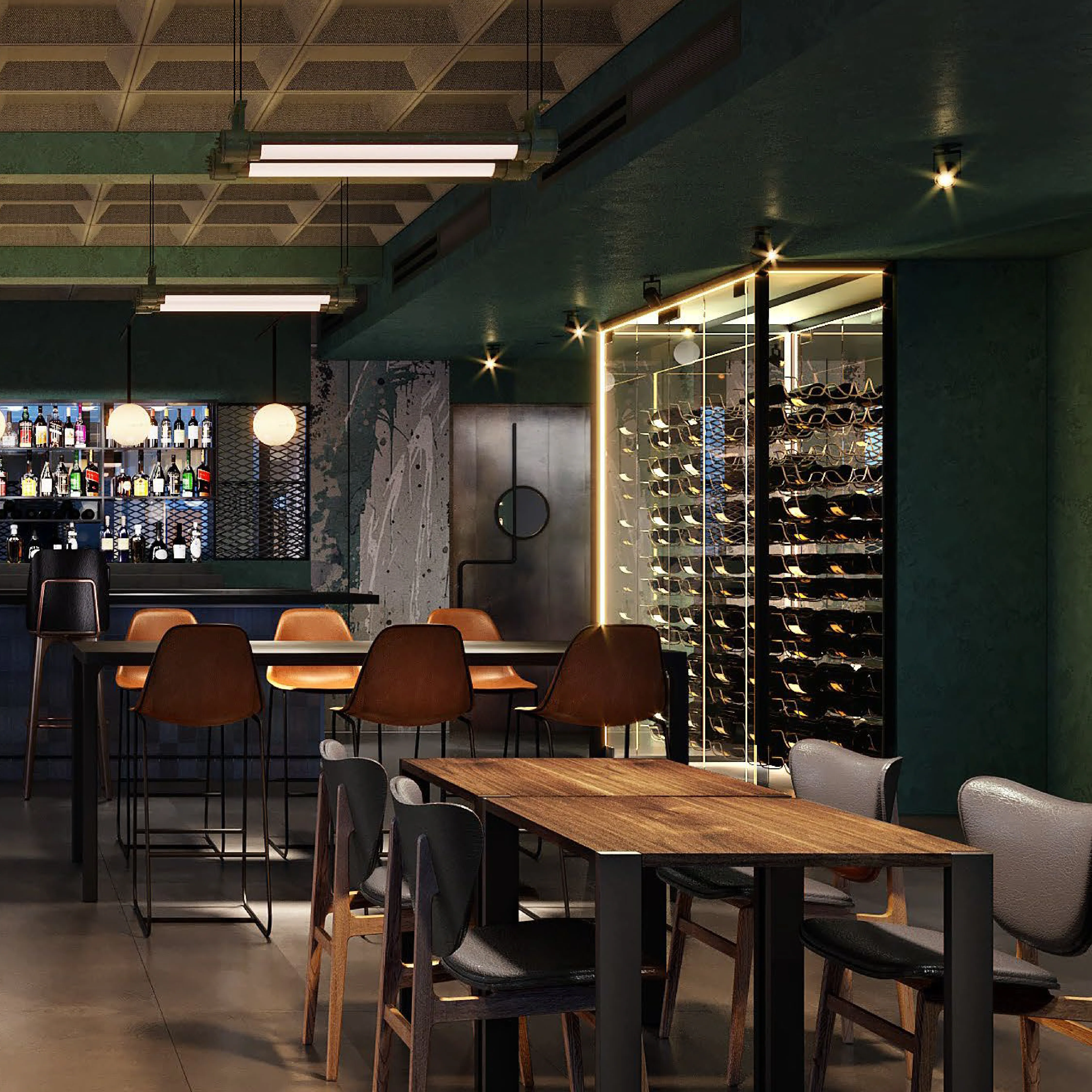
The Kaukau space — dark green ceilings, cascading foliage and warm leather seating overlooking Kinshasa.
03 — Moodboard Creation
From the space, a moodboard was built — cocoa beans, vintage botanical illustrations, warm natural materials, candlelight. That moodboard then fed back into the space, with specific suggestions for how the interior and brand could develop together.
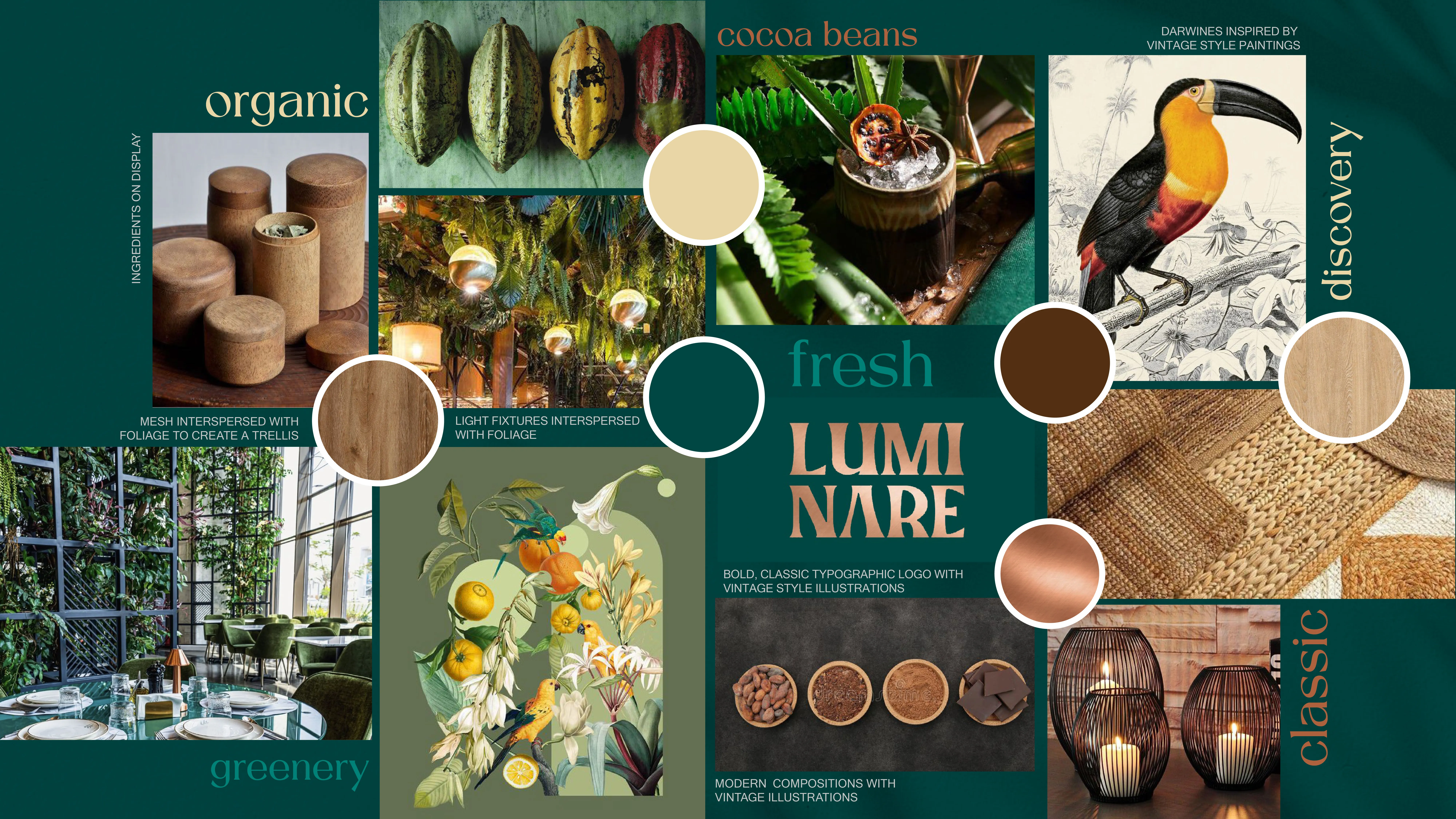
Kaukau moodboard — the creative concept before any logo work began.
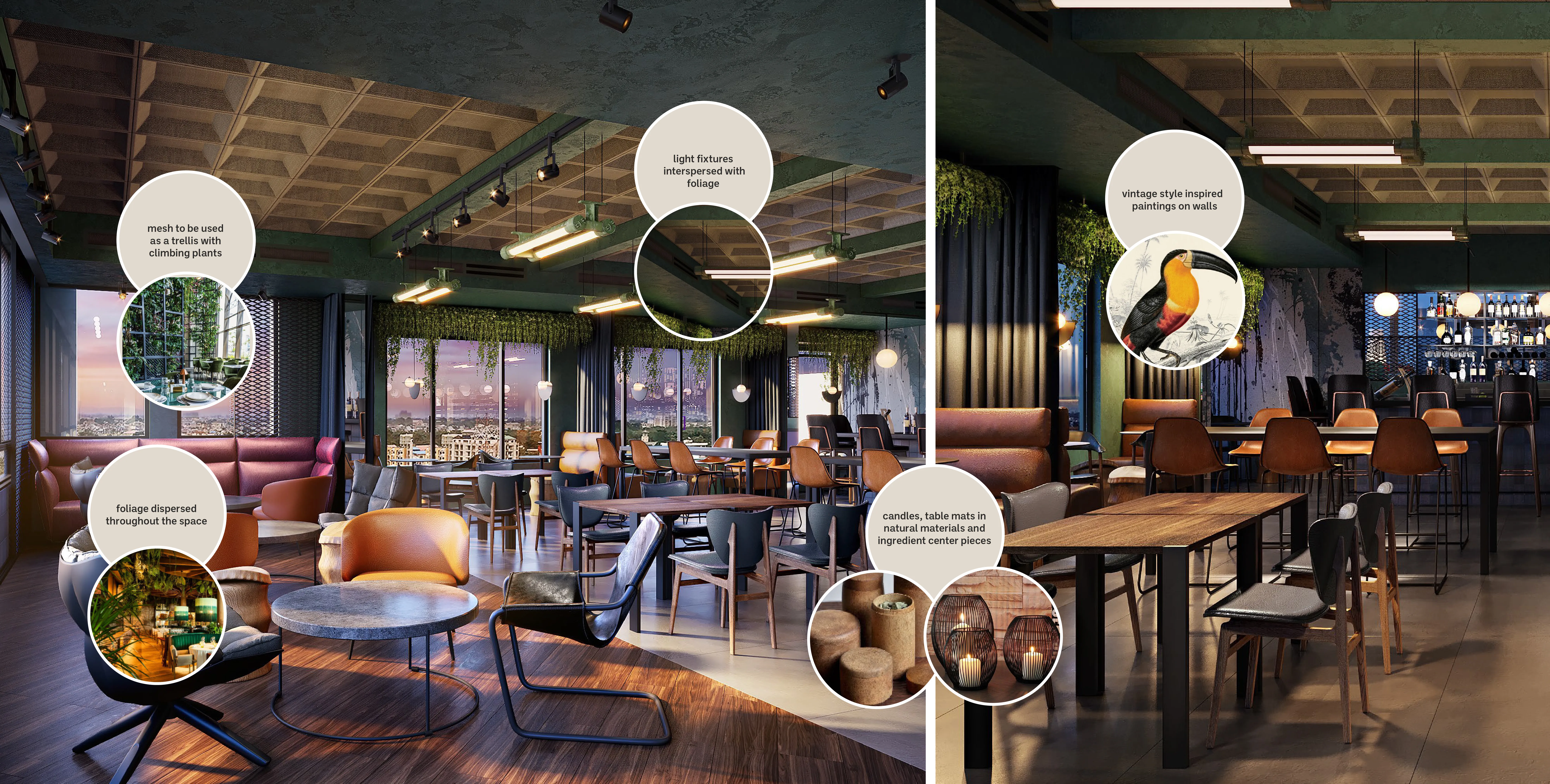
Brand suggestions overlaid on the interior renders — connecting the moodboard back to the physical space.
“Rather than layering a brand onto the space, the identity was built from it, combining the interior and the landscape of Kinshasa into a cohesive system.”
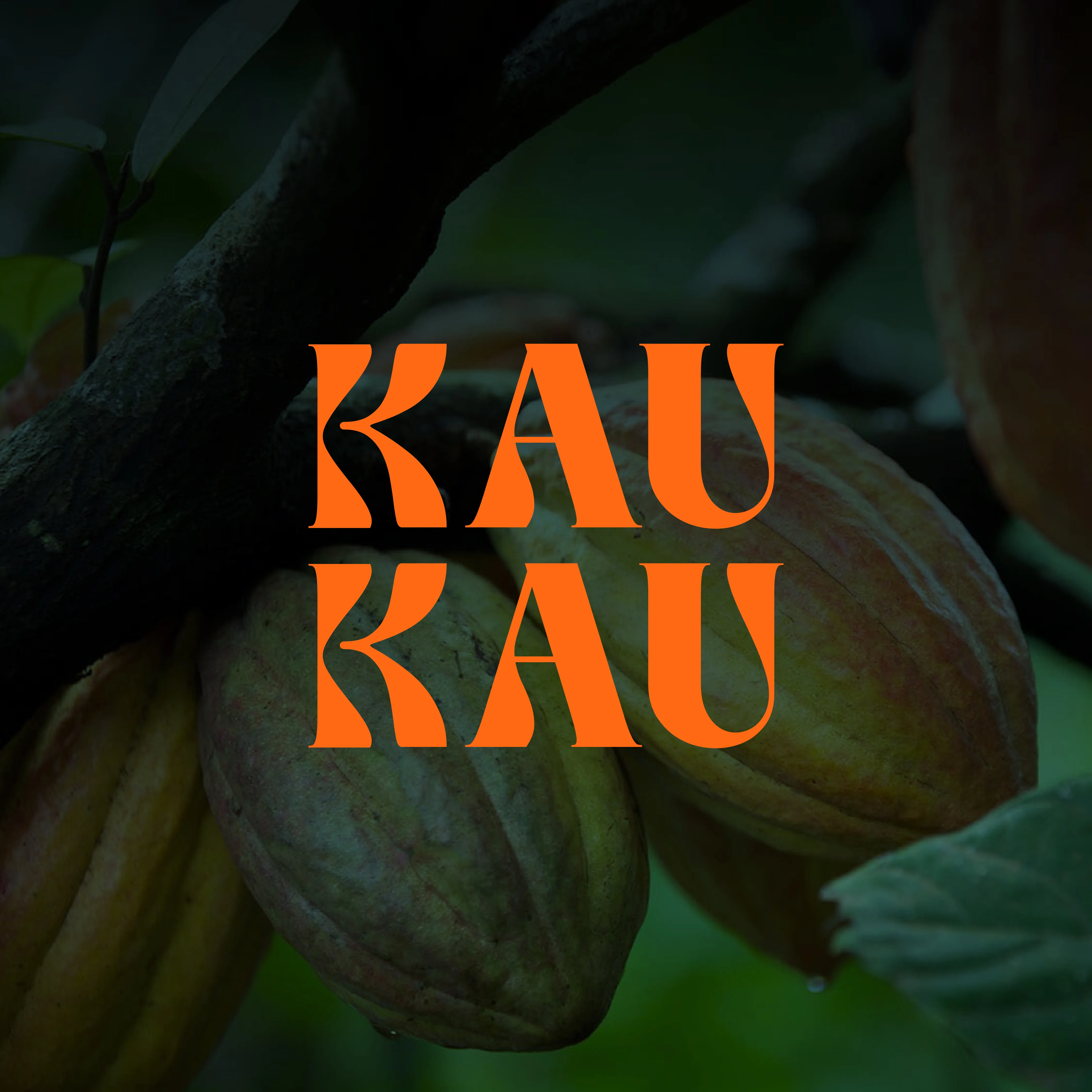
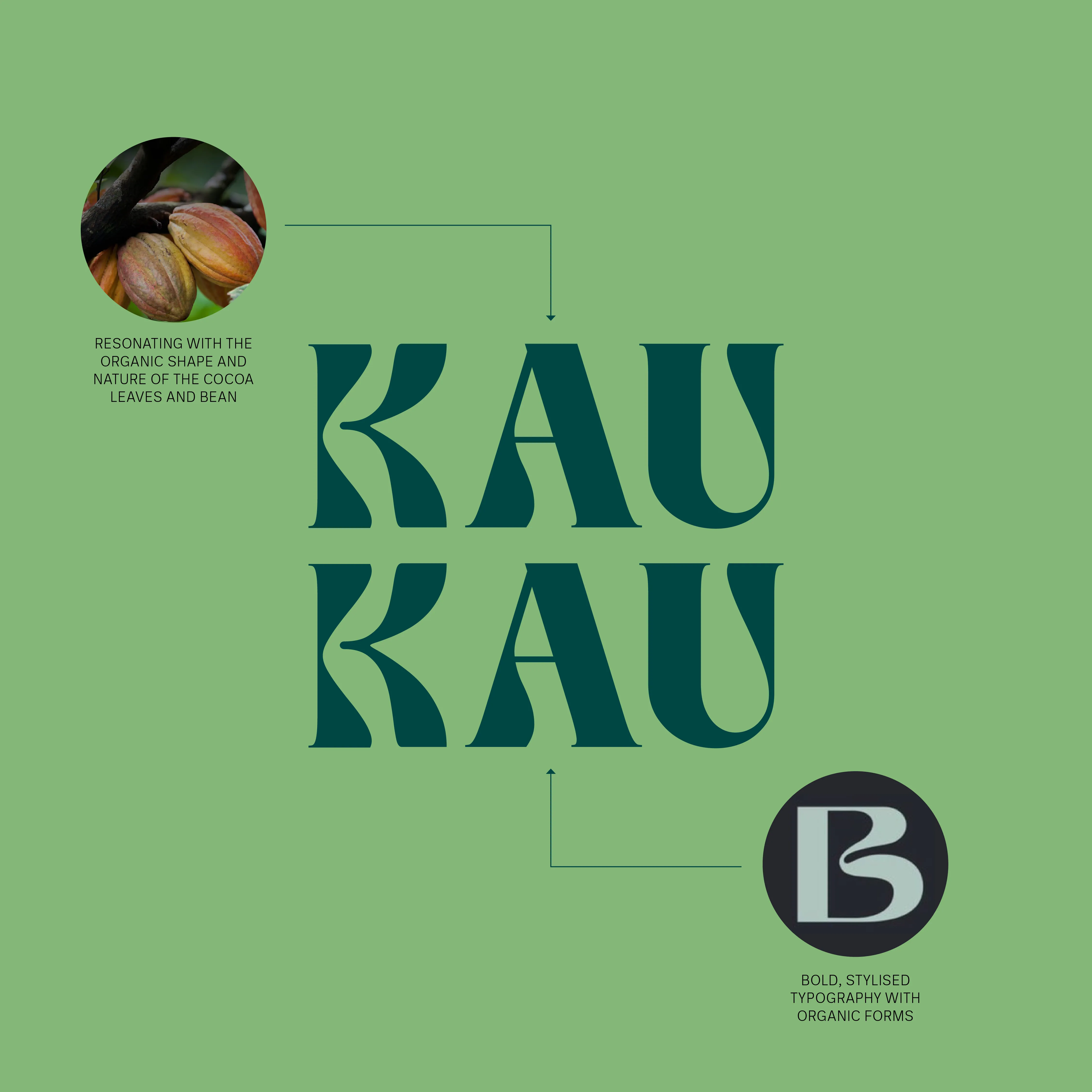
The identity was developed from the interior and the wider context of Kinshasa. The space’s deep green tones, warm materials and layered textures were combined with references from the local landscape and natural elements, forming a cohesive visual language. The cocoa tree became a central concept, its leaf, pod and bean informing the structure of the wordmark and the broader graphic system. The result is an identity that feels embedded in its environment, carrying a consistent story across signage, menus and the overall experience.
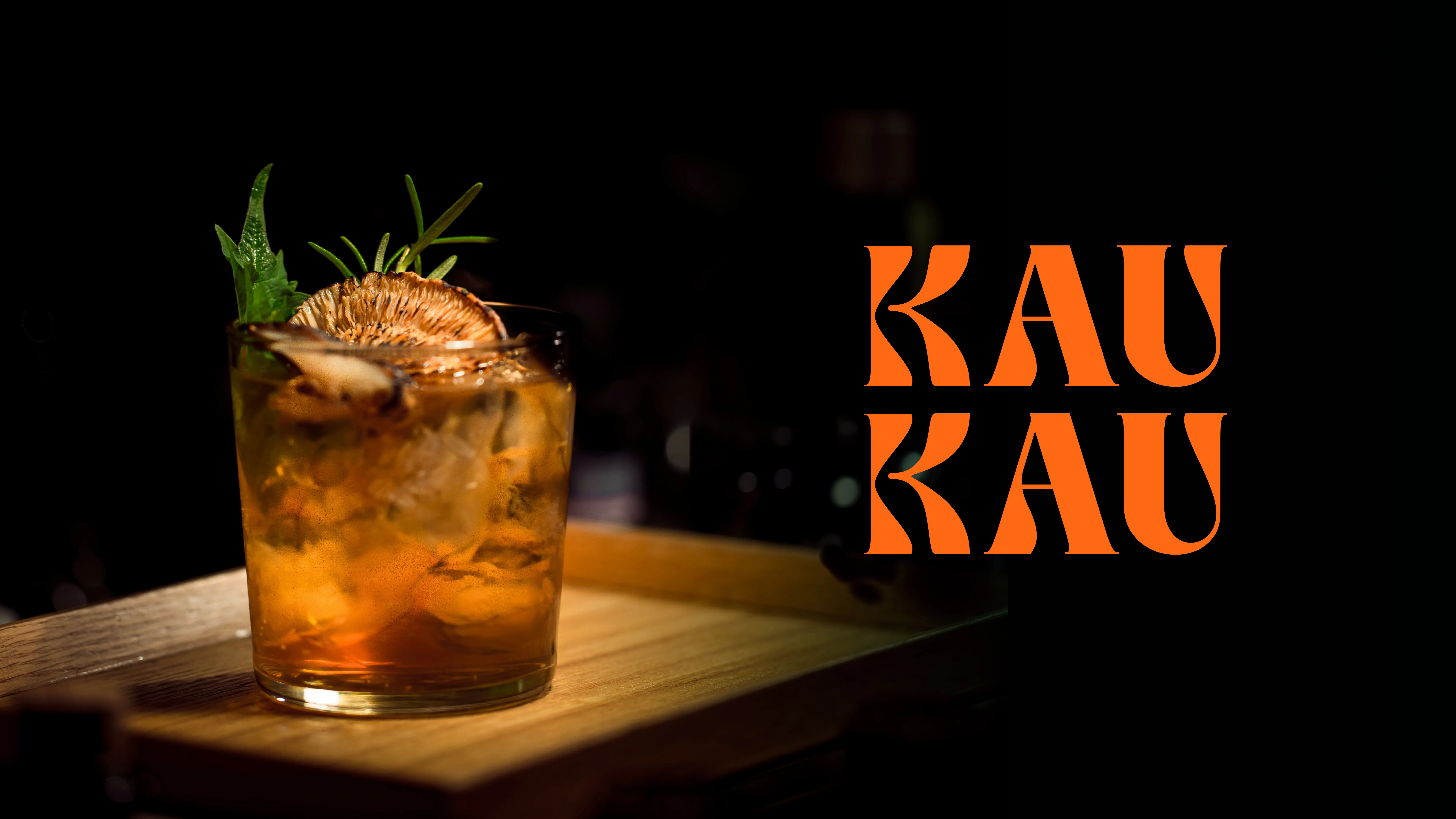
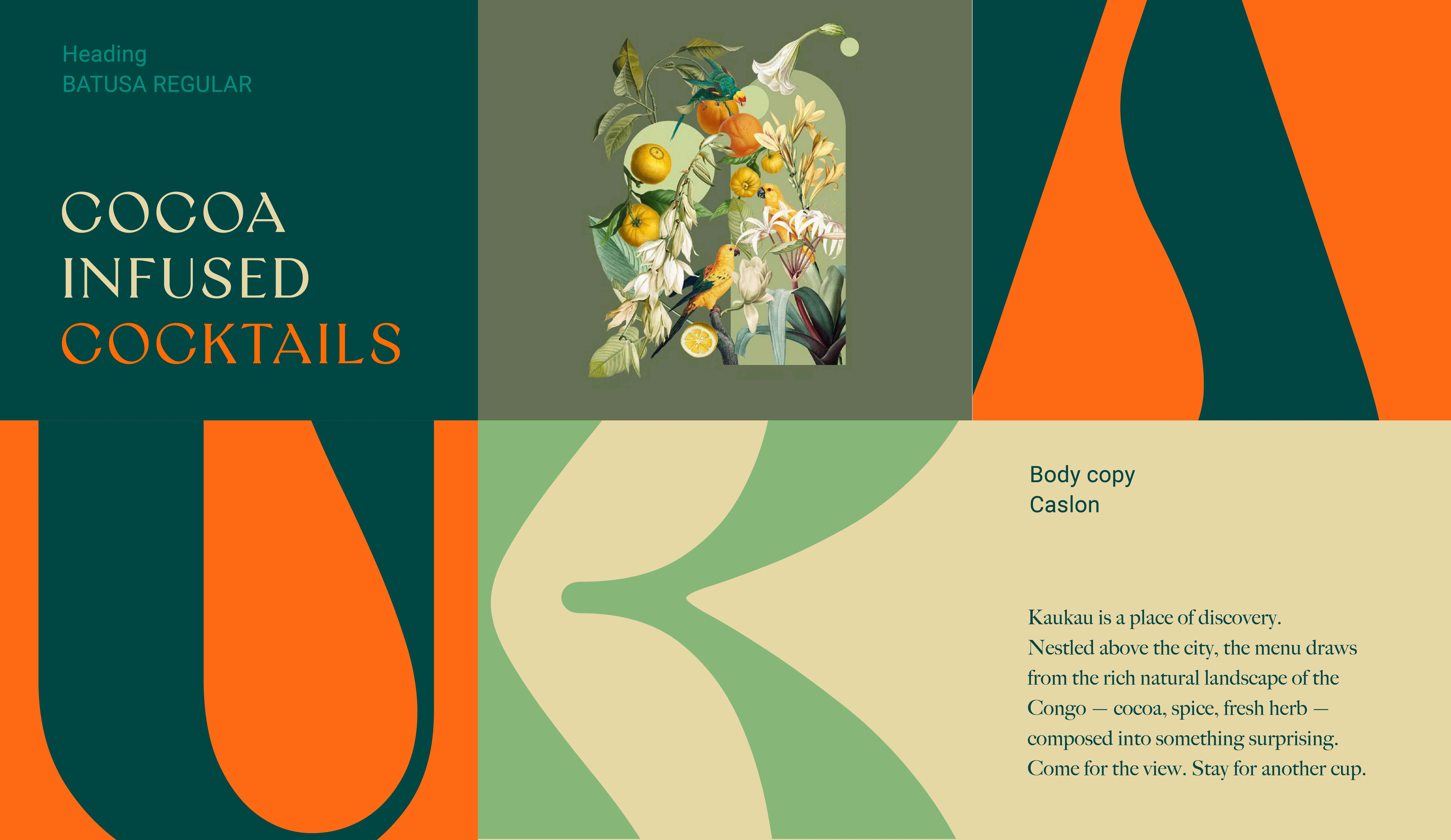
04 — The identity
The concept came from the cocoa tree — the organic shape of the leaf, pod and bean translated into a typographic wordmark that is both bold and natural. The typeface, Batusa, was chosen for its rounded, stylised letterforms that echo the plant's organic forms. The result is an identity that feels approachable without losing presence, designed to speak to a younger, curious diner without alienating the broader hotel audience.
The Solution
The identity was rolled out across signage, menus and visual collateral — every touchpoint carrying the warmth and character of the brand through consistent use of the deep green, cream and cocoa brown palette, the bespoke typography and the organic visual language drawn from the cocoa tree.
01
Visual Identity
Logo system, colour palette (Deep Green, Cream, Cocoa Brown), typography, and organic visual language drawn from the cocoa tree.
02
Signage
Brand identity applied across restaurant signage — from entrance to interior wayfinding.
03
Menu Design
Menus designed to carry the full brand identity — typography, palette and visual language applied across covers and interiors.
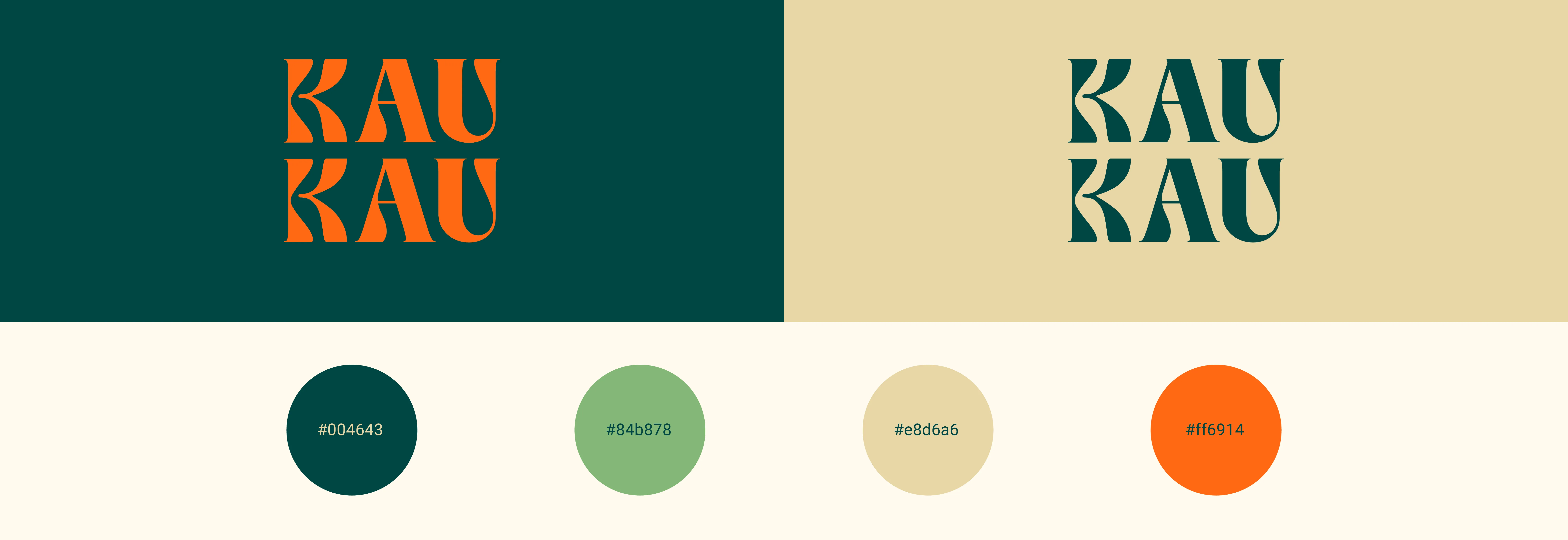
Brand overview: colour swatches, typography, graphic device.
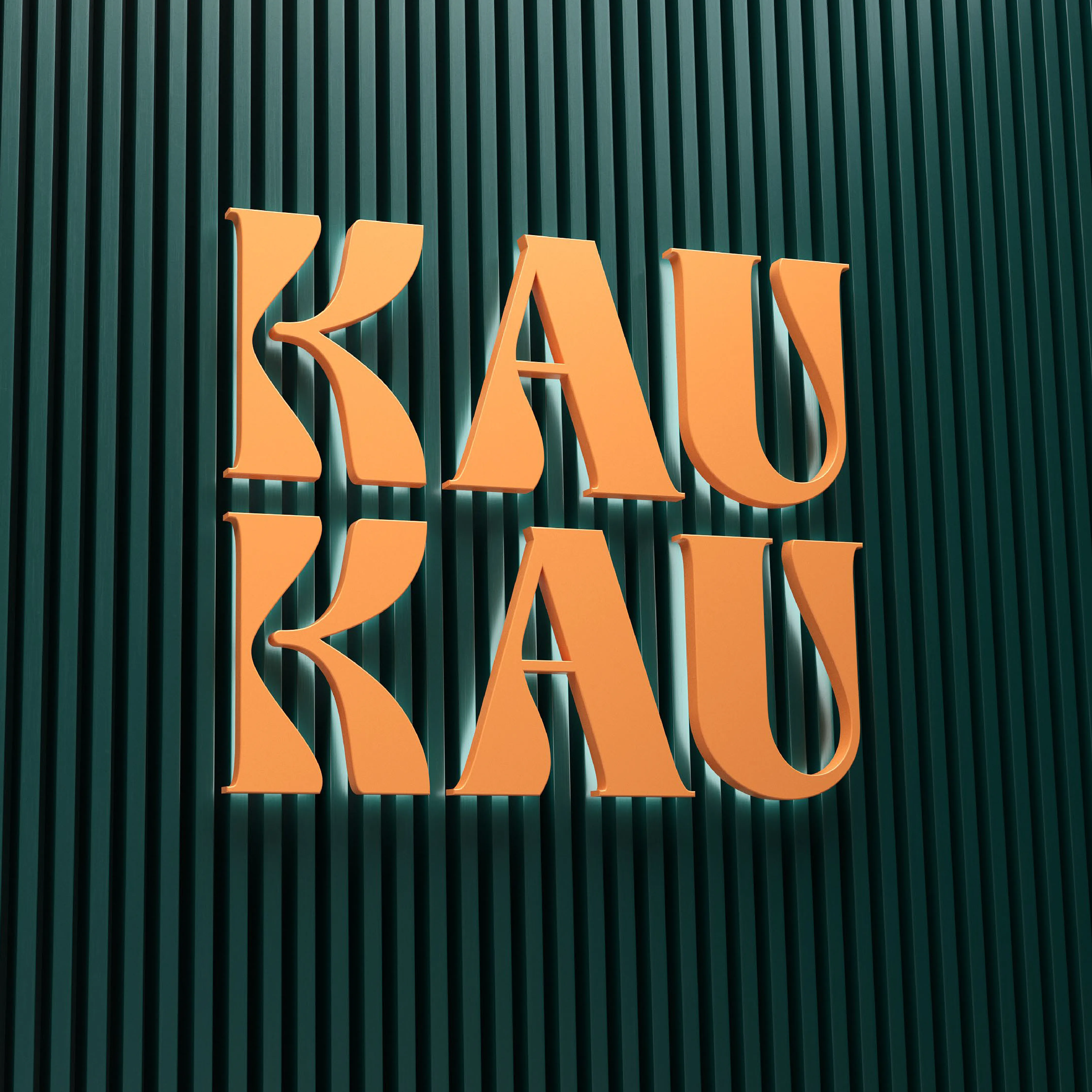
Lift lobby signage — the wordmark at scale, applied in raised lettering to the ribbed green wall.
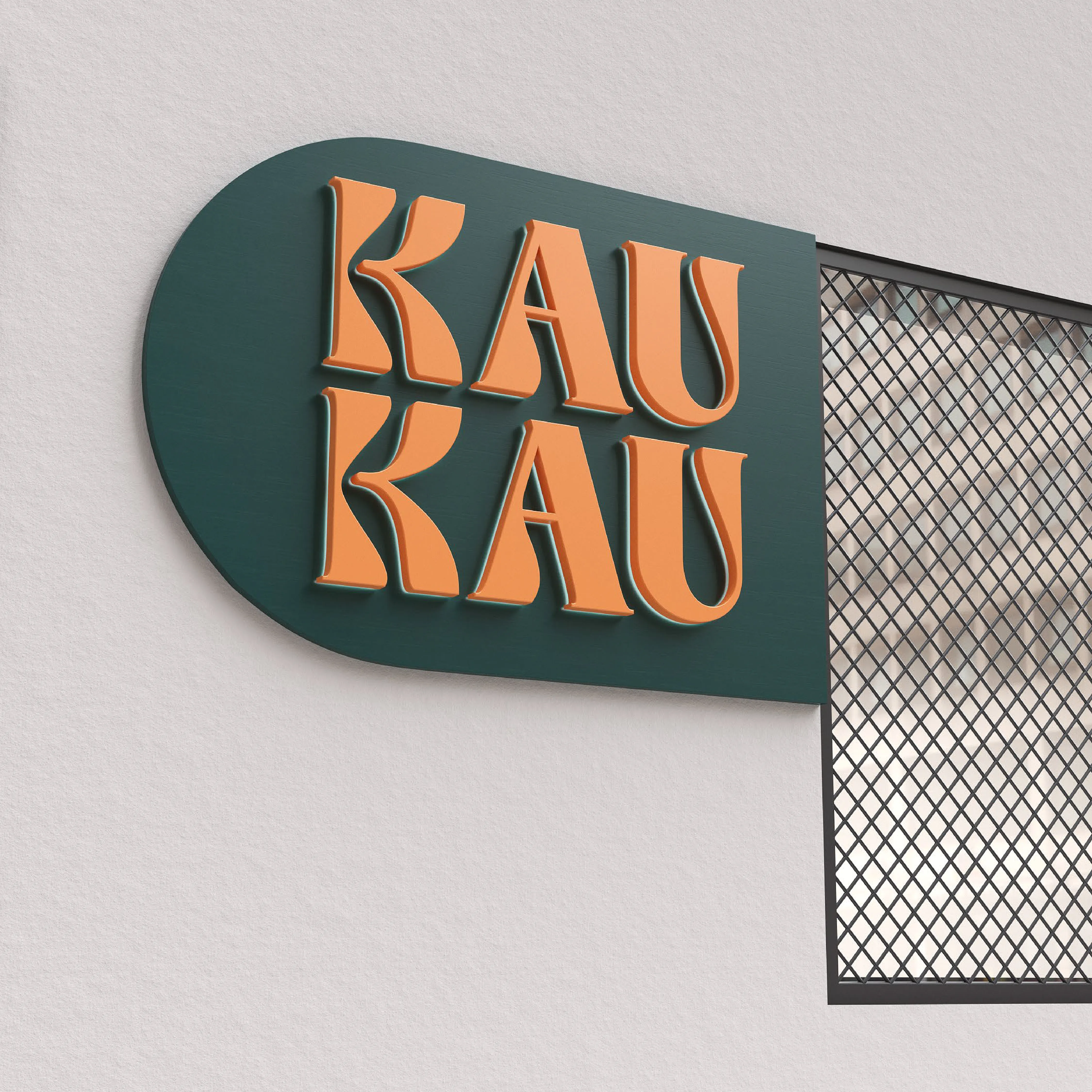
Entrance signage — the brand identity marking arrival at the restaurant.
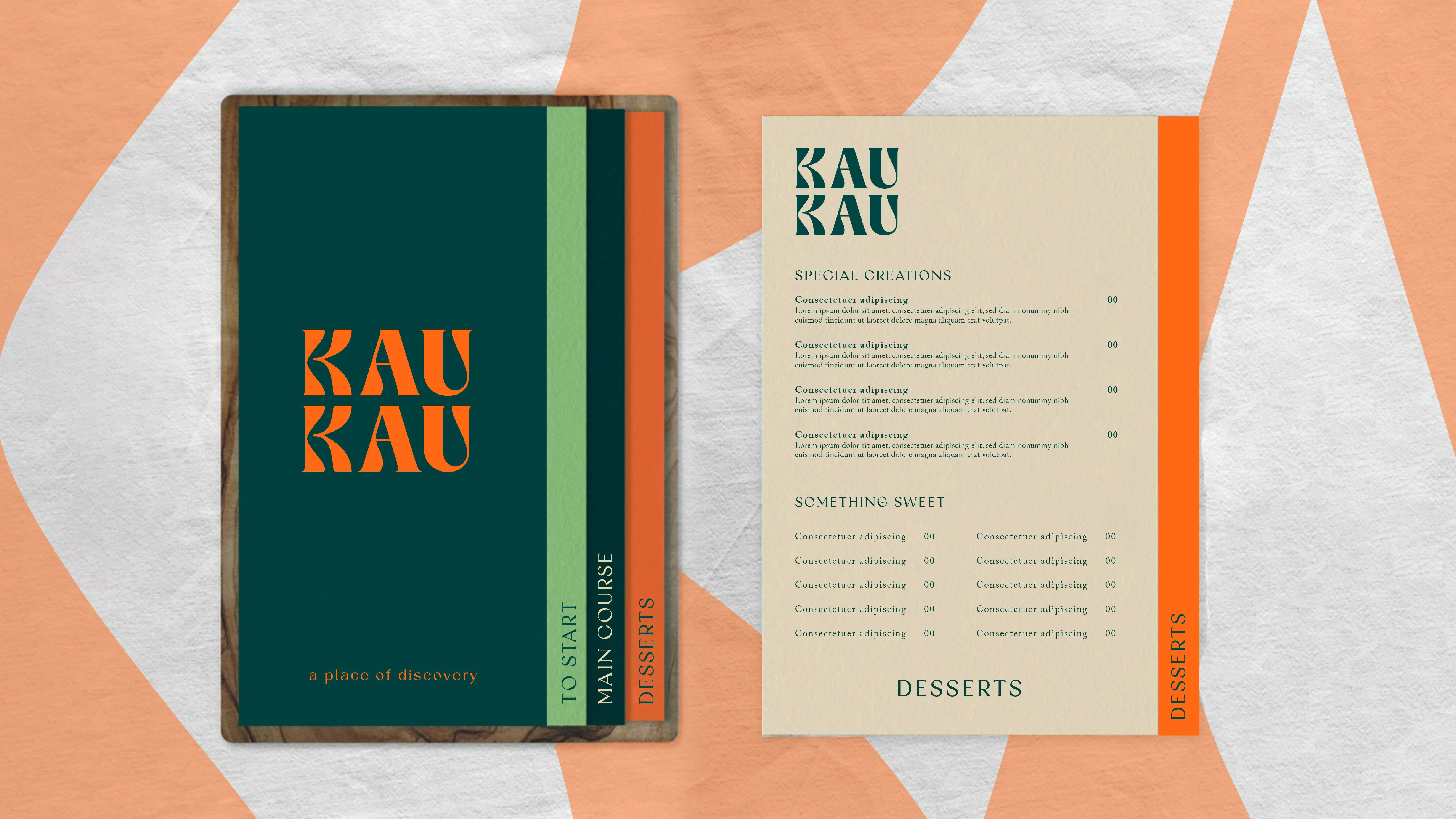
Menu design — cover and interior layout carrying the full brand identity.
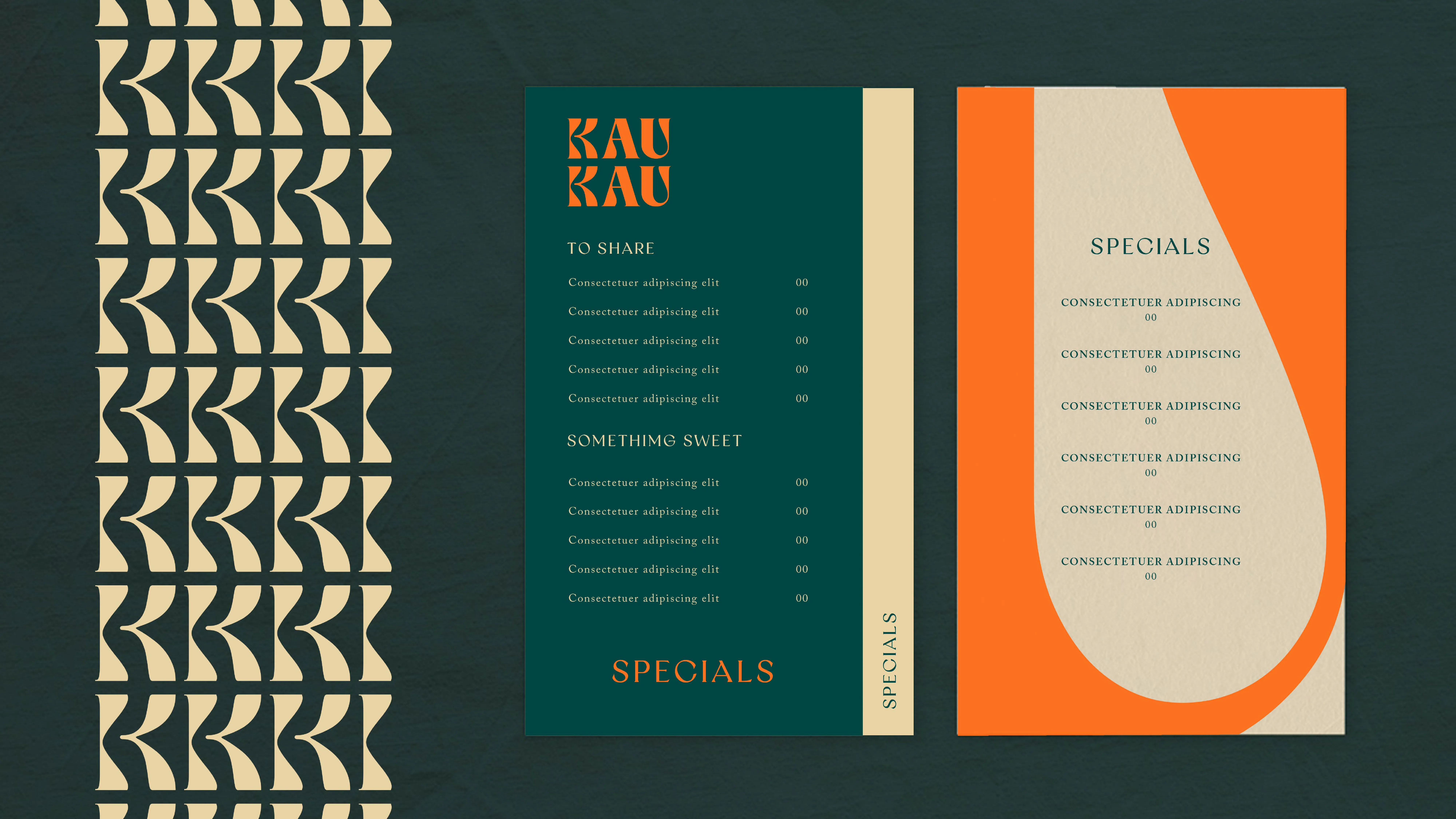
Menu variants — the graphic pattern language applied across different formats.
An identity built from the inside out, developed from the space, rooted in the natural landscape of Kinshasa, and rolled out across every touchpoint from signage to menus.