Navigation
Sticky navigation with active-state highlighting
The nav highlights whichever section the user is in as they scroll. Keeps orientation without adding visual clutter.

A full rebrand and one-page website for a US-based SaaS platform using predictive modelling to identify faults in underground pipe networks before they fail.
Sole designer — responsible for full rebrand, visual identity system, and one-page website design.
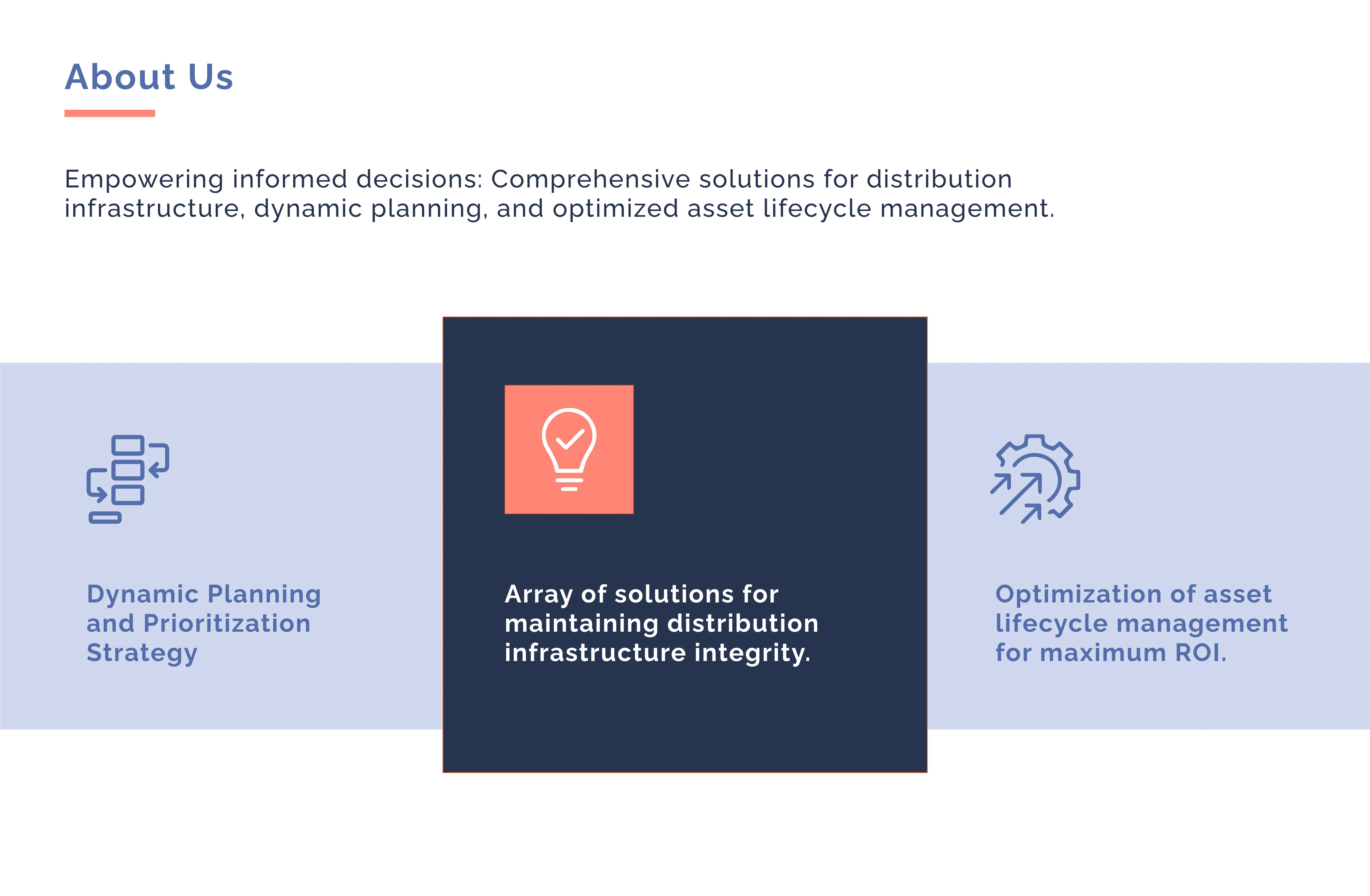
The Challenge
The client had built a technically sophisticated product: predictive modelling software for underground pipe networks. But the brand had been auto-generated at startup and never revisited. For a platform selling to infrastructure decision-makers, that was a real problem. The people signing off on contracts needed to trust the product before they had even seen a demo. A generic brand was actively undermining the credibility of what was underneath it.
The brief was to rebuild the brand from scratch and design a one-page website that could function as a virtual brochure: clear enough for a non-technical audience, credible enough for the people holding the budget.
No Brand System
Auto-generated, nothing to build from
High-Stakes Audience
Decision-makers judging on first contact
No Web Presence
Nowhere to send prospects
The Approach
The name gave the concept its direction. Infractiv fuses "infrastructure" and "active", suggesting both the underground systems it monitors and the interventionist nature of what it does.
Rather than designing a generic tech logo, the mark was built from a modular grid of interconnected elements referencing the pipe network itself, with a deliberate break at the centre: a visual echo of the fault-detection capability at the product's core.
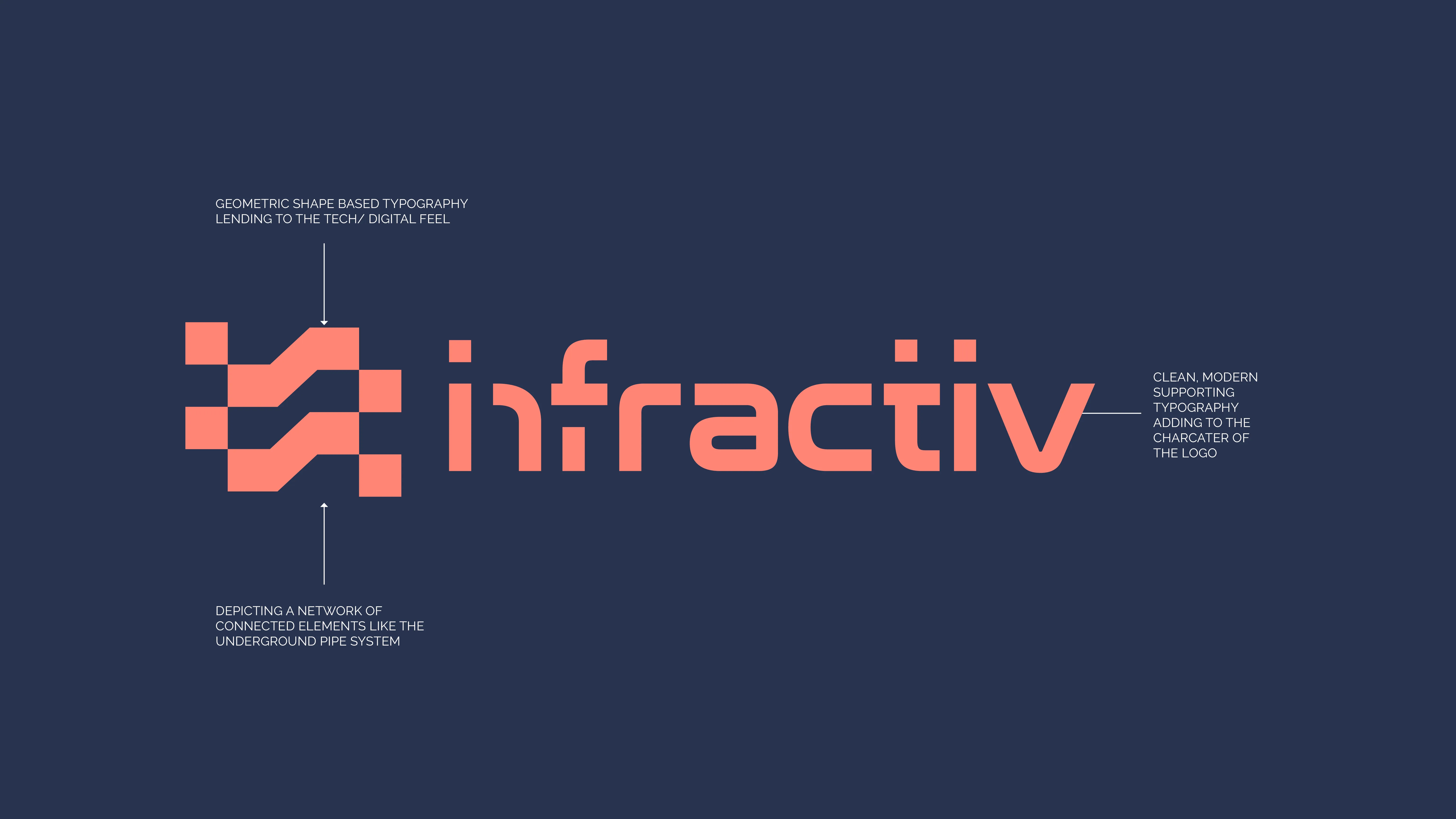
Logo rationale — a geometric symbol of interconnected elements representing the underground pipe network, with a fracture break at the core reflecting the product's fault-detection capability.
For the website, three decisions shaped the experience:
Navigation
The nav highlights whichever section the user is in as they scroll. Keeps orientation without adding visual clutter.
Interaction
The three core capabilities cycle in sequence rather than sitting as a static list. Draws attention to the product's range without requiring the user to read everything at once.
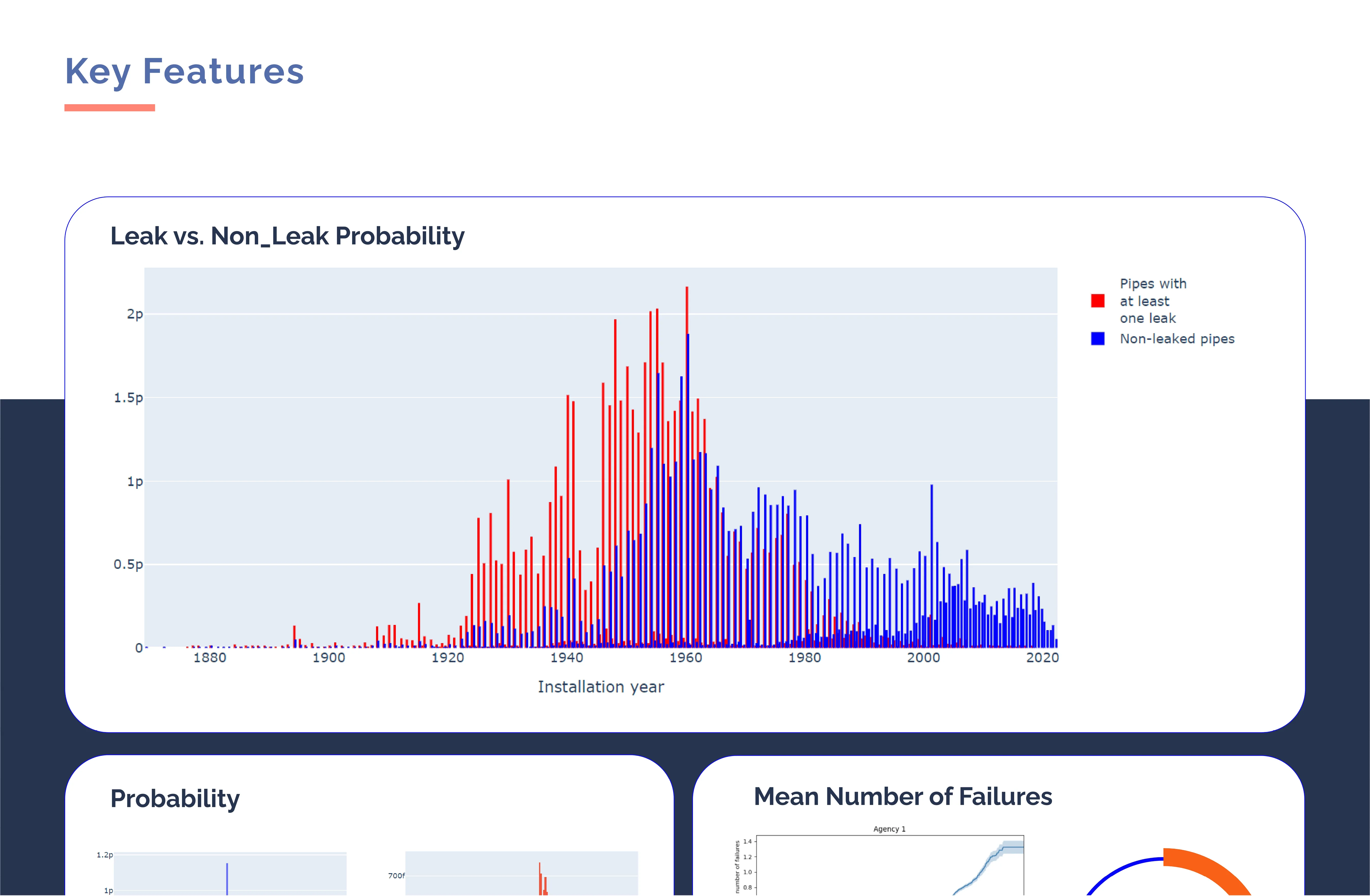
Data
The Key Features section puts Infractiv's actual predictive output on the page. Makes the product's value visible rather than described.

The Solution
The rebrand and website were delivered in two phases: brand identity first, then the website with a refined colour palette that had evolved through the brand development process.
01
Brand Identity System
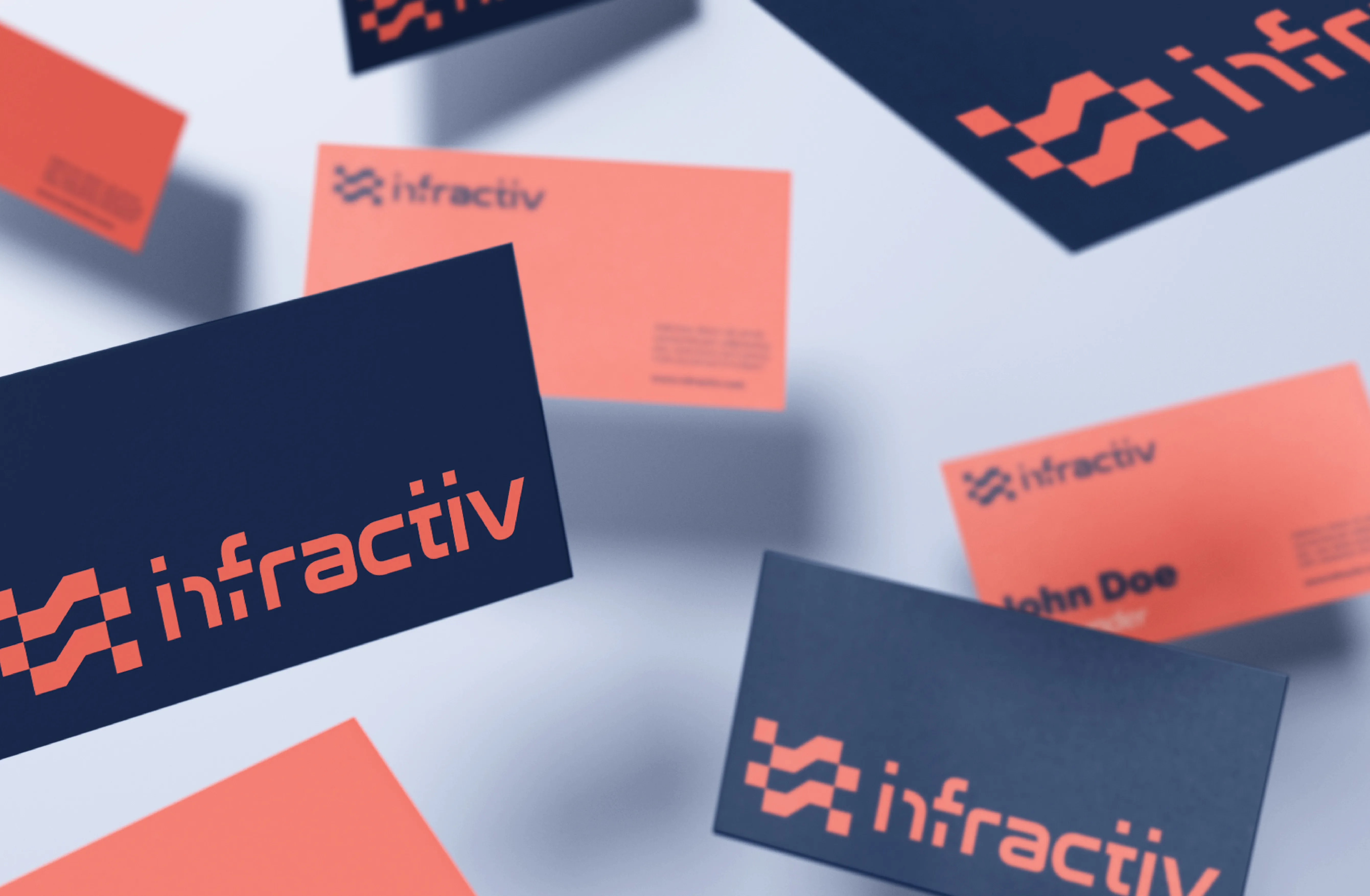
Full logo suite across colour variations, colour palette (Navy, Periwinkle, Coral, White), geometric typography system, and brand application across business cards and social posts.
02
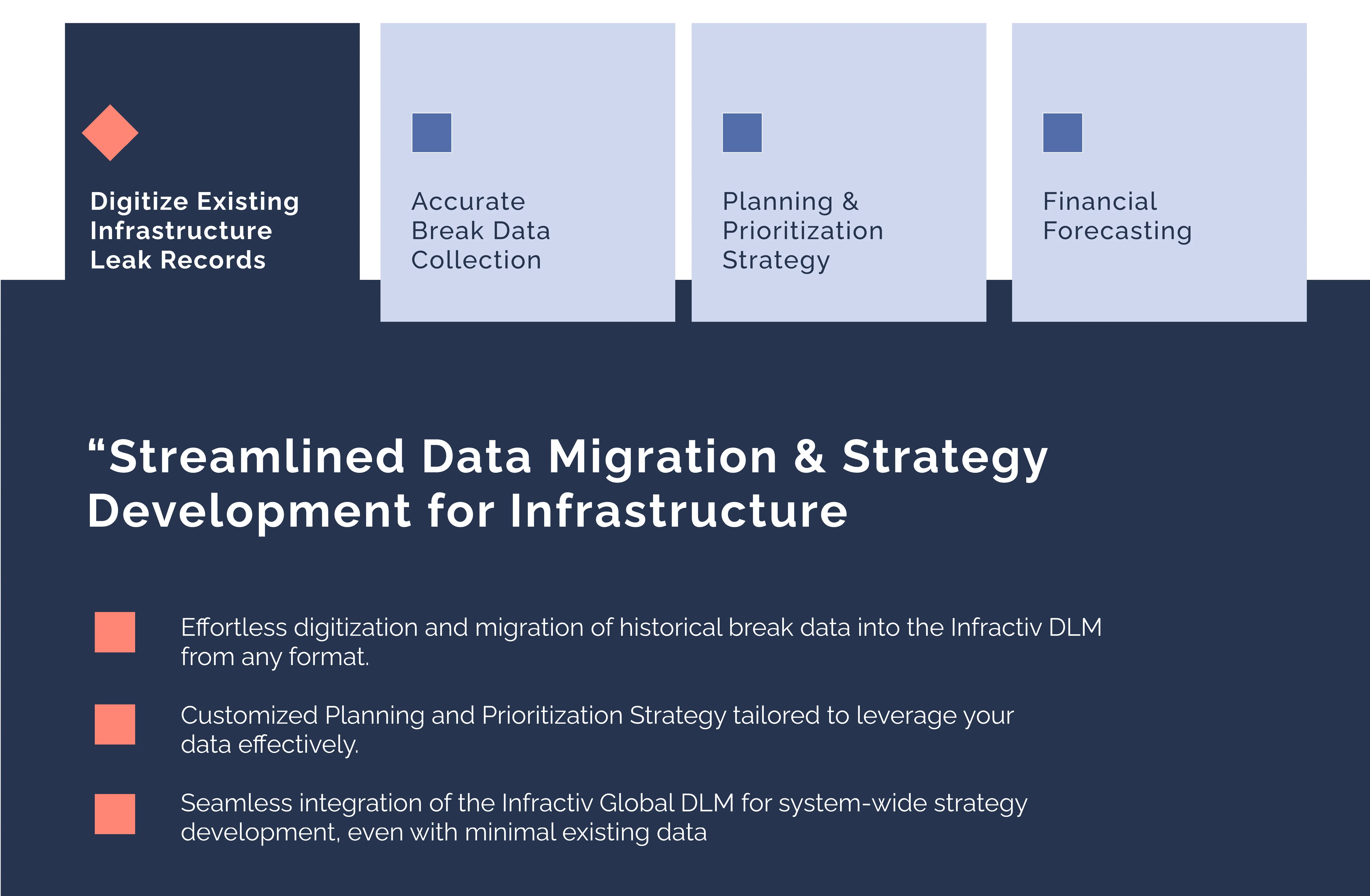
One-Page Website Design
A fully designed single-page website covering About Us, Key Features (with interactive data dashboard), and Get In Touch — designed to function as a virtual brochure for infrastructure decision-makers.
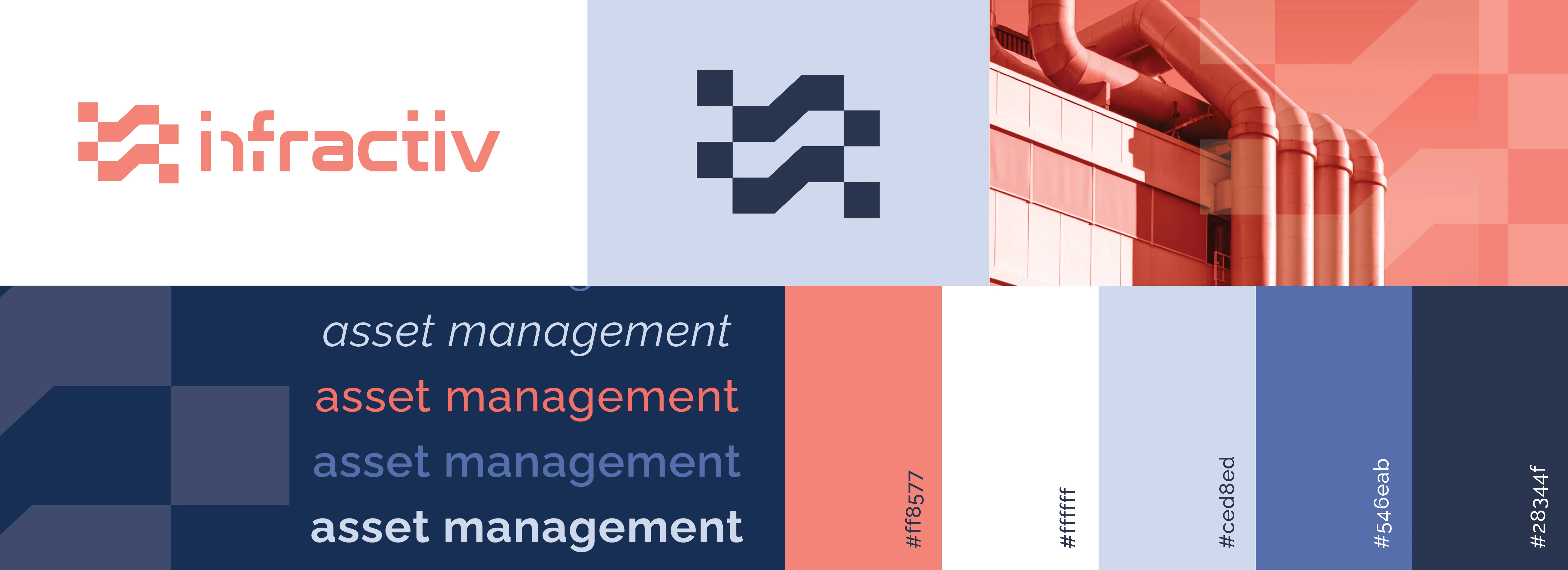
Brand identity overview — logo system, isolated mark, typography, and colour palette


Motion — the brand and website in action.
A rebrand that made a technically complex product look as credible as it actually is.