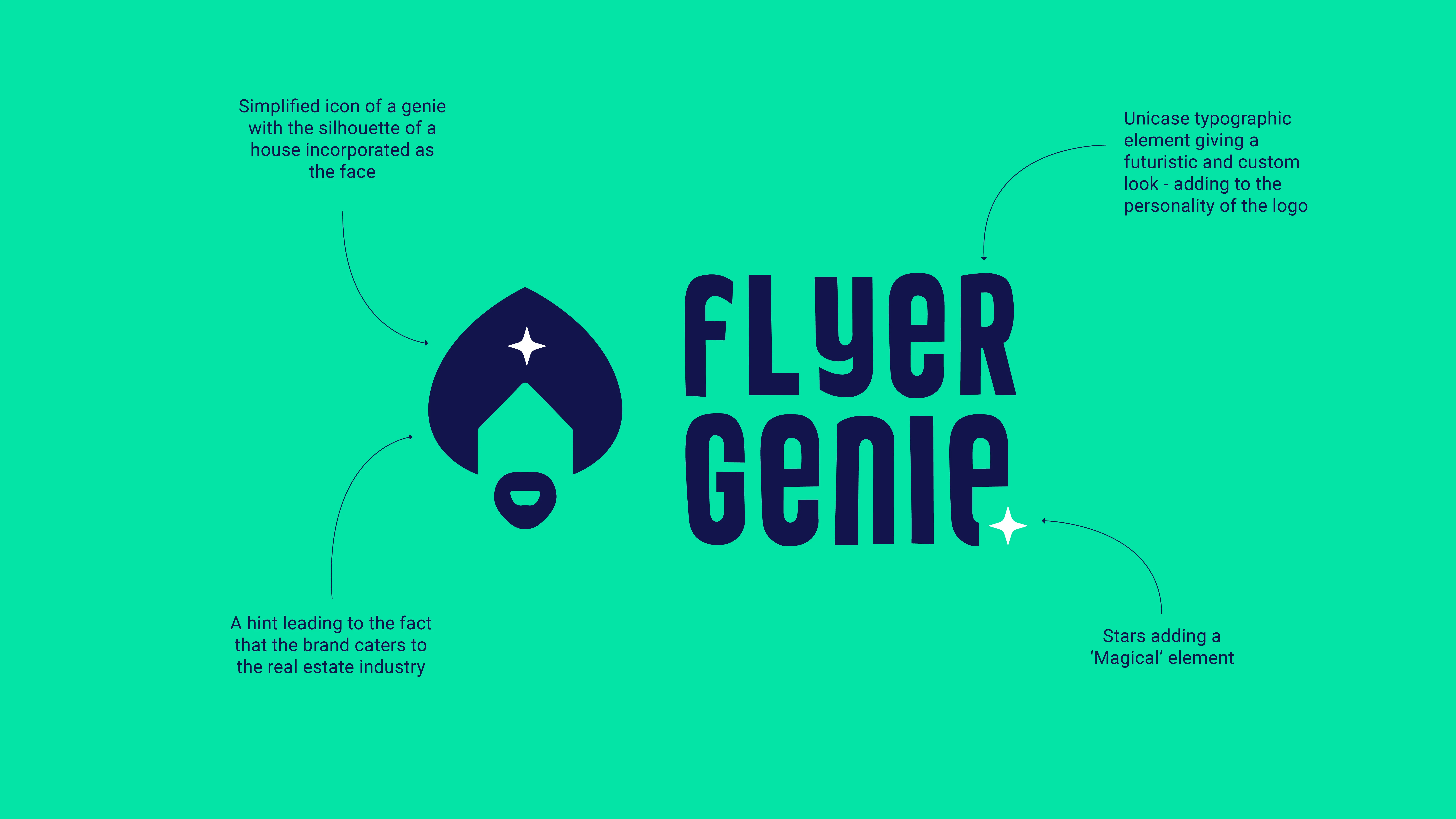
Flyer Genie — logo on turquoise background

Building a brand identity for an AI tool that makes real estate marketing effortless.

A complete brand identity for an AI startup that lets real estate brokers generate professional property flyers in seconds.

Client
Morris Anderson
Year
2024
Role
Brand Designer
Category
Brand

Sole designer — visual concept, logo system, colour palette, typography, brand guidelines, and landing page design.

Identity Design Brand Guidelines Digital Design B2B AI Tech SaaS

Flyer Genie is a brand new AI-powered tool that lets real estate brokers generate professional property flyers in seconds — a genuinely useful product entering an increasingly crowded market. The client had a name and a product. What they didn't have was a brand.

The brief was clear but demanding: create an identity that felt modern and distinctive without looking like every other tech company. No generic gradients, no cold blues, no sanitised neutrality. The brand needed its own personality — something that communicated speed and innovation while carrying a sense of magic and delight that matched what the product actually does.

Starting from nothing but a product name, everything needed to be built from scratch: a visual concept, a logo system, a colour palette, a typography hierarchy, a visual language, and guidelines that would let the brand live consistently across digital platforms.

AI startup

brand new — zero existing identity

4

deliverable categories

1st round

approved — no revisions

The name gave the concept everything it needed. Each decision followed from there.

Icon

The Concept

A genie grants wishes — and this product does exactly that in ten seconds flat. Rather than illustrate a genie literally, the mark distils it into something more ownable: a simplified genie silhouette with a house shape embedded as the face, quietly nodding to real estate without spelling it out.

Typography

Unicase Type

The wordmark uses unicase typography — a mix of upper and lowercase letterforms — giving it a custom, futuristic quality that sets it apart from standard tech brands. It reinforces the sense that this is a product with its own personality.

Palette

Colour

A deliberate rejection of the cold blues dominating the AI space. Navy as the foundation, turquoise and lime green bringing energy and momentum, cream adding warmth. Technically capable but genuinely enjoyable to use.

Visual Element

Magic Device

A four-pointed star threads magic consistently through every touchpoint — cursor, button accent, section highlight, animation trigger. It is not decoration. It is a system.

Logo rationale — the genie icon with house silhouette, unicase typography and star element

Logo rationale — the genie icon with house silhouette, unicase typography and star element.

The identity was delivered as a complete brand toolkit, approved in the first presentation round with no revisions.

01

Visual Identity System

A full logo suite across all colour variations, a bold palette built to stand out in a saturated AI market, a typography hierarchy using Oswald and Roboto, and a star device with defined usage across every touchpoint.

02

Landing Page

A designed landing page applying the full identity in context — demonstrating colour blocking, typographic hierarchy and the star device as an interactive element.

03

Social Media

Brand-consistent assets showing how the identity translates to digital content and campaign materials.

04

Brand Guidelines

A complete guidelines document covering logo construction, safe space rules, colour values, typography rationale and the visual element application across the product.

Flyer Genie brand identity
Logo variations — stacked.
Flyer Genie brand identity
Logo variations — horizontal.
Flyer Genie brand identity
Colour palette — four colours chosen to stand out in a market full of cold blues and grey neutrality.
Flyer Genie brand identity
Typography — geometric headings, clean body copy. Built to work at every scale.
Flyer Genie brand identity

Landing page - The full identity applied in context.

Motion — the star device animated as a feature highlight

Brand extended to social - consistent identity across digital formats.

Landing page design — the identity applied in context, with colour blocking, typographic hierarchy and the star device as an interactive element

Brand guidelines - everything needed to use the identity correctly and consistently.

A brand built from scratch, approved in one round, that gave an AI startup the identity to stand out in a crowded market.